The network for creativity
Join 1.25M professional creatives like you
Connect with clients, get discovered, and run your business 100% commission-free
Creatives on Contra have earned over $150M and we are just getting started
Back to feedPost
Taste Test

I'm exploring two hero section directions for a bakery landing page and would love your feedback. Which one feels more inviting and memorable?
Which direction works better for a bakery brand, and why? Your feedback is greatly appreciated! 🙌
3 voted
60%
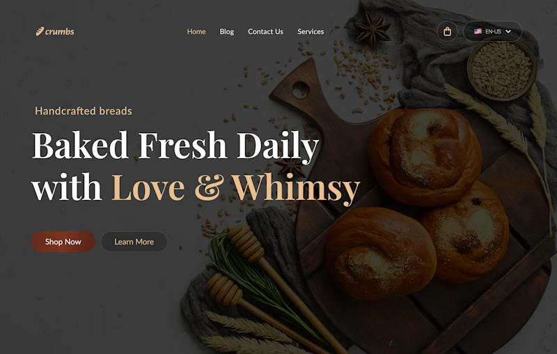
2 voted
40%
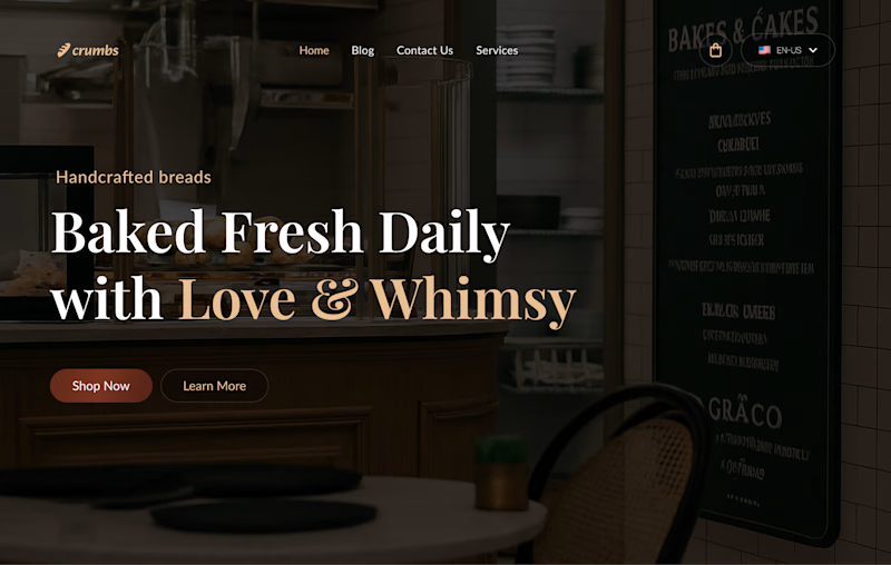
5 votes
Closed
The network for creativity
Join 1.25M professional creatives like you
Connect with clients, get discovered, and run your business 100% commission-free
Creatives on Contra have earned over $150M and we are just getting started





Related posts


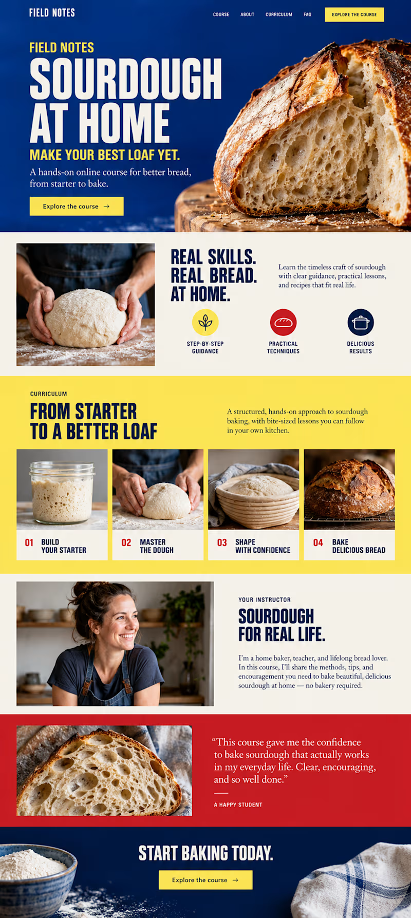
Which direction would you choose for a sourdough course sales page in Kajabi?

34 voted
59%
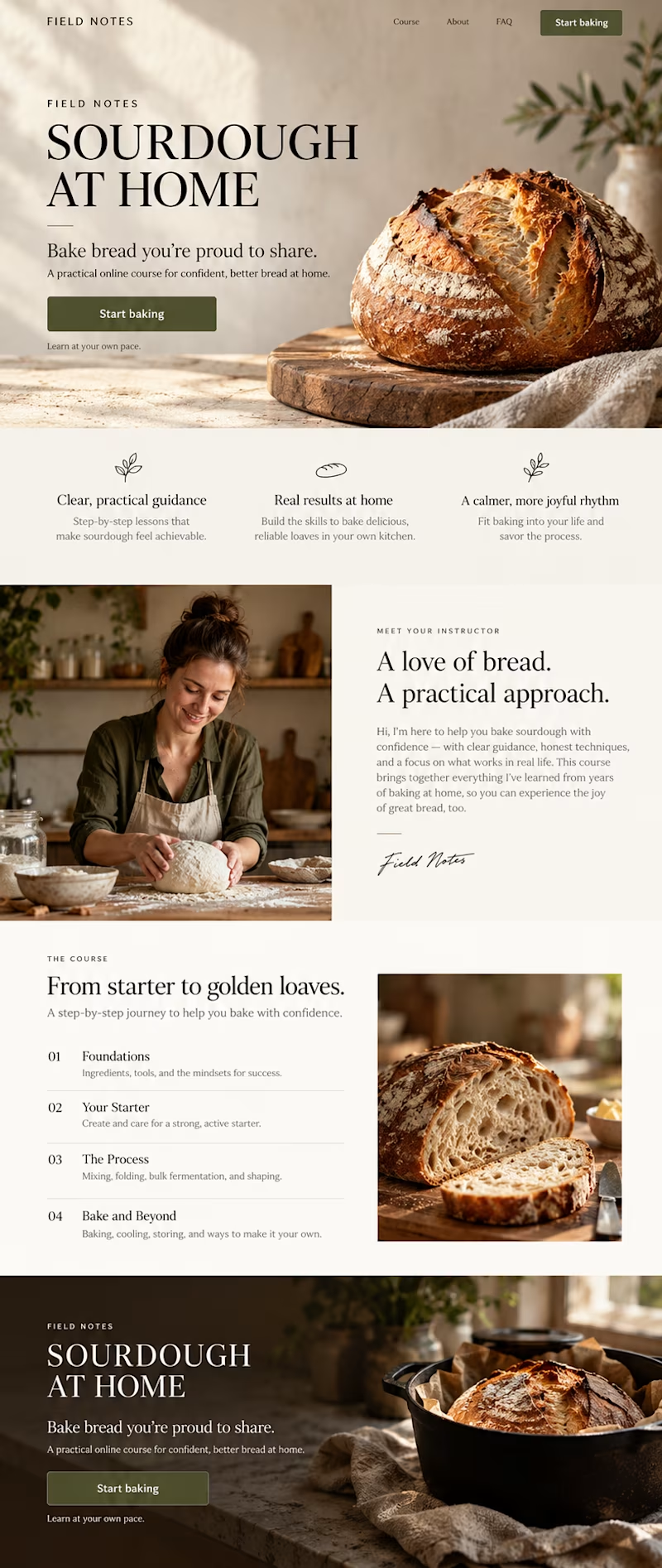
24 voted
41%
58 votes
Closed


In recent days I’ve been practicing designing around an image.
Sometimes an image can have great potential and reinforce the message we want to convey. I’m not saying this is the correct way to prepare a strategy, it’s simply an exercise. As a result, I created these three hero section designs, which I’ve published in the Figma community where they can be freely used for experimentation.
If you use them, I’d love to see the outcome, so make sure to tag me!


So beautiful

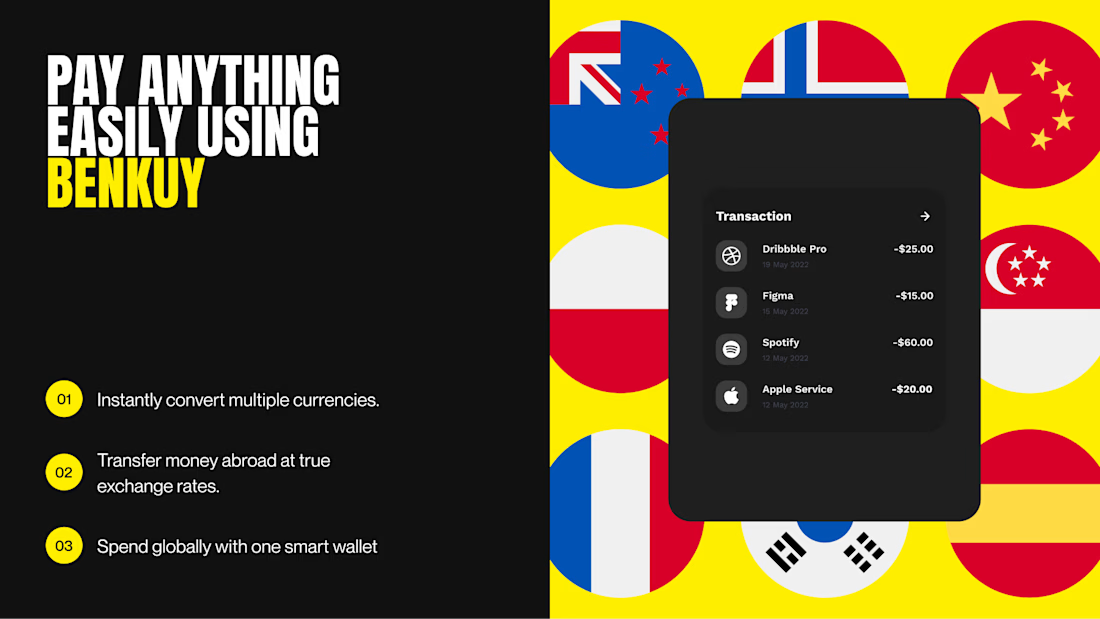
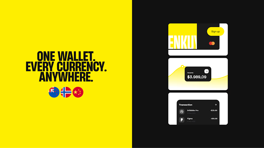
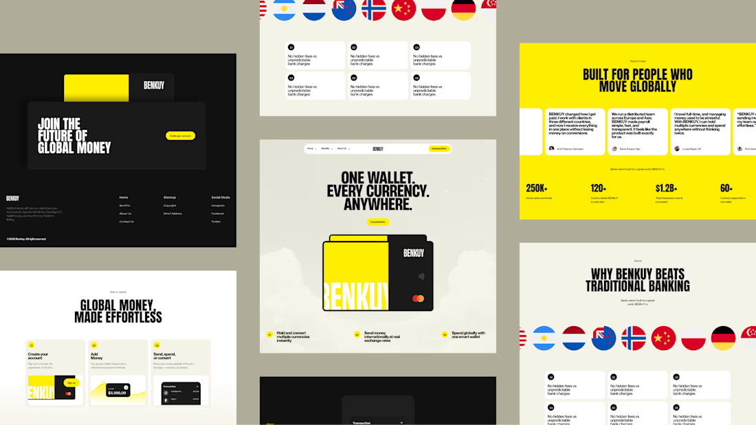
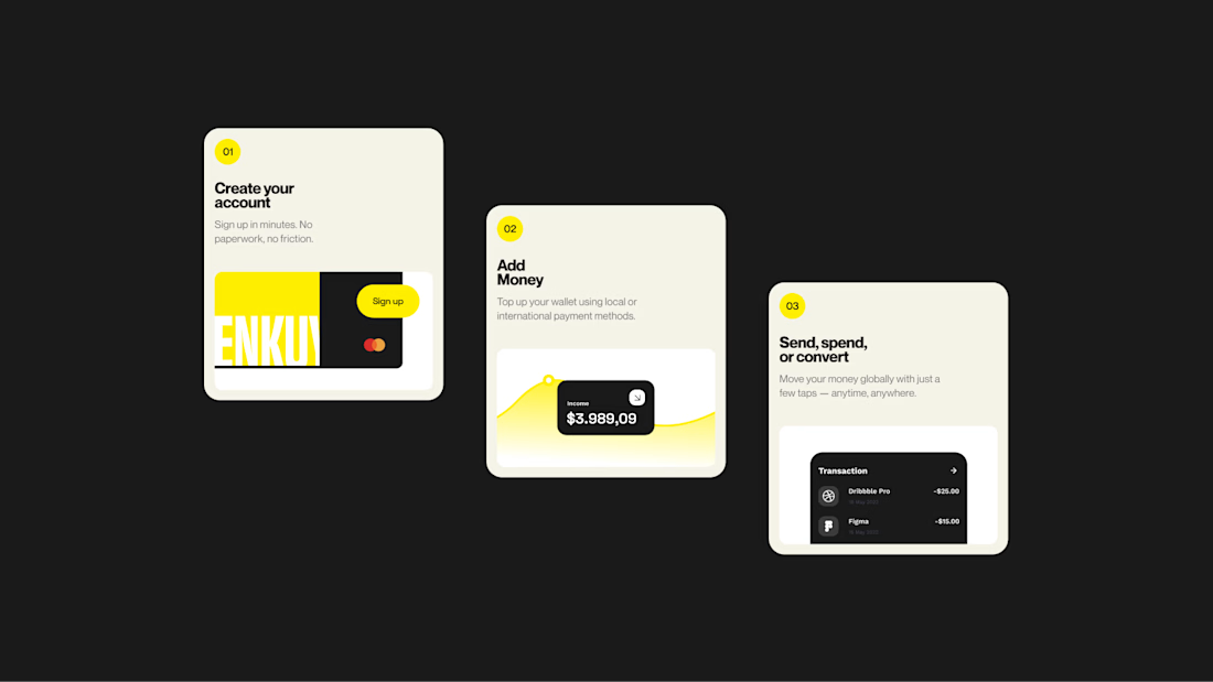
BENKUY - Finance Landing
Simplifies global money movement with one wallet for every currency. A bold, minimal interface combines clean layouts, strong typography, and vibrant accents to create a fast, modern, and seamless experience.
Want to create something like this?
Let's Talk!

That's unbelievable bro keep going 🔥🔥🔥