The network for creativity
Join 1.25M professional creatives like you
Connect with clients, get discovered, and run your business 100% commission-free
Creatives on Contra have earned over $150M and we are just getting started
Back to feedPost

I designed a comprehensive, ultra-luxury branding deck concept for an e-commerce platform specializing in high-end delicacies (fine hams, pristine caviar, and uncommon vintage wines).


The network for creativity
Join 1.25M professional creatives like you
Connect with clients, get discovered, and run your business 100% commission-free
Creatives on Contra have earned over $150M and we are just getting started

Challenges
View all


Related posts

Client’s choice vs. Designer’s choice 👀
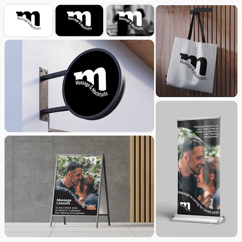
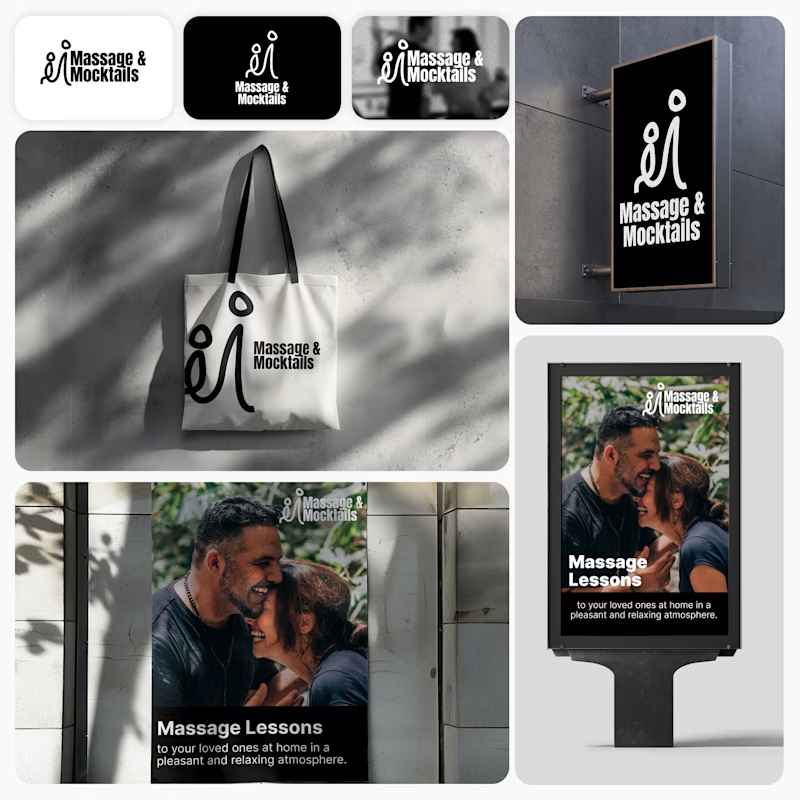
I’m currently working on a branding project for Massage & Mocktails — a concept built around couples learning massage together in a relaxed, social atmosphere.
These are two early, black & white directions from Stage 2 of my branding process, before moving into color, typography, and the full visual system.
The interesting part?
My client chose Concept 1. I chose Concept 2.
Now I’m curious what other creatives think.
Which direction would you choose — 1 or 2? And why?
Sometimes the most interesting part of branding is seeing how differently a client and a designer respond to the same brief.
21 voted
44%
27 voted
56%
48 votes
Closed

Concept 2 for me. That interlocking figure mark reads as two people meeting, which is the actual brief here, so it gives you more to build a system on. Concept 1 is the safer, more literal pick, which is usually why clients reach for it.

🌸 Fleur d'amour part 1.
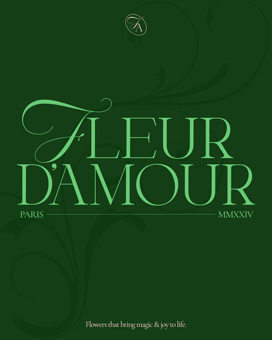
Fleur d'amour is a beautiful flower shop in Paris, making sure the beauty and magic of their flowers reaches people lives to make them better, happier, and serene.
The brand direction is elegant, a bit premium, and somewhat minimal, communicated through a mix of curvy typography and a thin elegant serif.
I developed a scalable logo suite to make sure each application can have an option that fits.
What do you think?
(This is a fictional project aimed for exploration)


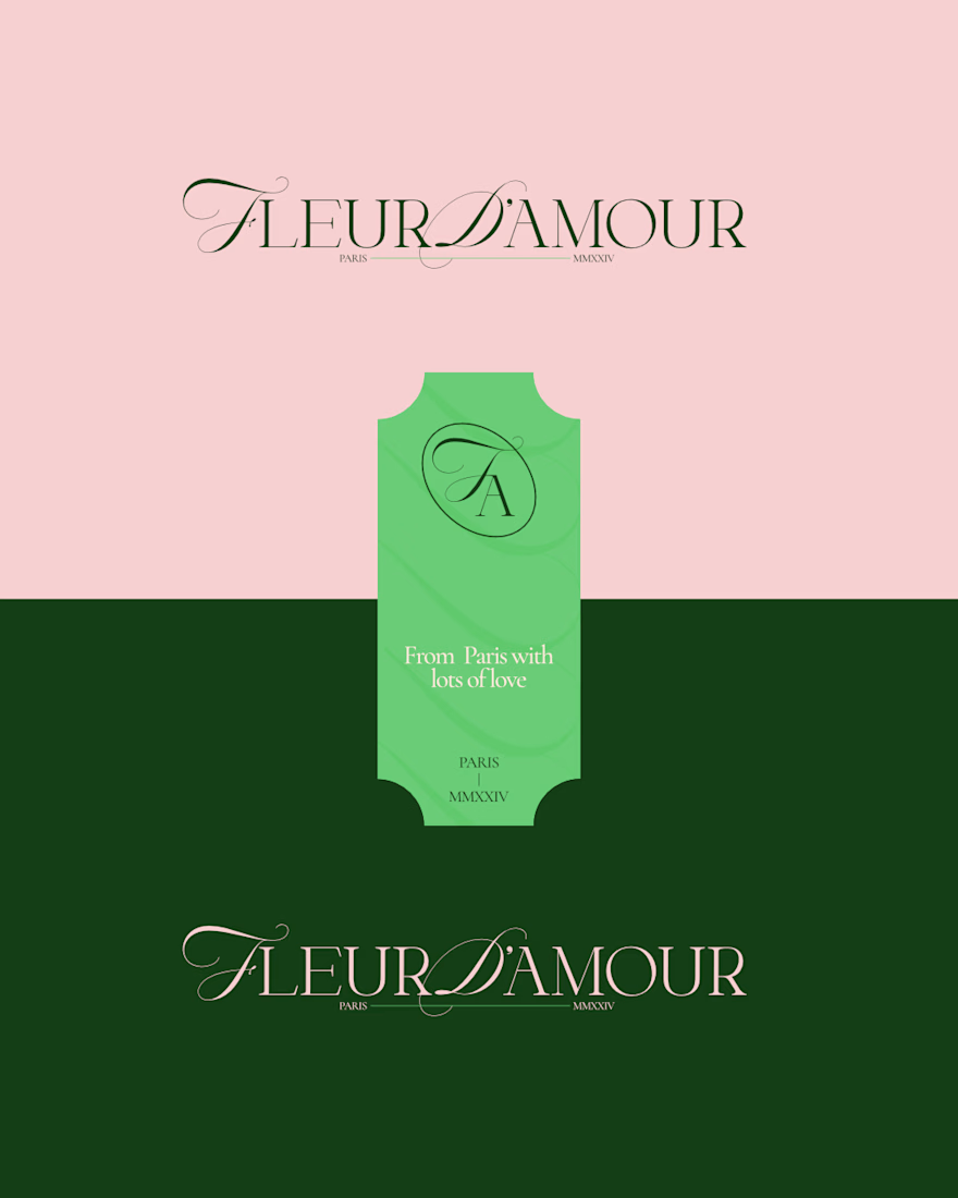
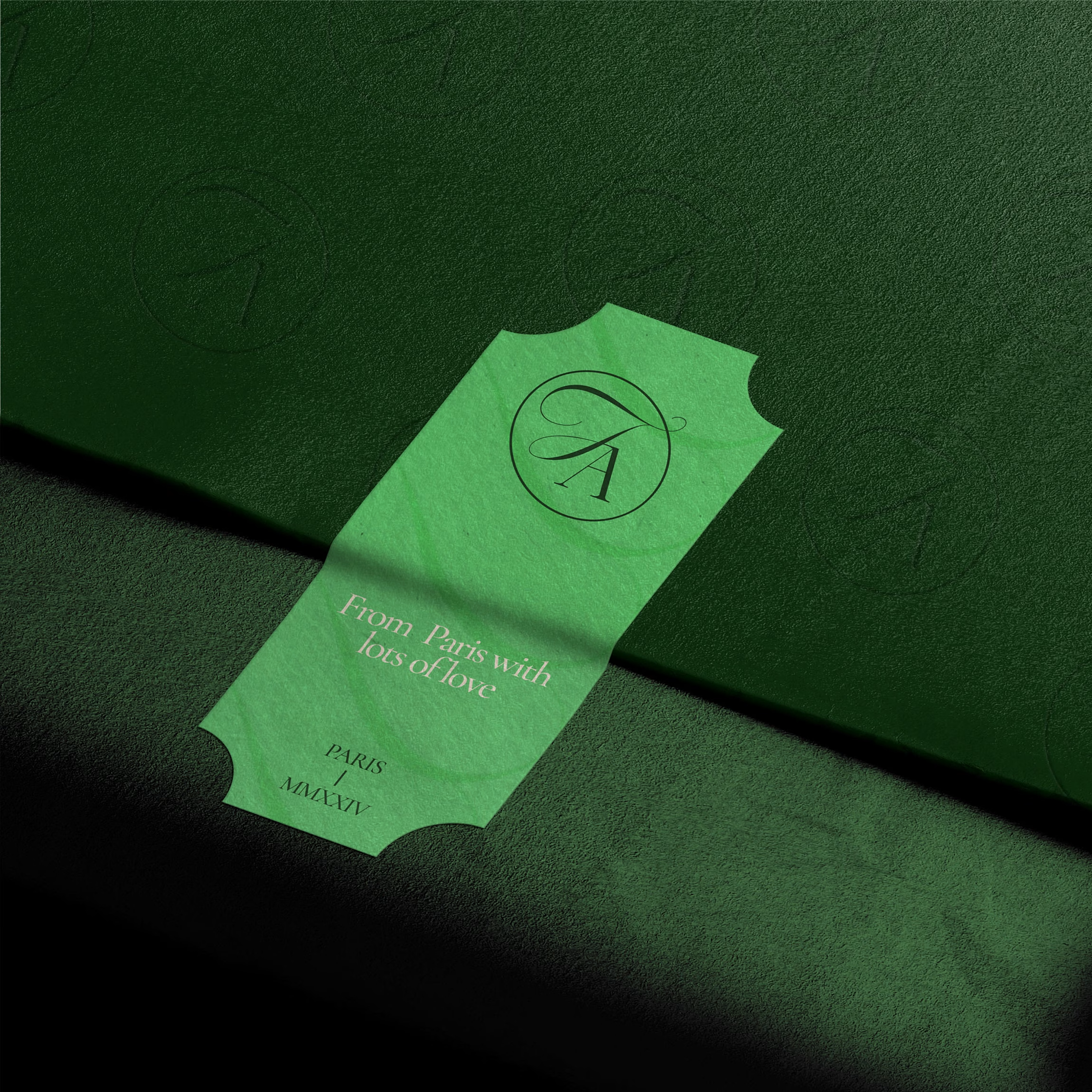

The script mark next to that thin serif does the premium work without extra ornament. The ticket lockup feels especially right for a Paris flower shop.

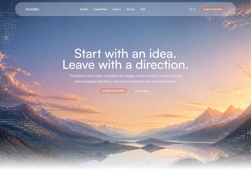
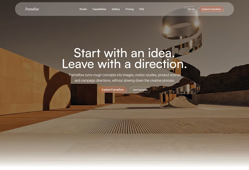
Explored two different visual directions for the same SaaS landing page.
The structure stays consistent, while the imagery, mood and art direction shift the overall brand feel.
Interested to know which direction feels stronger.

11 voted
73%
4 voted
27%
15 votes
Closed

Woww... What a precious design priyansh bro.😍 💯 🔥 🎉