The network for creativity
Join 1.25M professional creatives like you
Connect with clients, get discovered, and run your business 100% commission-free
Creatives on Contra have earned over $150M and we are just getting started
Back to feedPost

launched my new portfolio a few days ago. 👨🏻🎨
liked the variant of a non-scrollable 100vh site here.
https://kantorlab.de

The network for creativity
Join 1.25M professional creatives like you
Connect with clients, get discovered, and run your business 100% commission-free
Creatives on Contra have earned over $150M and we are just getting started

Related posts

Fresh Framer Template drop!
Simple, monochrome, studio template
Template includes a design-system skill and page and instructions on how to use it.

this looks incredible!


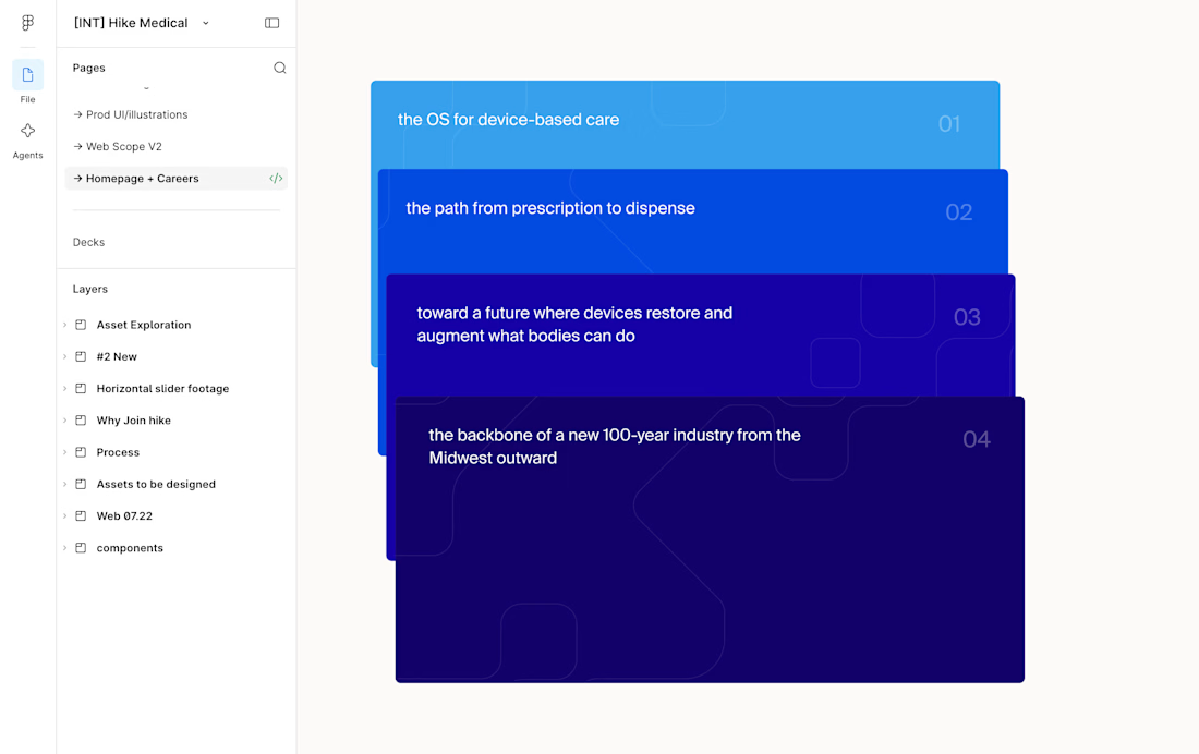
This card stack transition combining the SVG of each card to the sticky position is giving my brain really satisfying scratches 😘👌
--
I've been doing a lot more Framer developments lately where I don't do the design, I think one of the big advantages of having a strong background in design is that I can see the designers vision to translate it into the web obsessing over the details.
I.e. see Figma design screenshot in the comments how each card had the same SVG but in irregular placements, I saw it as an opportunity to perfectly align them on scroll and add a bit of a transparency reveal at the end. It feels way more intentional and ties everything together.
Design by @Iverson developed by me
Figma design handoff