The network for creativity
Join 1.25M professional creatives like you
Connect with clients, get discovered, and run your business 100% commission-free
Creatives on Contra have earned over $150M and we are just getting started
Back to feedPost

While looking for design references, I visited a local tea shop I found on Google Maps. The place looked beautiful and aesthetic, so I became curious about their menu.
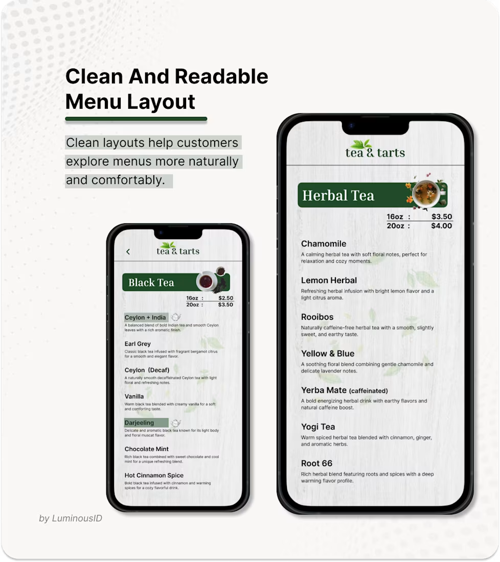
But when I opened it, the menu was only displayed as an image, making it difficult to read the tea descriptions and prices on mobile.
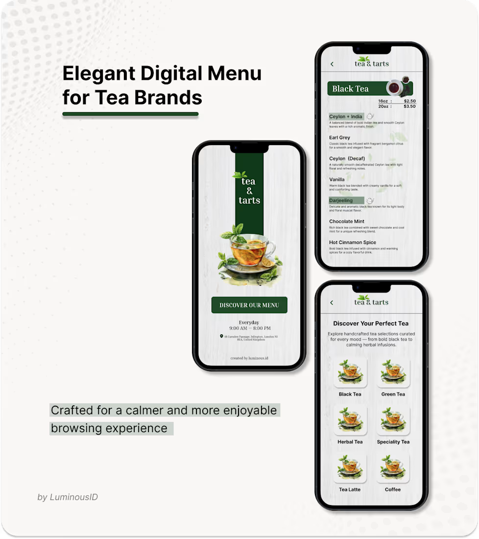
That experience inspired me to redesign it into a calmer and more interactive digital menu experience for modern tea brands 🍵
Featuring:
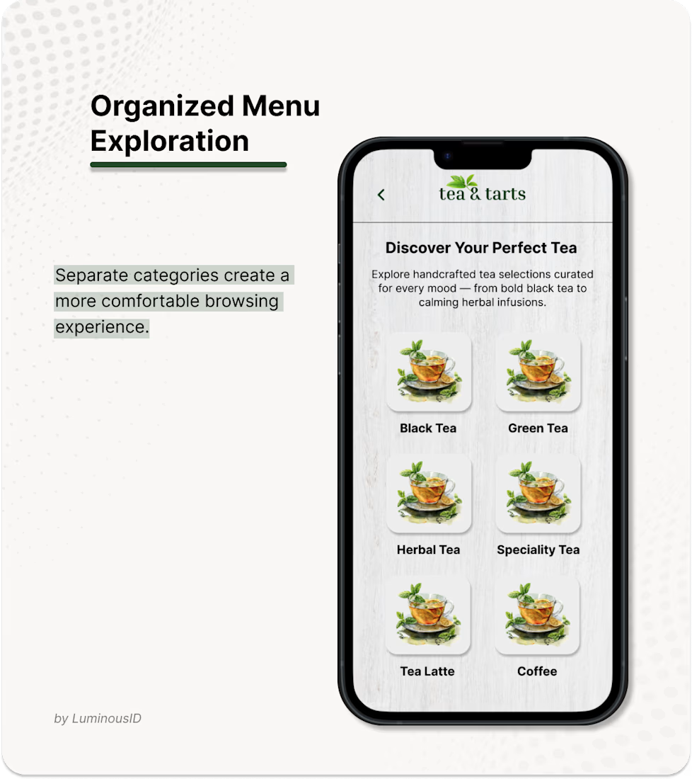
Organized categories
Clean menu layouts
Smooth mobile interaction
Responsive browsing experience Designed to make menu exploration feel simpler, cleaner, and more enjoyable ✨ Open for custom café & restaurant projects via Contra DM.


The network for creativity
Join 1.25M professional creatives like you
Connect with clients, get discovered, and run your business 100% commission-free
Creatives on Contra have earned over $150M and we are just getting started





Related posts





🔥 🔥


Which Kajabi pricing section would you ship?
Creative Business Lab has three paths: Course, Live Cohort, and Mentorship. Both designs show the same $690 Live Cohort with the same benefits. Only the presentation changes.
Vote Horizontal tabs or Side tabs, then tell me the one thing you’d improve before launch. Have a stronger third approach? Show it in the replies.

21 voted
50%
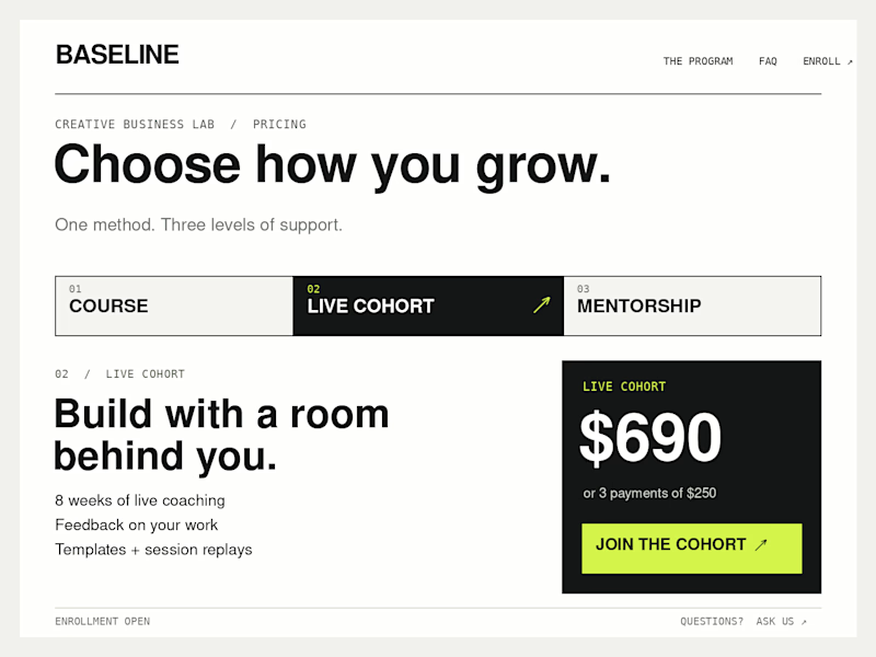
21 voted
50%
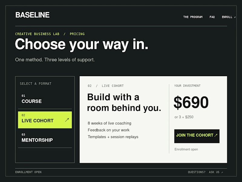
42 votes
Closed

Horizontal. side tabs read as nav, people skip them. though the stronger third option is no tabs at all, three cards side by side. both of these hide two prices behind a click and comparison is the one job a pricing section has.


I've built a new mobile AI assistant that brings chat, text and image generation, voice input and document analysis into one app.
It have Smart Chat, Text Creator, Image Create, Voice Input, plus PDF Scanner, Photo Analyze, Social Content and Prompt Ideas, filtered by category.
Almost everything AI can do, just in one place.


Such an amazing tool! Keep going!