The network for creativity
Join 1.25M professional creatives like you
Connect with clients, get discovered, and run your business 100% commission-free
Creatives on Contra have earned over $150M and we are just getting started
Back to feedPost

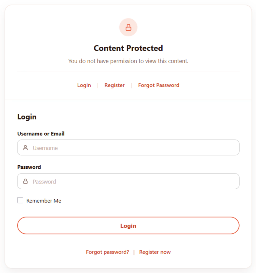
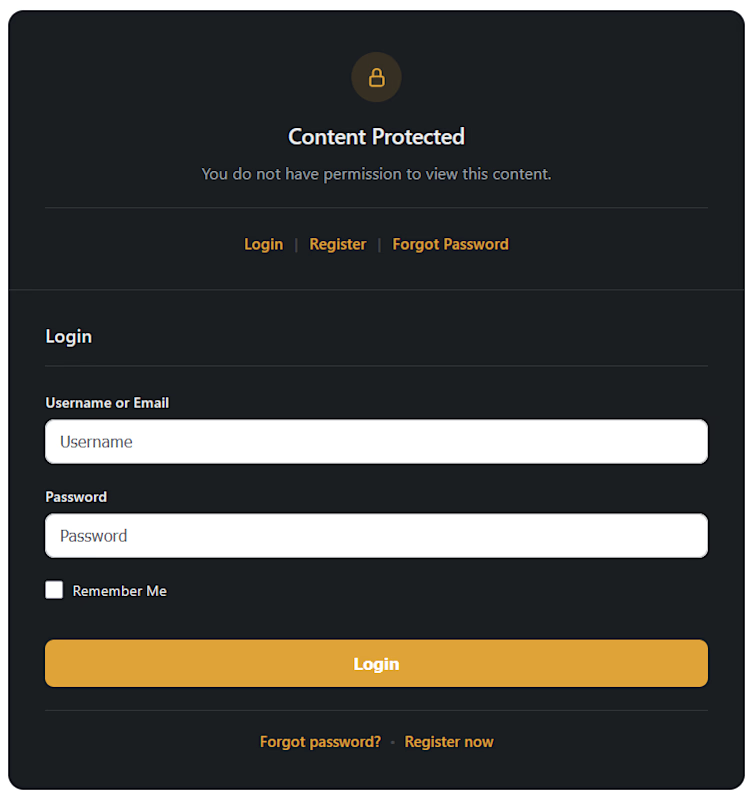
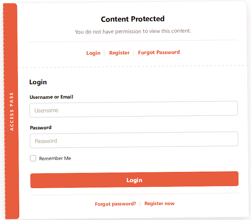
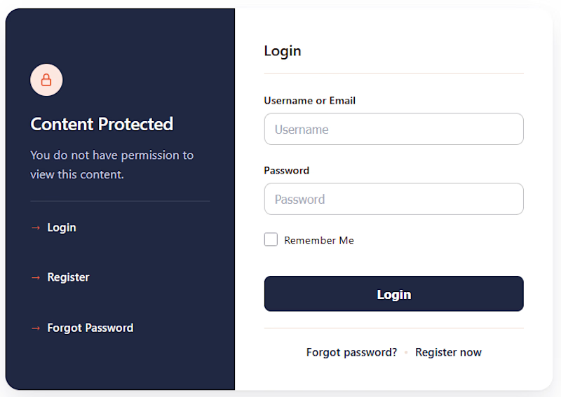
A few days ago, I shared a rough first pass of the authentication screens for the content protection feature I’m building into my WordPress plugin.
Got one comment, and it was sharp:
→ Add an icon or simple image above the title
→ Don't let the login form/CTA go full width on desktop, cap it around 400-500px
Both went straight into the final design.
Worth noting: the process behind this was hybrid. AI helped me move fast through structure and iteration, but the calls that actually shaped the outcome came from a human brain, mine and the feedback above.
The design phase is officially wrapped up, and here it is.

The network for creativity
Join 1.25M professional creatives like you
Connect with clients, get discovered, and run your business 100% commission-free
Creatives on Contra have earned over $150M and we are just getting started







Related posts

Just wrapped up a new redesign, and I’m really happy with how it turned out. 💻
Can’t wait to share more details and the live site soon...


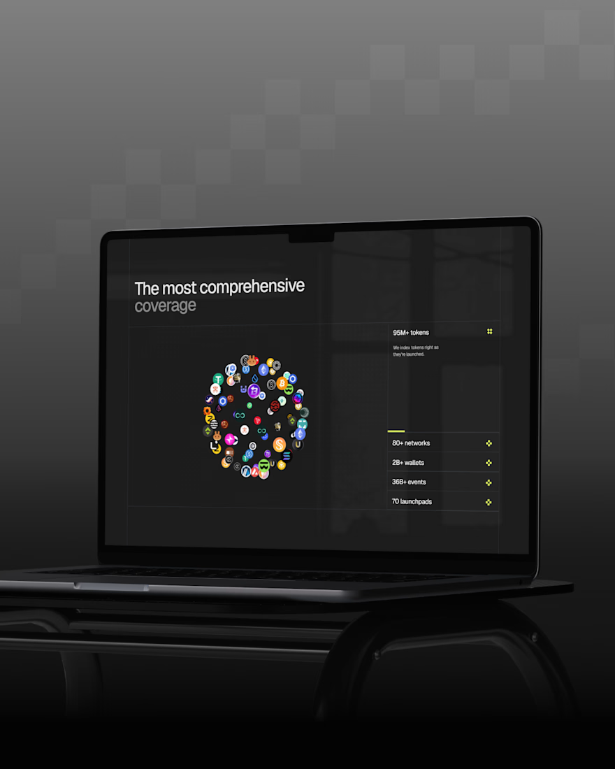

Sitting on this before the reveal instead of rushing to post it says you're already happy with how it landed, so now I'm curious what part of the redesign you're most excited for people to see once the site goes live.

New case study: the landing page for REVAI, a concept AI sales platform.
The brief I gave myself was structural, not decorative: design a page where every section earns the next one. Hero makes one claim and gets out of the way. The value proposition comes before any feature gets named — because a feature nobody understands yet is just noise. Proof (testimonial, logos) sits right before the final ask, not scattered earlier where it does nothing.
Art direction followed the same logic — high contrast where the page needs to make a claim, quieter and more editorial where it needs to build trust. The layout isn't there to look good in isolation. It's there to move someone from "what is this" to "I trust this" in one scroll.

Love the colors dude! Hell of a work🔥