The network for creativity
Join 1.25M professional creatives like you
Connect with clients, get discovered, and run your business 100% commission-free
Creatives on Contra have earned over $150M and we are just getting started
Back to feedPost


The network for creativity
Join 1.25M professional creatives like you
Connect with clients, get discovered, and run your business 100% commission-free
Creatives on Contra have earned over $150M and we are just getting started








Related posts

🚀 Modern Landing Page Design & Development
Looking for a clean, modern landing page for your next project?
I've created a modern landing page using HTML and Tailwind CSS, with responsive layouts and clean, easy-to-customize code.
💻 Preview the live website:
https://5e592461-custom-ui-design-project.netlify.app/
🛒 Get the source code here:
https://contra.com/payment-link/lUv8g6E9-modern-landing-page-design-and-development
Perfect for developers, designers, and anyone looking for a starting point for their next website.
#WebDevelopment #HTML #TailwindCSS #LandingPage #WebDesign #FrontendDevelopment #Contra


The Smart And Simple Health Solutions hero is a great demo of the template, the big statement type over the runner photo reads instantly. Shipping a live preview plus the source code makes this a genuinely useful starting point for anyone building.

Most SaaS and agency websites share the exact same issue: they look great in Figma, but feel sluggish, bloated, and fail to convert once built.
A pretty site doesn't mean much if it takes 4 seconds to load or fails to guide a visitor straight to a booked demo or call.
Recently, I’ve been helping high-growth SaaS teams and digital marketing agencies move away from slow legacy setups and onto clean, high-performance Framer builds.
Here’s what we focus on:
• Sub-second load times and clean SEO structure
• Custom interactions & micro-animations that enhance UX without dropping frames
• Conversion-focused layouts designed to turn cold visitors into booked pipeline
If your current site feels sluggish or doesn't reflect the true quality of your product, feel free to reach out or drop a message!

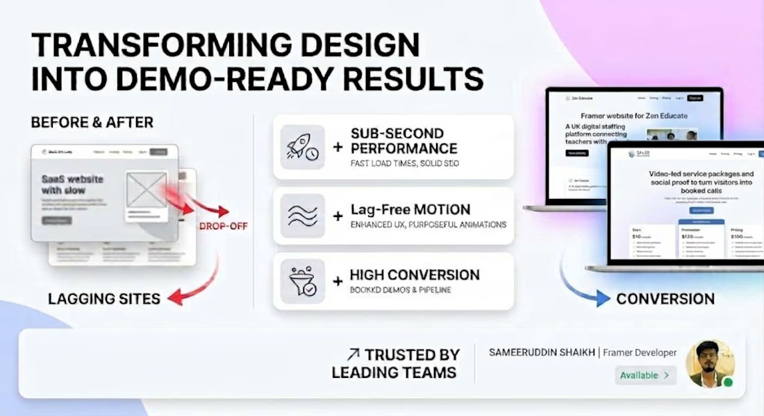
Look great in Figma but feel sluggish is painfully accurate. The before and after graphic showing the drop-off from lagging sites to conversion-focused builds tells the whole story in one glance.

Same SAE-REN project. A new way to explore it.
I’ve reworked the case study to make the connections between the identity, packaging, and physical applications clearer.
I think this version finally strikes the balance I was looking for: explaining the design decisions and logic behind the system while making the full page a pleasure to explore.
Old or new, which version would make you keep exploring?
2 voted
15%
11 voted
85%
13 votes
Closed

New♥️