The network for creativity
Join 1.25M professional creatives like you
Connect with clients, get discovered, and run your business 100% commission-free
Creatives on Contra have earned over $150M and we are just getting started
Back to feedPost
Taste Test



Halftone Style Battle 🟢 vs 🔴
Designing an interactive hero section for Aura Botanica (Cellular Radiance Elixir) using the trending #Halftone technique.
If you were landing on this product page, which aesthetic converts you faster? Drop your pick below! 👇
#halftone #tastetest #uidesign #webdevelopment #frontend #motiondesign
1 voted
50%
1 voted
50%
2 votes
Closed
The network for creativity
Join 1.25M professional creatives like you
Connect with clients, get discovered, and run your business 100% commission-free
Creatives on Contra have earned over $150M and we are just getting started











Related posts

Two camera distances for the same Movable Ink cut. One leans in, one shows the whole layout. 1 or 2.
10 voted
50%
10 voted
50%
20 votes
Closed

2 is more stunning the animations feels unique and that's unbelievable 🎉🎉🔥🔥
great job Blahomyr❤️❤️

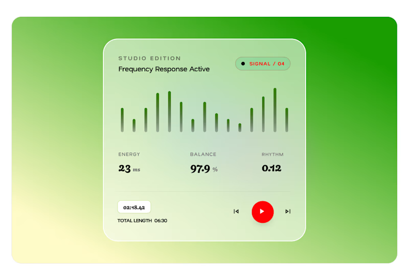
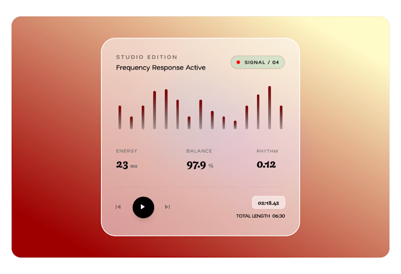
A card design, two ways.
Card A or Card B?
Which version wins?
2 voted
29%
5 voted
71%
7 votes
Closed

Card B is perfect man

Poster Club turns a simple event template into your own print. I built two working Flutter versions and recorded the same editing flow in each.
Print Room: calm, editorial, with a mounted canvas and bottom tools.
Cutout Playground: bold, playful, with loose prints and tools at the edge.
Which one would you rather use?
What made the difference?
Grab it for free:
https://contra.com/products/cUHBysMu-poster-club-free-flutter-ab-ui-kit

37 voted
60%
25 voted
40%
62 votes
Closed

Print Room looks great!!