The network for creativity
Join 1.25M professional creatives like you
Connect with clients, get discovered, and run your business 100% commission-free
Creatives on Contra have earned over $150M and we are just getting started
Back to feedPost
Presentation Exercise #2
This slide comes from a real startup pitch deck.
The headline is strong.
The data is strong.
The story is strong.
But here's the question:
If you only had 3 seconds to understand the slide...
where would your eyes go first?
👀 The headline?
👀 The 0.8% → 4.9% growth?
👀 The breakout verticals?
👀 The trend chart?
One thing I notice in presentation design:
Good slides don't just show data.
They decide what deserves attention first.
This slide does a great job of making the takeaway obvious:
Network-driven transactions grew 5× in 16 months.
Everything else supports that message.
If you were redesigning this slide, what would be the first thing you'd change?
#presentationdesign #pitchdeck #startup #storytelling #datavisualization
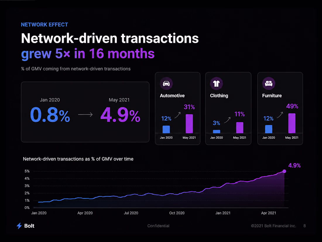
The Big Numbers always take the first attention.
The network for creativity
Join 1.25M professional creatives like you
Connect with clients, get discovered, and run your business 100% commission-free
Creatives on Contra have earned over $150M and we are just getting started
Related posts
I just uploaded this new case study for a sales deck design template done in Google Slides...which cover image do you prefer?
Here's the case study for reference :)
53 voted
69%
24 voted
31%
77 votes
Closed
It is so so amazing 😍
Project:
A promo reel for a real client. A LinkedIn brand consultant who helps serious professionals show up online without the noise.
The Human by Design moment:
I built the loud version first. Big text, fast cuts, hype music. Exactly what a LinkedIn promo is expected to look like. It was competent work. Then I watched it back and deleted it.
Not because it was badly made. Because it was wrong for her. Her clients come to her to get away from that noise. A loud promo would have contradicted the thing she's known for.
AI could generate something polished. It couldn't know that polished was the wrong call for this particular client. I knew, because I built her website and I know her brand.
The decision that carries it:
Her brand has exactly one accent color. So in a 28-second reel, that color appears once, on a single word. Everything else stays calm. AI would have spread it everywhere for "visual interest." Using it once was the whole point.
Envato as the toolkit:
Stock video, music, fonts, and AI-generated textures. All from Envato. Four asset categories in one deliverable.
Real client:
Not a spec project. She's an active consultant, I built her website, and she reviewed and approved this reel.
Social links: https://www.instagram.com/reel/Da5GRSnTkj9/?utm_source=ig_web_copy_link&igsh=MzRlODBiNWFlZA==
Really great walkthrough video
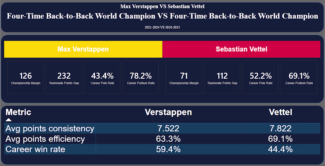
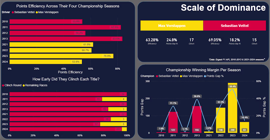
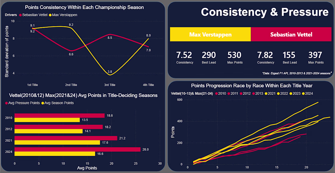
F1 Data Analysis: Vettel vs Verstappen — SQL & Power BI
A SQL + Power BI comparison of Sebastian Vettel's (2010–2013) and Max Verstappen's (2021–2024) four-title runs at Red Bull Racing — same team, different eras, very different paths to the top.
Built on the Ergast F1 database: 14 SQL queries across 5 categories (dominance, race execution, consistency, teammate benchmarking), visualized in a 5-page Power BI dashboard.
Key finding: Vettel converted a higher share of available points on average (69.05% vs Verstappen's 63.28%), despite winning fewer races overall.
Tech Stack
SQL Server · DBeaver · Power BI · Excel
Full project: github.com/MZT49/four-time-champions-vettel-vs-verstappen
Trending
Claude
Claude has entered the design space. How are you using Claude Design?
Contra University
Learn from expert creatives how to earn more using next-gen AI tools.
creativeaiflow
Creative AI workflows are evolving. What tools do you use, and what are their strengths and weaknesses?
freelancerlife
Freelancer life is wins, pivots, and everything in between. What’s yours right now?