The network for creativity
Join 1.25M professional creatives like you
Connect with clients, get discovered, and run your business 100% commission-free
Creatives on Contra have earned over $150M and we are just getting started
Back to feedPost
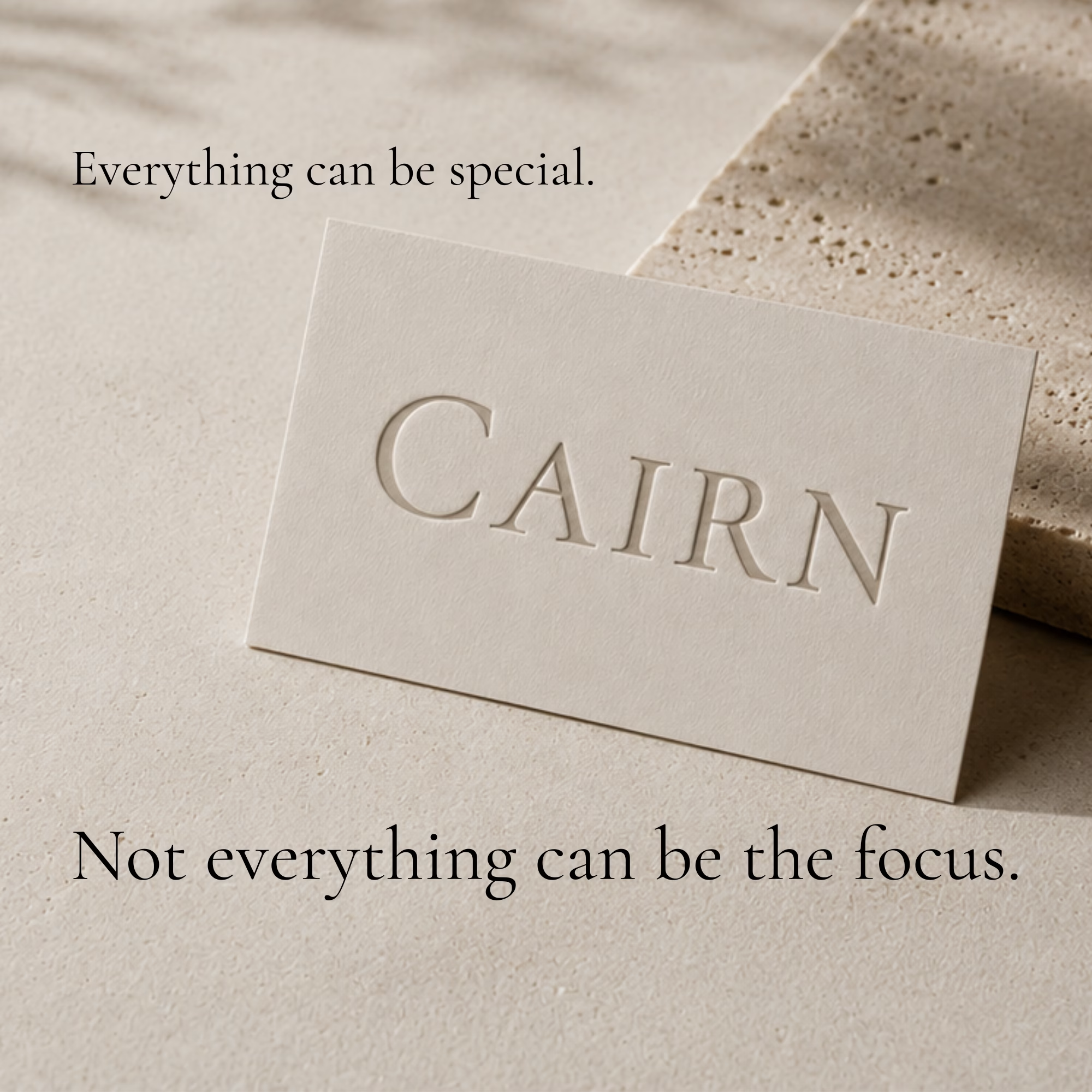
One of the biggest challenges I see in branding is that people spend so much time choosing the perfect elements that they want all of them to be the focus.
The logo.
The colors.
The typography.
The imagery.
The problem? When everything is competing for attention, your audience doesn't know where to look first.
Strong branding comes from hierarchy, not volume.
Everything can be special, but not everything can be the focus.
That's when the details start to matter.




Well said. When everything is competing for attention, nothing truly stands out. Strong branding comes from knowing what deserves focus and letting the supporting elements do their job

Thank you! That's such a great way to put it. When everything is trying to be the focal point, nothing gets the chance to lead.
The network for creativity
Join 1.25M professional creatives like you
Connect with clients, get discovered, and run your business 100% commission-free
Creatives on Contra have earned over $150M and we are just getting started





Related posts


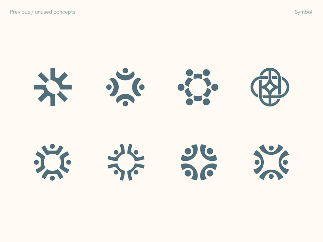
Rejected logo concepts exploring collaboration, shared expertise & working side by side




Which hero visual feels right for this brand?
While working on the homepage for Halfspace, a website design and SEO agency, I explored two different hero visuals for the same headline and layout. Same message, same structure, just a different visual metaphor and mood.
Option 1 - Rocket Launch. Bold, literal, and energetic, visually reinforcing the "launch your business" message with motion and fire.
Option 2 - Glass Cube. Abstract, sleek, and premium, giving a more refined, tech-forward feel without relying on a literal metaphor.
Would love your honest UX/UI take, which direction feels more impactful, memorable, and aligned with a web design/SEO brand, and why?
11 voted
41%
16 voted
59%
27 votes
Closed

Both design are great; it's hard to choose one