The network for creativity
Join 1.25M professional creatives like you
Connect with clients, get discovered, and run your business 100% commission-free
Creatives on Contra have earned over $150M and we are just getting started
Back to feedPost

People Ask : " Is it will be still interactive in mobile? "
See the result
webdesigninteractivewebsitedesignuxuidesignFlutter DevelopmentGraphic DesignWeb DevelopmentGoogle AntigravityNext.jsVisual Studio Code


The network for creativity
Join 1.25M professional creatives like you
Connect with clients, get discovered, and run your business 100% commission-free
Creatives on Contra have earned over $150M and we are just getting started



Related posts


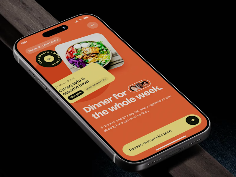
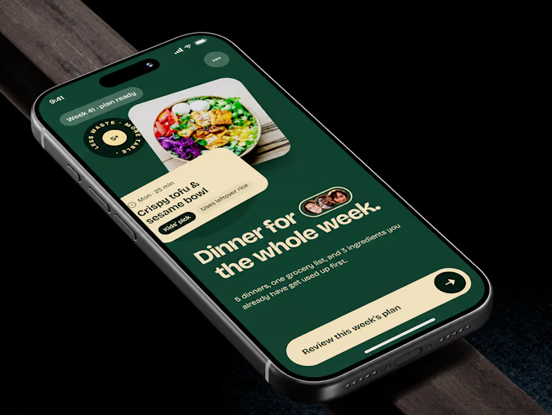
🧪 TASTY TEST: WHICH ONE MAKES NEXT WEEK FEEL SORTED?
Meal planner mobile app design. Same UX, two palettes.
🍊 A · Citrus Energy
Orange + buttery yellow. Appetite first.
🌿 B · Forest Calm
Deep green + cream. A calmer weekly ritual.
💡 GROWTH THINKING
Users want dinner handled, not another planning task.
My hypothesis: orange could win the first tap; green could signal less effort. I’d test plan-open rate AND grocery-list completion. More taps mean little if people abandon the next step.
🗳️ A OR B — WHICH WOULD YOU TRUST WITH NEXT WEEK’S DINNERS?
Vote and tell me why.
📩 BUILDING A MOBILE APP? LET’S FIND WHAT’S HOLDING GROWTH BACK.
https://calendly.com/asol_design/demo
#MobileAppDesign #AsolDesign
15 voted
68%
7 voted
32%
22 votes
Closed

One walk through Pasadena. Two ways to design it.
A: Field Guide, with the map up front.
B: Departure Board, with the itinerary up front.
Same places, same features. Which would you choose: A or B?
Download the Flutter source code for both versions for free.
https://contra.com/products/7ySCJSxh-switchback-two-flutter-app-designs


4 voted
50%
4 voted
50%
8 votes
Closed

Map up front for me. When I'm walking a new city I want to see where things are before the schedule. Cool that you shared the Flutter source!

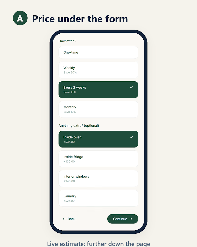
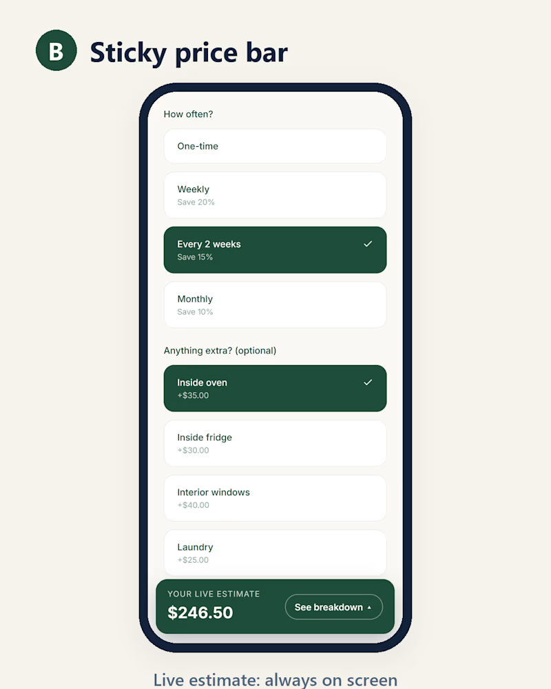
Quote form on a phone: where should the live price sit?
This is QuoteDesk, my Base44 Challenge entry for a home cleaning company. The estimate updates live as you pick options, but on a phone it sits under the form, so you have to scroll down to see it (A).
Vara Creative suggested a sticky price bar under my post (B). I mocked it up on the real page to compare.
Which one would make you finish the quote? Vote, and tell me why in the comments. I'll build the winner.

2 voted
33%
4 voted
67%
6 votes
Closed

Sticky Bar