The network for creativity
Join 1.25M professional creatives like you
Connect with clients, get discovered, and run your business 100% commission-free
Creatives on Contra have earned over $150M and we are just getting started
Back to feedPost

Icons are not perfect yet but already have their own character.
Imagine having your own custom icons and NOT have to use the same icons as thousands, millions of other sites.
Memorability increases. It feels intentional and handmade.
That step up in brand depth and quality is what I'm aiming for.

The network for creativity
Join 1.25M professional creatives like you
Connect with clients, get discovered, and run your business 100% commission-free
Creatives on Contra have earned over $150M and we are just getting started

Challenges
View all


Related posts


In my INKFLESH identity work, the wordmark runs off the can's curve and gets partly hidden behind artwork on posters. That crop asks the rest of the identity to carry more recognition. The mark has a job when the name is only partly there.

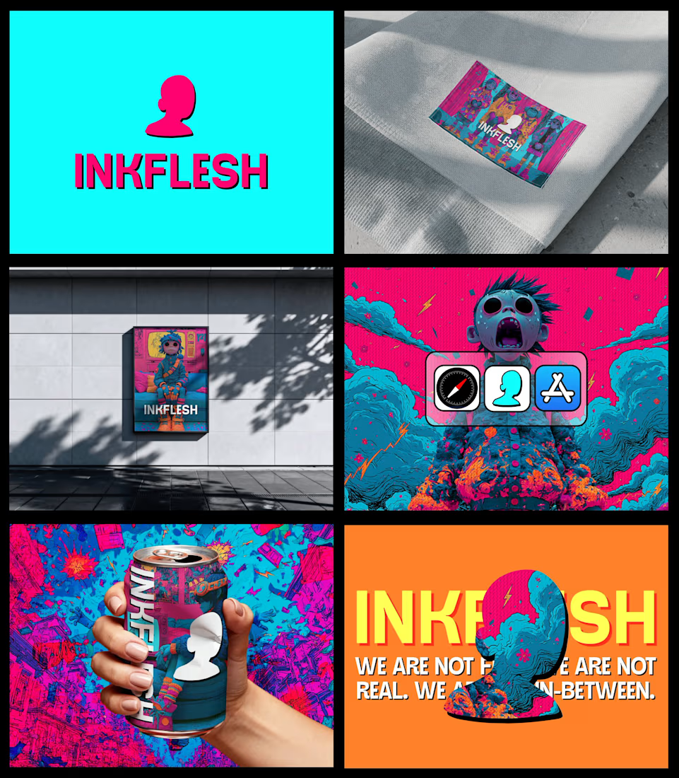


Web Design for Contra Labs — an extension of the Brand Identity we created.
Translating the visual language, principles, and character of the identity into a cohesive digital experience.


My Top Featured Projects on @Contra Labs 🔥
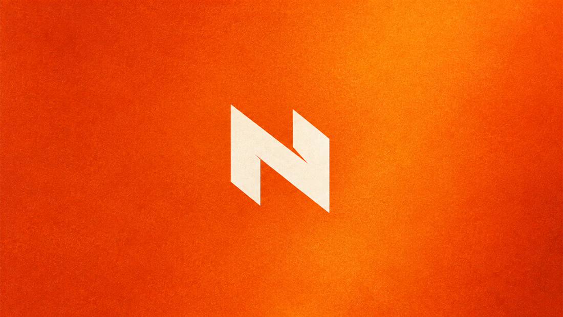
⚡| NEXVOLU
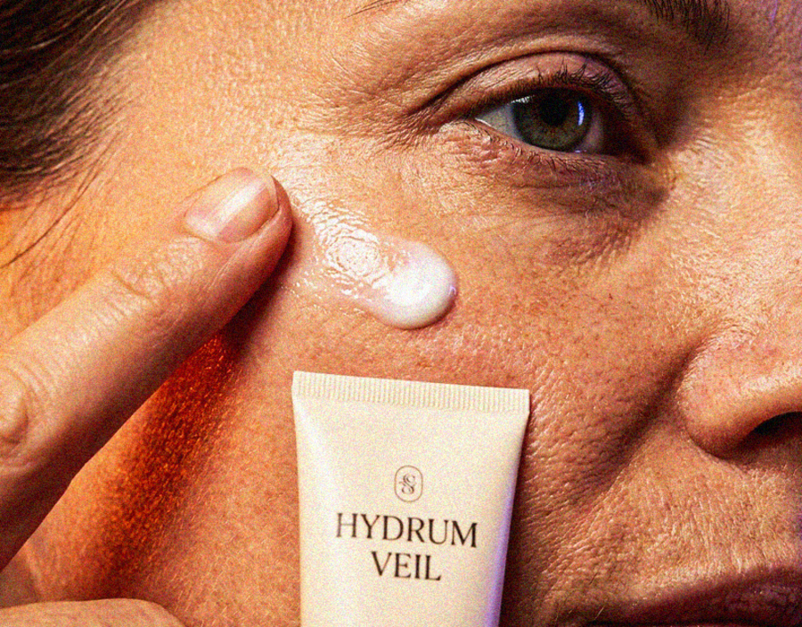
⚡| HYDRUM VEIL
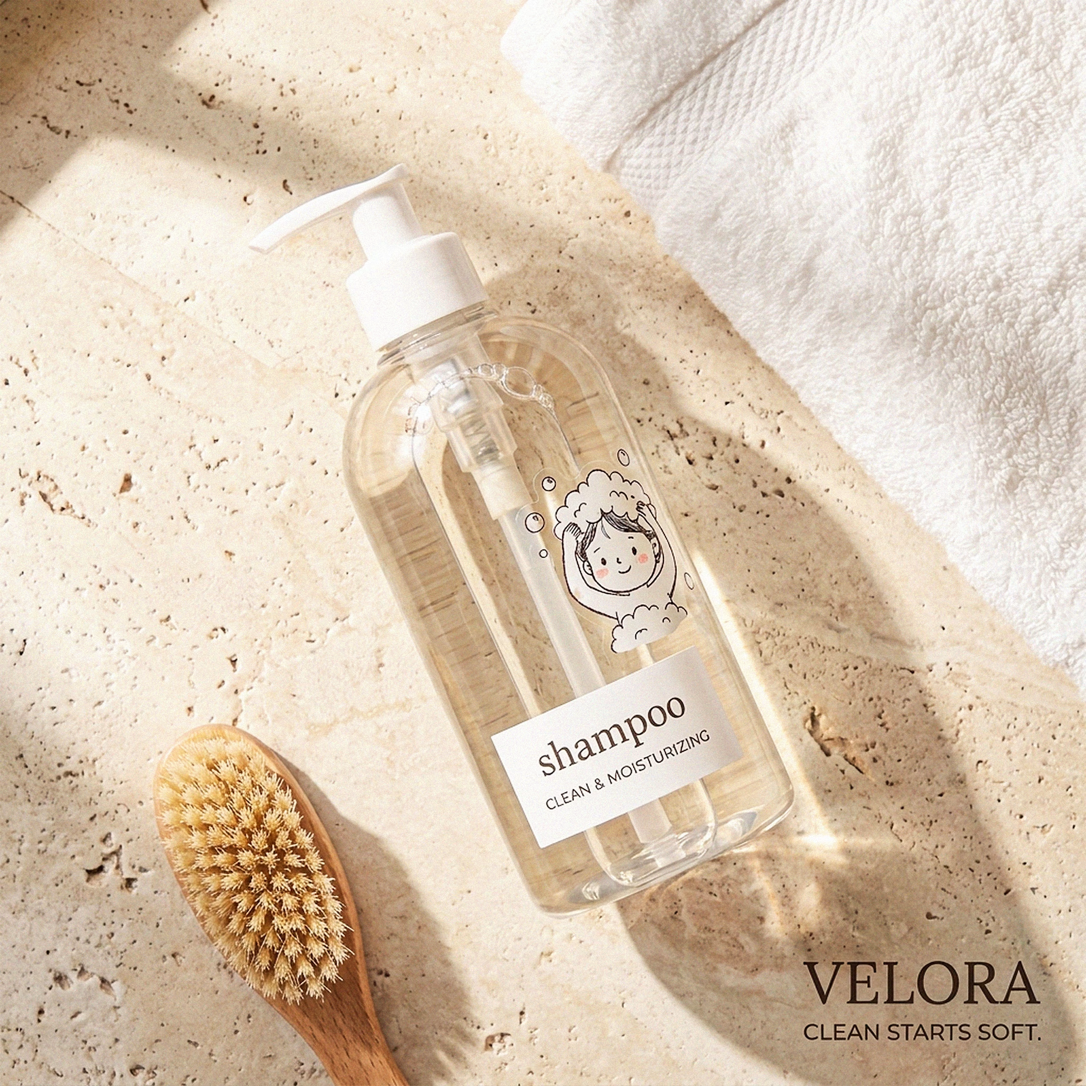
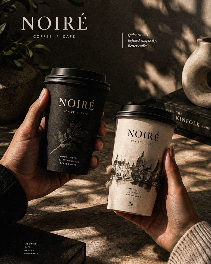
⚡| NOIRÉ
Each project explores a different direction, but the goal stays the same: build brands that stand out.
Which project is your favorite?
Drop the name below 👇



These are 🔥 Mine are all fav 🙌
Congo for Featured on @Contra HQ & @Contra Labs ... 😍


