The network for creativity
Join 1.25M professional creatives like you
Connect with clients, get discovered, and run your business 100% commission-free
Creatives on Contra have earned over $150M and we are just getting started
Back to feedPost
Taste Test
I am working on a new project, and I need your input for this Dark or white TESTING the design.
Which one will you prefer ?
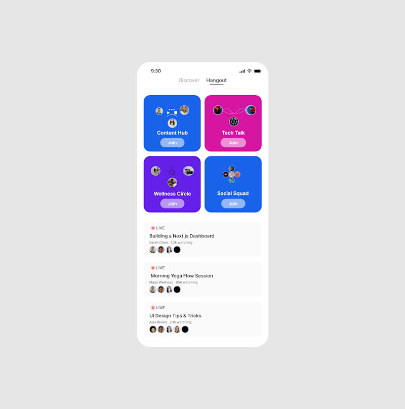
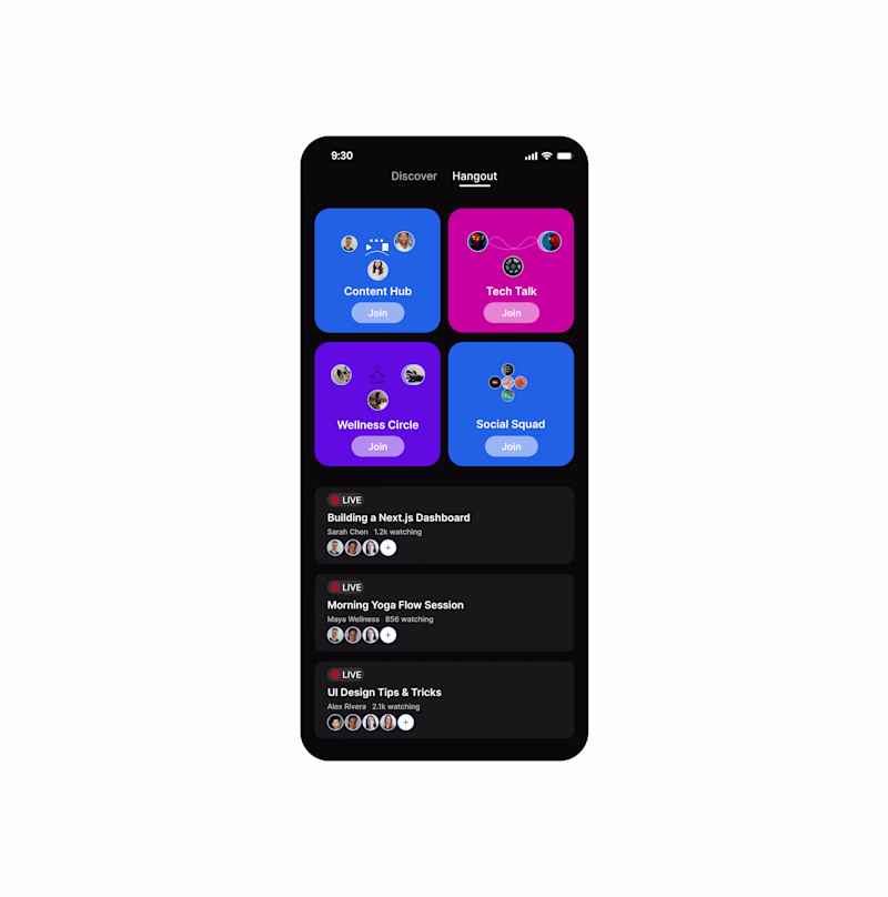
11 votes
Ends in 1d
Well done bro💯 , hangout (connecting and networking with people) will really fit white.
random i feel the "join" buttons, the white body can be 12% while the text is 100% Awesome work bro!
both version are good
Thank you
I go for the white
thank you
White looks better
Nice!
The network for creativity
Join 1.25M professional creatives like you
Connect with clients, get discovered, and run your business 100% commission-free
Creatives on Contra have earned over $150M and we are just getting started
Related posts
Exploring visual directions for a new course discovery screen.
Version A: High contrast, dark background.
Version B: Soft gradients, monochromatic flow.
I'm curious to hear from the community, which layout provides the better overall UX and visual hierarchy?
Cast your vote and let's discuss in the comments.
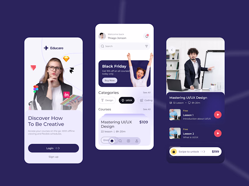
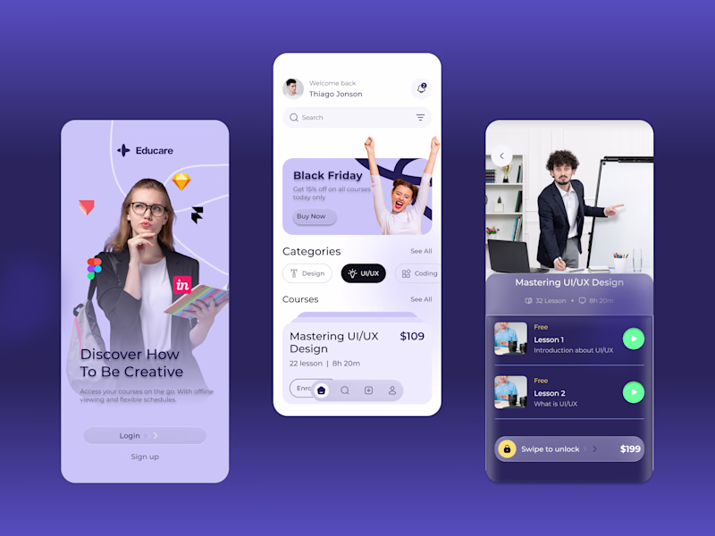
2 votes
Ends in 4h
Dark Mode" UI/UX that looks professional, modern, and expensive. Using the aesthetic seen in my Blvck Coffee project
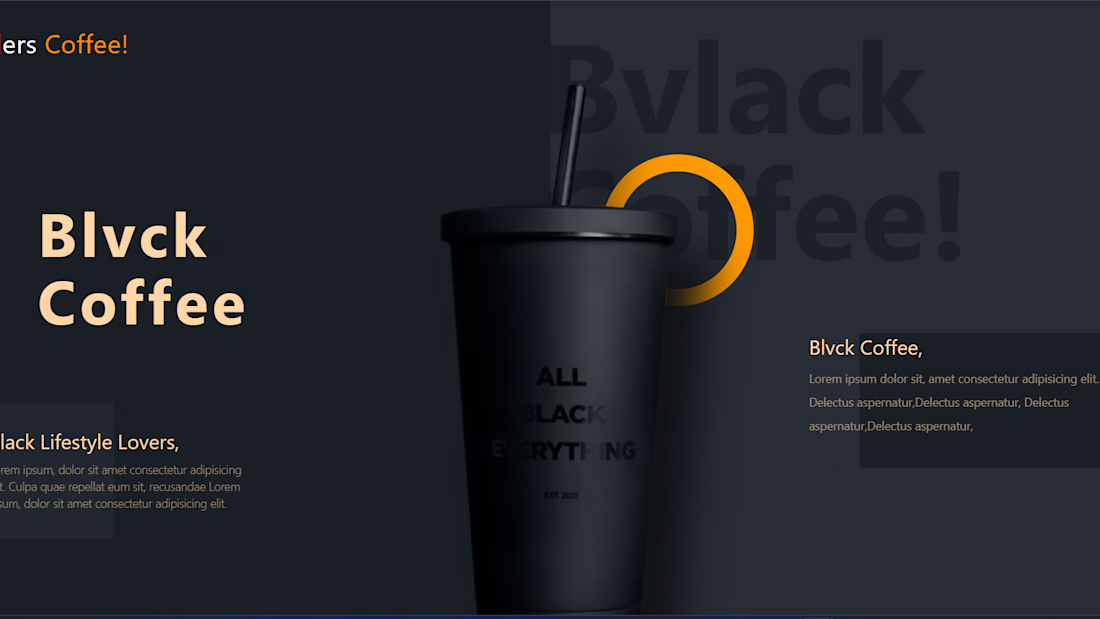
Great work, it reflects the high-end image of the coffee brand! I think reducing the spacing between the title letters would make it even better.
Trending
Runway
AI video generation is exploding. What are you dreaming up in Runway?
Contra University
Learn from expert creatives how to earn more using next-gen AI tools.
creativeaiflow
Creative AI workflows are evolving. What tools do you use, and what are their strengths and weaknesses?
portfolioreview
The best portfolios tell a story, not just show a grid. Share yours for feedback.
freelancerlife
Freelancer life is wins, pivots, and everything in between. What’s yours right now?