The network for creativity
Join 1.25M professional creatives like you
Connect with clients, get discovered, and run your business 100% commission-free
Creatives on Contra have earned over $150M and we are just getting started
Back to feedPost

The aesthetics of brand design carry over in a big way from the sports world!
Learning things like CRO, GMB, and other ad specific skill sets were something I had to really dive deep into in the blue collar niche

Going from top sports brands to roofing sites is such a specific pivot, and probably the kind of range most designers claim to have but rarely get proof of. What carried over between those worlds, and what had to be relearned completely?
The network for creativity
Join 1.25M professional creatives like you
Connect with clients, get discovered, and run your business 100% commission-free
Creatives on Contra have earned over $150M and we are just getting started











Related posts

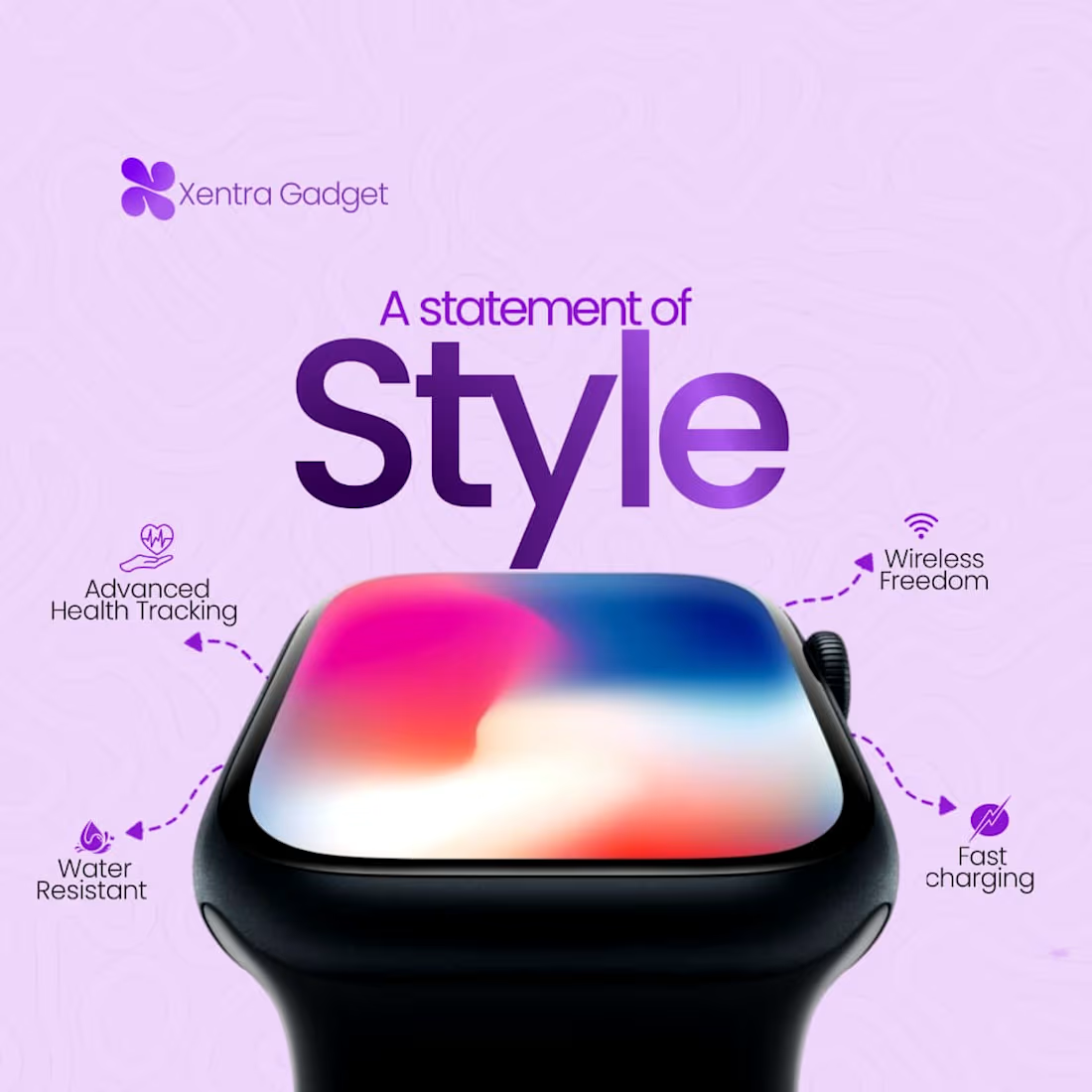
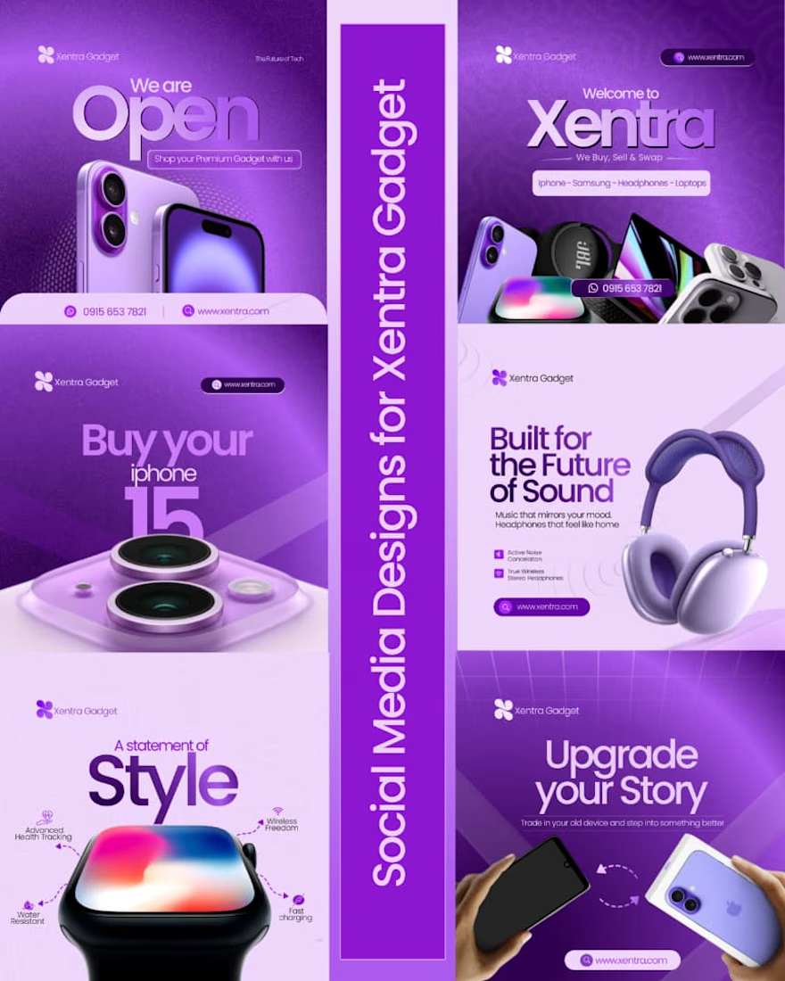
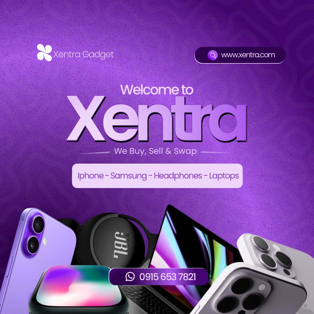
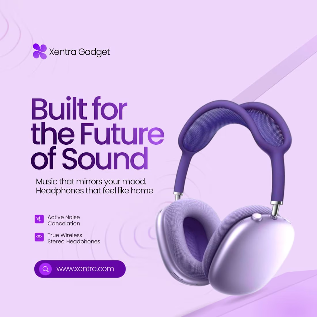
Brand Design for Xentra Gadget.





Great 👍🏻

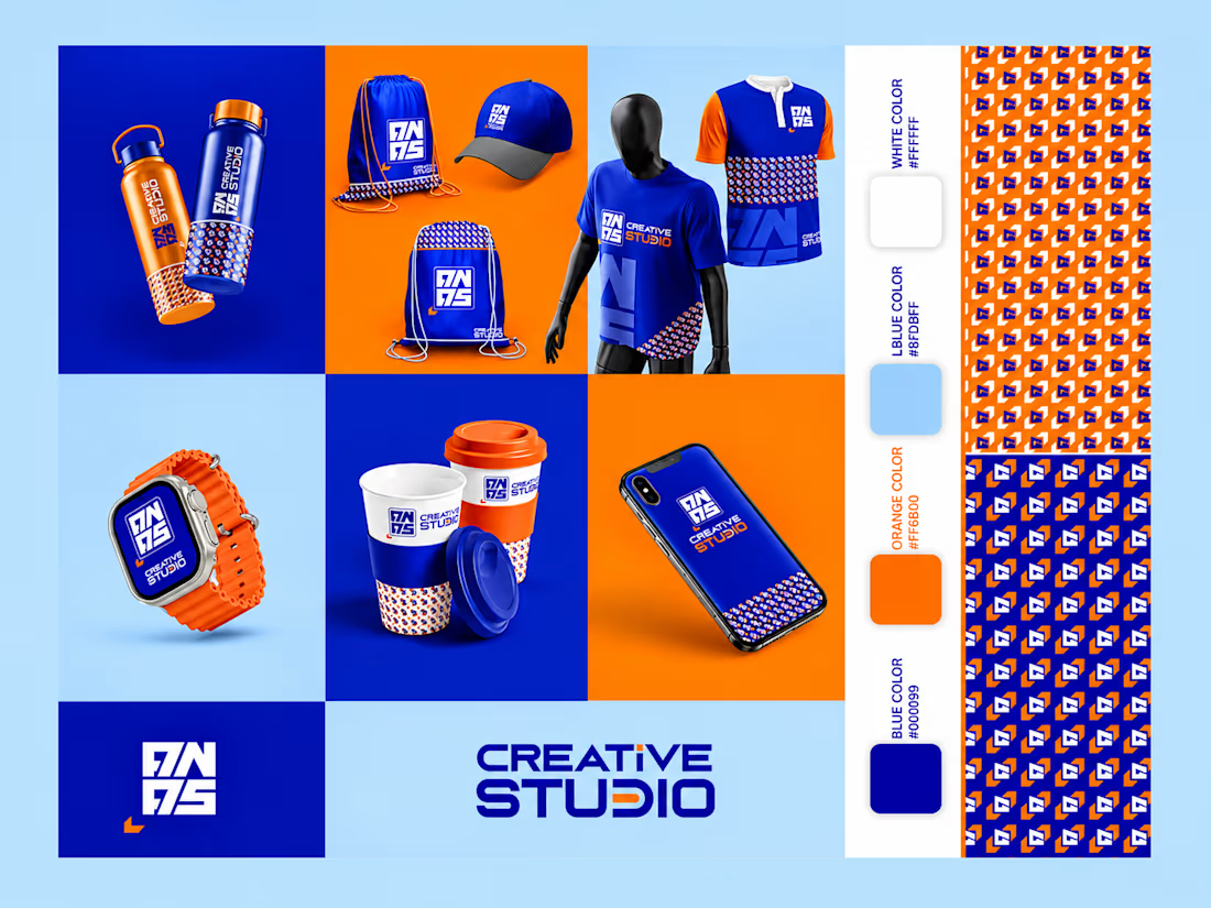
I created a bold, modern, and visually distinctive brand identity for Creative Studio, combining vibrant blue and orange colors to create a strong and memorable visual presence. The branding features a custom logo, typography, a consistent pattern system, and a complete range of branded mockups, including apparel, bottles, bags, cups, a smartwatch, and a smartphone.
The design focuses on visual consistency, creative expression, and a contemporary aesthetic, bringing the brand to life across multiple touchpoints. Every element is thoughtfully designed to establish a cohesive identity that reflects innovation, creativity, and professionalism.
Project Focus: Brand Identity, Logo Design, Visual Branding, Color Palette, Pattern Design, Typography, and Product Mockups. Brand Design Label Design Product Design



Nice