The network for creativity
Join 1.25M professional creatives like you
Connect with clients, get discovered, and run your business 100% commission-free
Creatives on Contra have earned over $150M and we are just getting started
Back to feedPost

Visions — NFT Presentation Design
A modern presentation design project created for an NFT-focused concept, combining bold visual direction with a clean and structured storytelling approach.
The deck was designed to communicate complex ideas in a simple, engaging, and visually compelling way — balancing strong typography, visual hierarchy, and contemporary aesthetics to create a cohesive presentation experience.


The network for creativity
Join 1.25M professional creatives like you
Connect with clients, get discovered, and run your business 100% commission-free
Creatives on Contra have earned over $150M and we are just getting started

Related posts

Most hardware founders pitch their premium products on a standard white background.
They assume clean design always means bright design.
But for a high-ticket physical product, a white canvas actively cheapens your perceived value.
I recently designed the investor pitch deck for a European automotive startup building something completely contrarian. A lightweight, purely analog mechanical car for driving enthusiasts. No complex touchscreens. No heavy electronics. Just raw, purposeful engineering.
To raise capital from European investors, we abandoned the standard corporate aesthetic.
We built all 22 slides in a deep, cinematic dark mode.
This is why the dark aesthetic works perfectly for high-value hardware:
📍 The Spotlight Effect
A dark canvas swallows visual noise. It acts like a spotlight in an empty room, forcing the investor's eye directly onto the curves of the car and your specific manufacturing metrics.
📍 Subconscious Exclusivity
Premium brands rarely use blinding white in their showrooms. Darker tones instantly signal a high-end, exclusive experience before you even speak.
📍 Contrast Power
When we mapped out the detailed cost breakdown, the bright accent numbers against the dark background made the unit economics impossible to ignore.
Your presentation design is not just a container for your business plan. It is the first real test of your brand positioning.
Open your current deck. Does your visual aesthetic actually justify the valuation you are asking for?


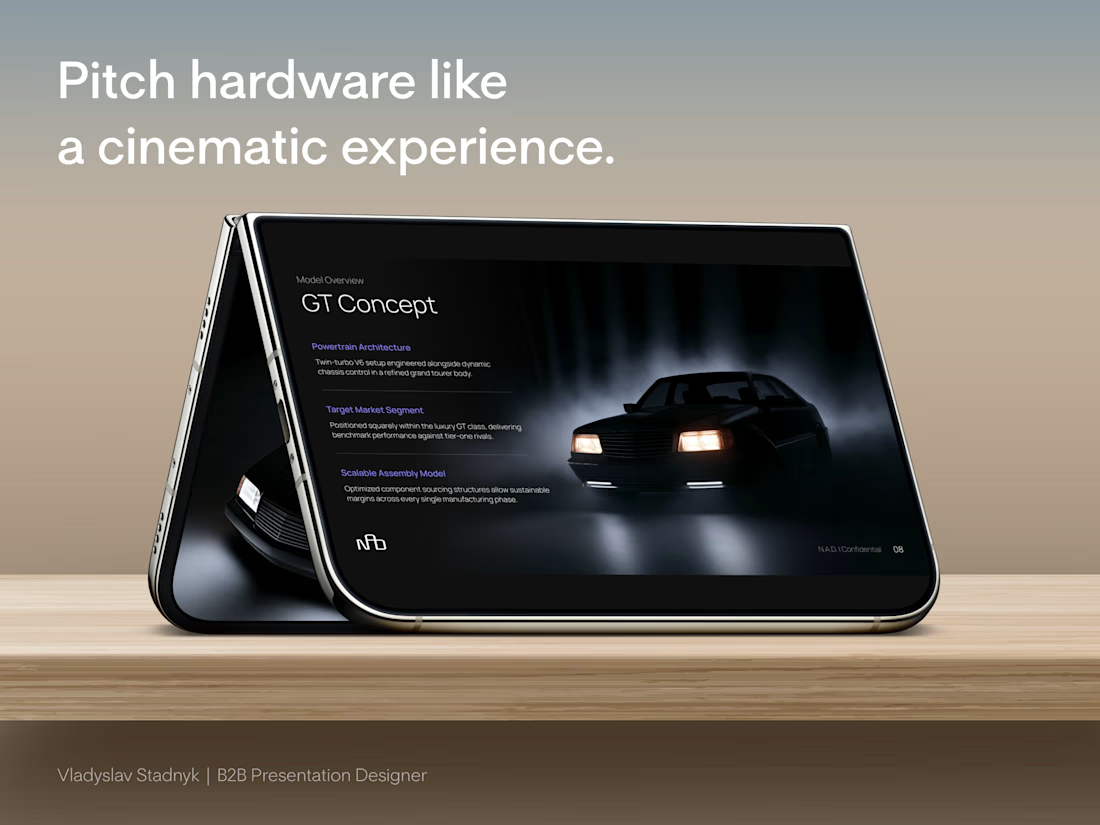

Dark-mode pitch decks for hardware hit different — white slides make premium physical products feel like Amazon listings. Background tone is part of the valuation story.


The glowing circles keep the outreach cycle easy to follow on that dark blue.

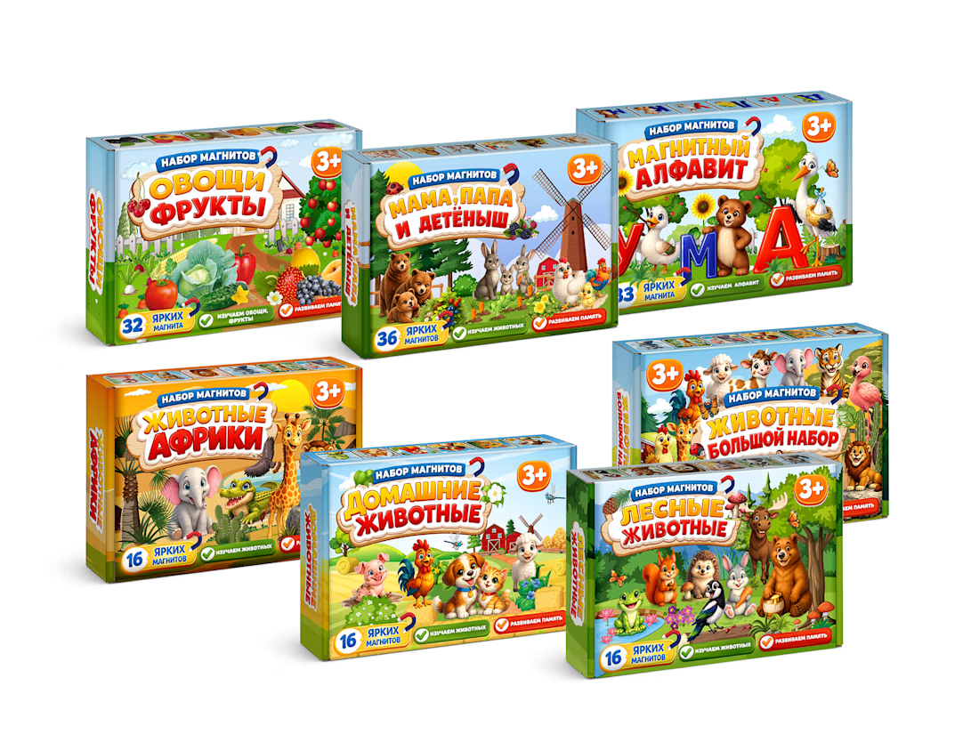
MagnoToys — Multi-SKU Children's Educational Packaging System
Design and systematic structural layout of a multi-SKU packaging line for children's magnetic educational games. I developed the unified brand grid, managed consistent color-coding across 5 different product variants, and created production-ready vector dielines with precise bleeding and folding lines.



Cool!





