The network for creativity
Join 1.25M professional creatives like you
Connect with clients, get discovered, and run your business 100% commission-free
Creatives on Contra have earned over $150M and we are just getting started
Back to feedPost
Taste Test
AI Logo Challenge #01 | Part (4/4): Ideogram vs Human
The final part of my mini-series is here!
We've compared Ideogram with GPT, Gemini, and Claude. Now it's time for the final test: Ideogram vs Human.
Same prompt: Design a logo for a Penguin History Museum in Antarctica.
Human design time: 20 minutes.
Check out all four comparisons and cast your votes. Who deserves to win?
Voting closes on 24 October!
0 voted
0%
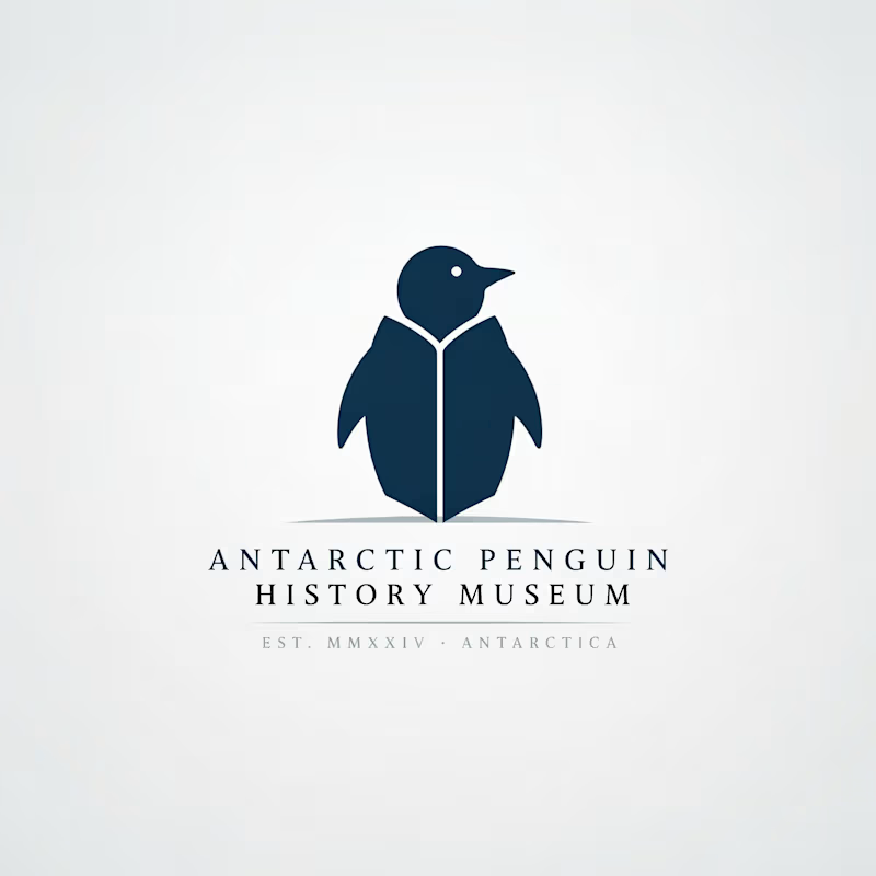
2 voted
100%
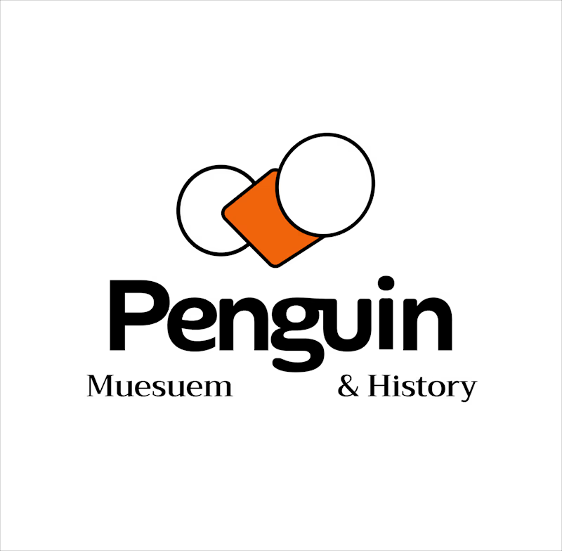
2 votes
Closed

human design..

My vote is Ideogram on this one, Atin. That 20-minute human mark has real charm, but it literally says "Muesuem," which is hard to unsee. The Ideogram silhouette reads like a proper museum identity, spelling included, and the series was a fun ride from start to finish.

This usually happens during a 20-minute design sprint, where spelling mistakes can be common. Since we're competing with a single output, we're not allowed to refine or edit the design afterward.
The network for creativity
Join 1.25M professional creatives like you
Connect with clients, get discovered, and run your business 100% commission-free
Creatives on Contra have earned over $150M and we are just getting started



Related posts

Experimental layouts for Pace. Which one do you like?
23 voted
52%
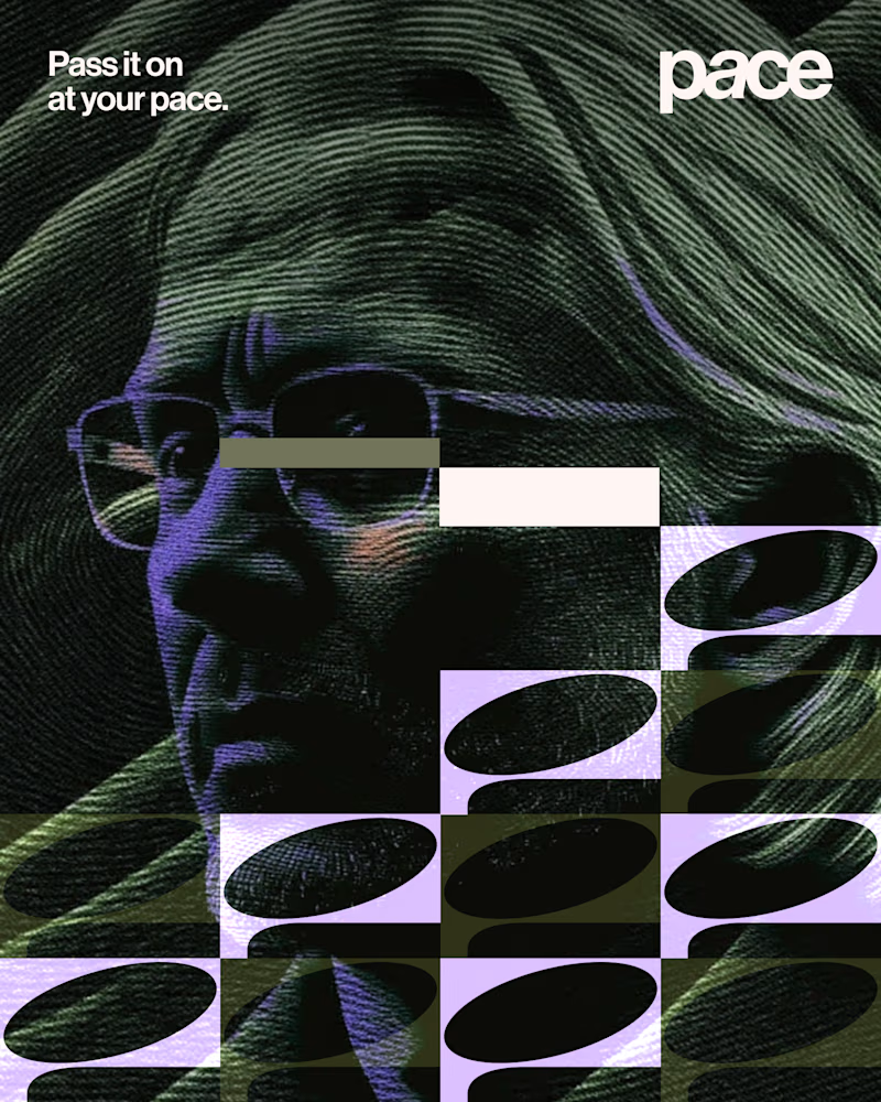
21 voted
48%
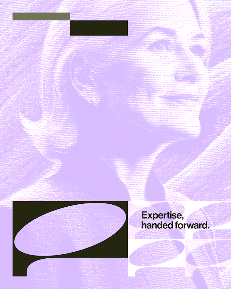
44 votes
Closed

Looks cool.

Exploring the listening state for an AI voice interface.
Which direction would you ship, A or B?
10 voted
29%
25 voted
71%
35 votes
Closed

The particle field looks more polished and beautiful🔥

Which one do you think i should put as a FEATURED SECTION cover on linkedin? Help me decide!
1 voted
33%

2 voted
67%

3 votes
Closed


which one matches your headline better? thats usually the tiebreaker for featured covers