The network for creativity
Join 1.25M professional creatives like you
Connect with clients, get discovered, and run your business 100% commission-free
Creatives on Contra have earned over $150M and we are just getting started
Back to feedPost

Luna Botanicals — Phase 1: Order Engine
Luna Botanicals is a portfolio project — a fictional indie cosmetics startup, built to show how an operations system evolves as a team scales.
This is Phase 1: the starting build for a solo founder. Four core tables — Customers, Products, Orders, Order Line Items.
Stock deducts automatically once an order is actually paid, so nothing oversells. A simple intake form, a fulfillment Kanban, and basic sales analytics round it out.
No automations yet. At this stage, the priority is just getting the chaos under control.
Link to build: Luna Phase 1
Portfolio Link: Portfolio
(Still learning video editing, so bear with the rough edges — will get smoother with practice.)


The network for creativity
Join 1.25M professional creatives like you
Connect with clients, get discovered, and run your business 100% commission-free
Creatives on Contra have earned over $150M and we are just getting started

Challenges
View all


Related posts


I’ve been razzmatazzing and flibbertigibbeting with Claude Code and somehow ended up with a new yels.dev.
It finally feels like me: simple on the surface, slightly complicated underneath, and very much alive.
You can see who I am, what I do, the work behind Herodot, RaptorLabs, CyberLink Security and Solmint, plus a selection of projects I’ve built across AI, cybersecurity, Web3, product systems, education, archives, and experimental digital spaces.
Built to be explored


The simple-on-the-surface, layered-underneath idea comes through so clearly in the presentation. I especially like how the project archive turns the site into something to explore rather than just a résumé of links.

I never believed in staying in one design lane.
Over the last few years, I moved across the full spectrum:
• Branding taught me systems how a mark survives across every medium.
• Packaging taught me physical detail real print constraints, paper stock, and dieline tolerance.
• UI/UX taught me structure frictionless navigation and user behavior.
• Web design taught me how to connect the entire journey from shelf to screen.
Instead of keeping these disciplines in silos, I brought them together into a unified personal archive.
A few years of learning, building, and refining now in one place:
👉 https://saurabhhsharma.netlify.app/


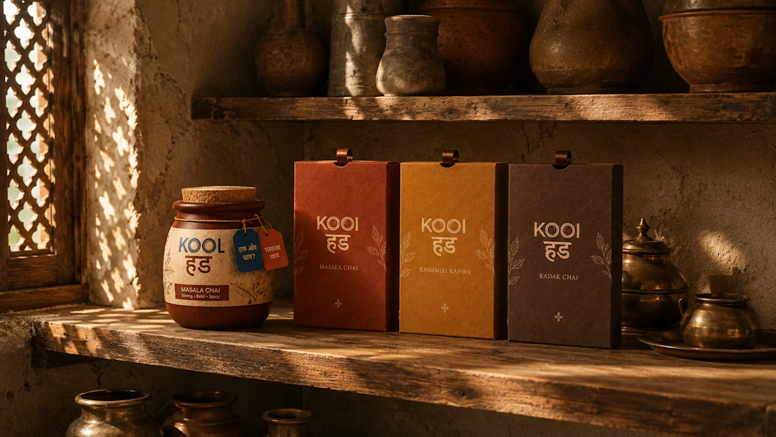
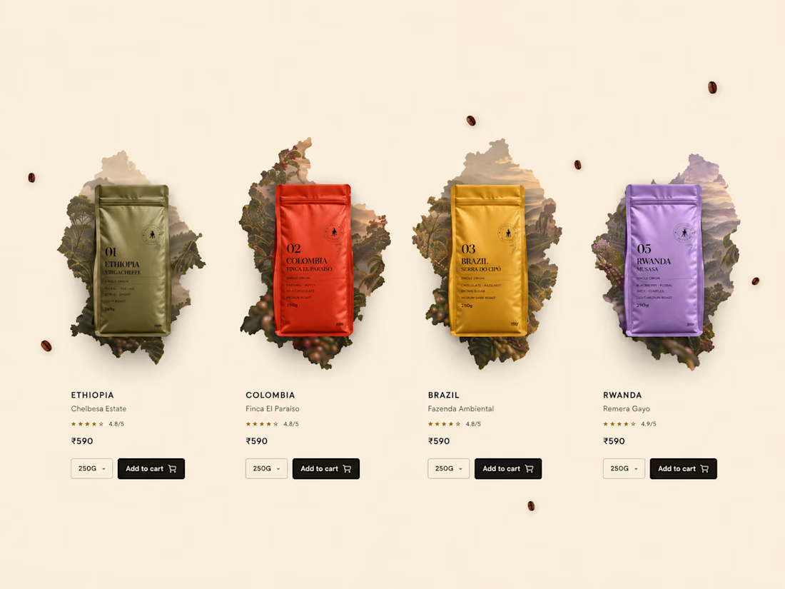
I love how you connect branding to packaging and UX—the idea that a mark has to survive every medium is so true. The case-study grid makes that range feel tangible without losing the thread.

Polishing this website right now, I will make this live today, SaaS website for Startups. Shower your love and feedback. 😁😊

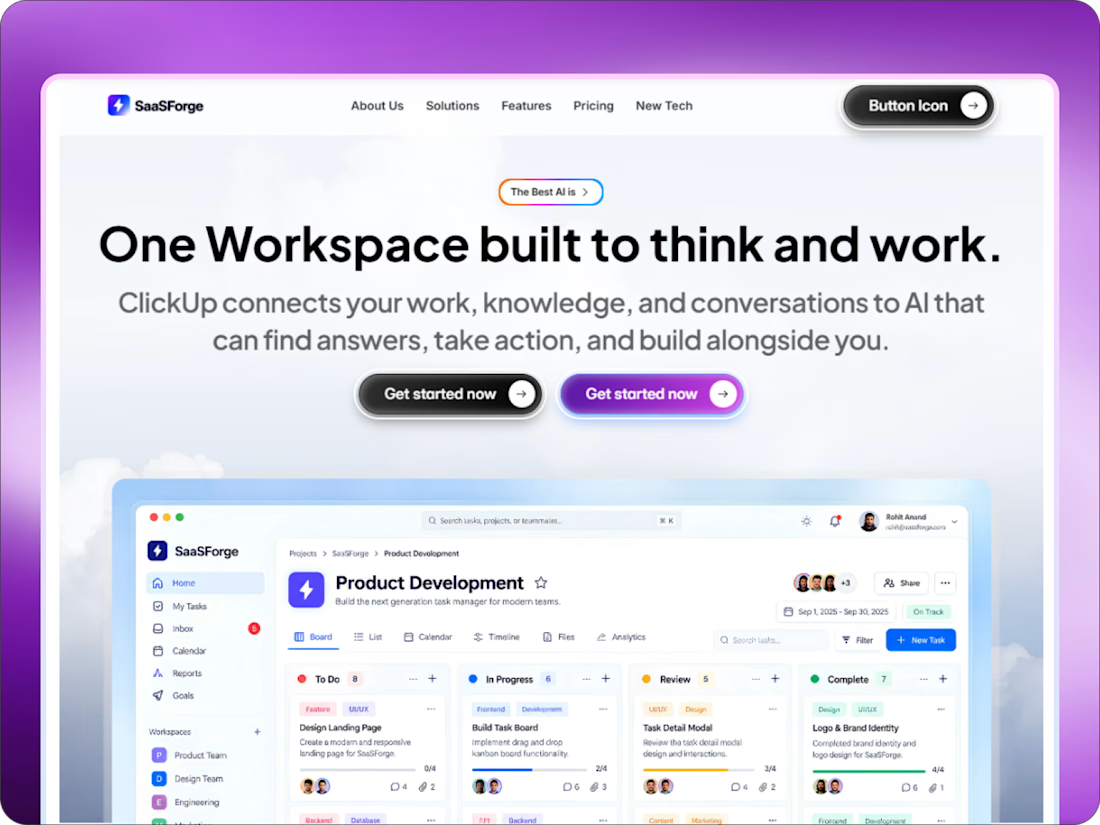
The purple frame gives the SaaS dashboard a confident launch moment, and the split between headline and product UI reads clearly. I’d love to see the button hover states carry a touch of that same contrast.