The network for creativity
Join 1.25M professional creatives like you
Connect with clients, get discovered, and run your business 100% commission-free
Creatives on Contra have earned over $150M and we are just getting started
Back to feedPost

exploring with pricing section for portfolio site. how does this look? 👀


Good job
The network for creativity
Join 1.25M professional creatives like you
Connect with clients, get discovered, and run your business 100% commission-free
Creatives on Contra have earned over $150M and we are just getting started



Related posts

New here, so I'm slowly filling in my portfolio and getting to know the place. So far I like it.
Here's an extract from Software Intelligence, a Framer site I designed and built a few months ago for an enterprise data consulting startup.
The visual idea mirrors what they do with data: compact blocks that animate, break apart and recompose, like charts taking shape. Few effects, all consistent, everything managed through the CMS.
If you have a minute, take a look at the full case study.
I'd love to know what you think, especially whether the motion supports the content or ends up overpowering it.

You're very welcome, Francesco — glad the note landed. The motion in that extract really does the heavy lifting for the content, so keep sharing your work here. Looking forward to seeing what's next from you. ✌️

Rebuilt my portfolio with AI and added new case studies.
Brand, web, and product UI. All custom coded, all in one page.

One page with brand, web and product UI together is a strong move. Clients see the range without clicking around. Rebuilding mine with AI coding tools taught me the same thing: the speed lets you spend the saved time on the case study writing, which is what actually wins work.

Photographer Portfolio Website
"Capturing light, emotion, and the moments you never want to forget." That line set the tone, and the layout follows it.
The hero is one motion-blurred portrait washed in red. The photographer's name runs across the bottom in a condensed white face, so large the screen cuts it off. The photo keeps its soft focus, and the name still reads first.
Thin grid lines split the page into narrow columns, and the small copy sits justified inside them. The loose photo gets a strict structure to lean on.
A single round red button with an arrow sits right on the letters and marks where to go next.
Designed by the Hue & Machine team.
#WebDesign #Photography #PortfolioWebsite #EditorialDesign #Typography #UIDesign #ProductDesign #CreativeDirection #ResponsiveDesign #FigmaDesign


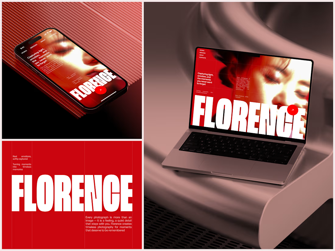

The heavy condensed white FLORENCE over the red portrait is bold, and keeping the same red across phone, laptop and type tile makes the case study read as one system. Did the red come from the photographer's own work, or was it your call?