The network for creativity
Join 1.25M professional creatives like you
Connect with clients, get discovered, and run your business 100% commission-free
Creatives on Contra have earned over $150M and we are just getting started
Back to feedPost

Thursday WIP.
Tightening Sprintline’s pricing + social-proof block so it doesn’t read like every other SaaS template.
Rule I’m using: if a section could live on 50 other sites, it gets redesigned.
Shipping the update this week.
Attach a crop of that section if you have it.
The network for creativity
Join 1.25M professional creatives like you
Connect with clients, get discovered, and run your business 100% commission-free
Creatives on Contra have earned over $150M and we are just getting started





Related posts

A recent SaaS website design project Done...


Excellent project, really nice

Making a website template for an IT services company. Which hero section do you think is best?
4 voted
24%
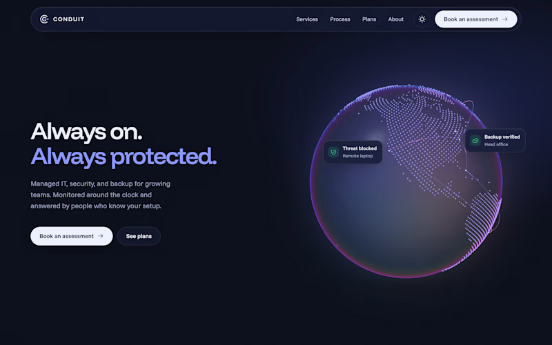
13 voted
76%
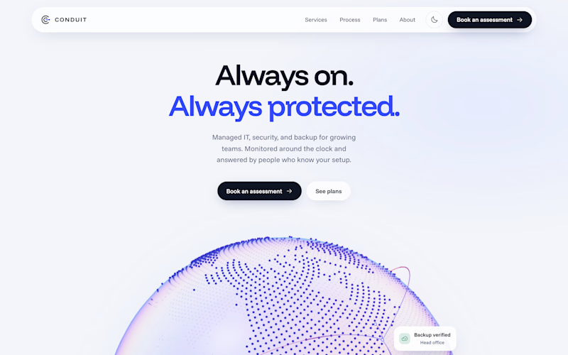
17 votes
Closed

It's more attractive Centered, light🎉🎉🔥🔥

Just launched Framer Portfolio template!
And...it´s totally FREE! Enjoy! 🙌
https://www.framer.com/marketplace/templates/riwa-mini/

Killer execution