The network for creativity
Join 1.25M professional creatives like you
Connect with clients, get discovered, and run your business 100% commission-free
Creatives on Contra have earned over $150M and we are just getting started
Back to feedPost
Icon Font Creator is an interactive web app built with Figma Make that lets users draw custom icons and instantly generate a downloadable SVG font.
Users can sketch individual icons, preview them as a live font, type custom text using their created characters, and export a usable SVG font file.
This project explores creative tooling, real-time preview interaction, and generative workflows powered entirely by Figma Make.

This is clever. Turning icon sketching into a live font preview solves a real workflow gap. Curious — how are you handling consistency across stroke weights and alignment?


Appreciate it 🙌
Consistency was a big focus. I added a normalization layer where every sketch snaps to a shared baseline + cap-height grid, with proportional stroke scaling and bounding-box alignment.
The goal wasn’t just exporting icons, but making them behave like a cohesive type system.
Now you can try this - https://prnt.sc/DYeRSvxNfoR3
That makes a lot of sense. Treating icons like a type system instead of isolated assets is what creates real visual rhythm. The baseline + cap-height alignment explains the consistency.


The network for creativity
Join 1.25M professional creatives like you
Connect with clients, get discovered, and run your business 100% commission-free
Creatives on Contra have earned over $150M and we are just getting started











Related posts


these are lovely, i love the way the rain & snow move.


spent all day designing an app icon.


ODD ATLAS® — An Interactive Educational Discovery Experience (Website)


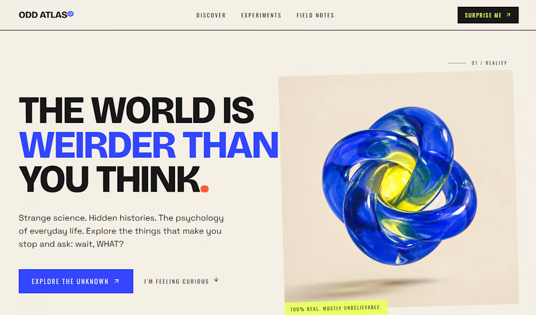

Educational projects rarely get this much visual care. Who's it for, kids or adults?