The network for creativity
Join 1.25M professional creatives like you
Connect with clients, get discovered, and run your business 100% commission-free
Creatives on Contra have earned over $150M and we are just getting started
Back to feedPost

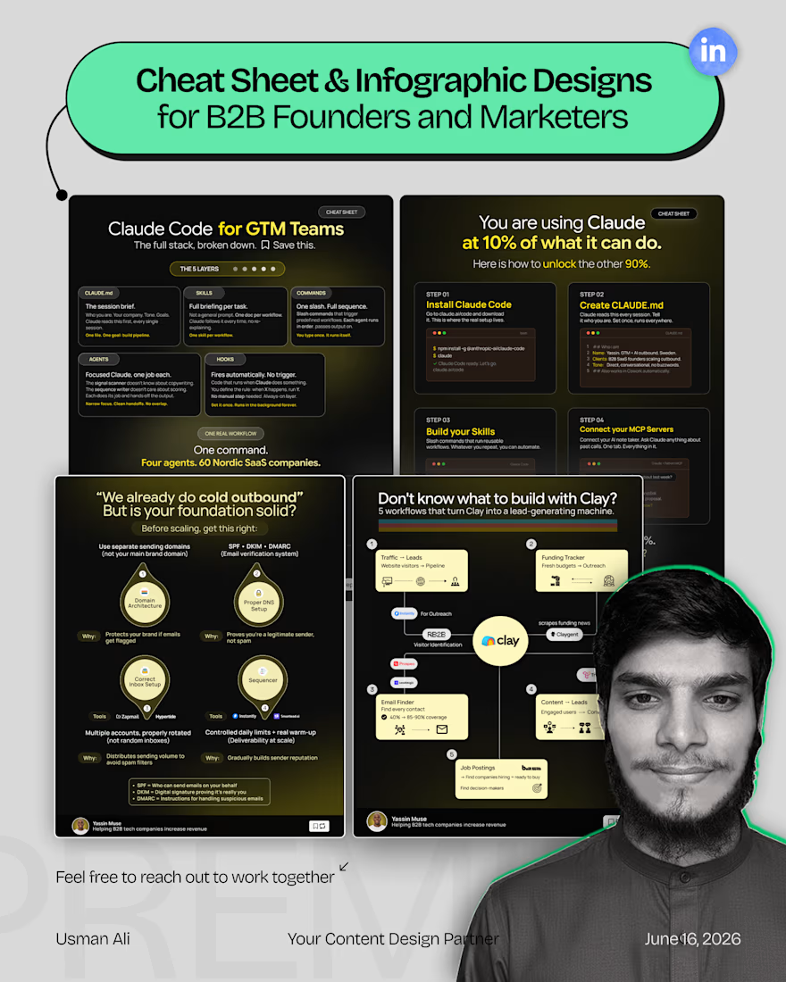
A good carousel is not just a bunch of slides put together.
It should make one idea easier to understand.
Same with an infographic.
You don’t need more text, more colours, or more design elements. You need a clear idea, a good flow, and visuals that help people get it.
For me, the process usually starts with:
What are we trying to say? Who needs to understand it? What can be shown instead of explained?
Then comes the layout, typography, spacing, and visuals. The design should support the idea, not complicate it!
That’s what I try to do with LinkedIn carousels and infographics for founders, coaches, and B2B/GTM teams.
So if you want to turn 'the rough idea in your Notion doc' into something people can actually understand and remember. Dm me!
Simple > crowded :)


The network for creativity
Join 1.25M professional creatives like you
Connect with clients, get discovered, and run your business 100% commission-free
Creatives on Contra have earned over $150M and we are just getting started

Challenges
View all


Related posts





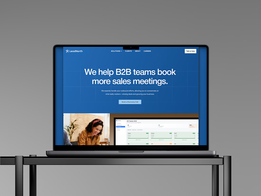




That saturated cobalt blue carries cleanly from the laptop hero onto the outdoor billboard and the Growth North 2026 stage screen.

A website should make the product easy to understand.
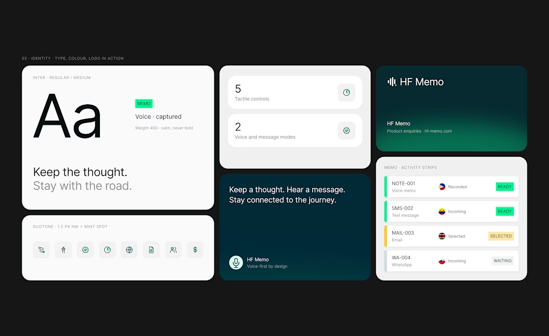
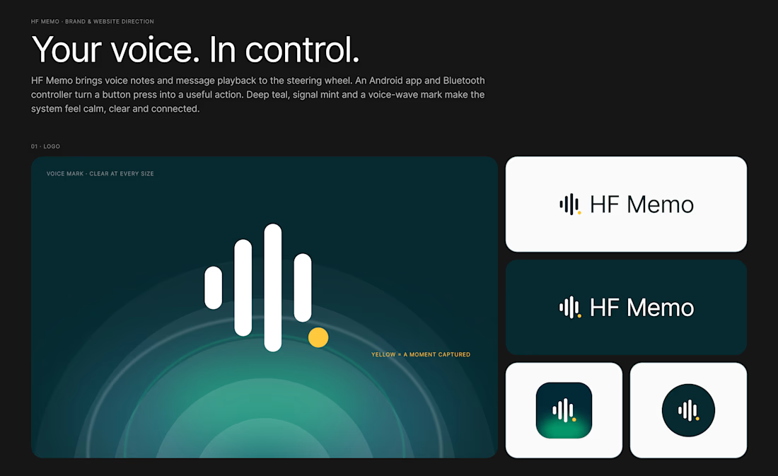
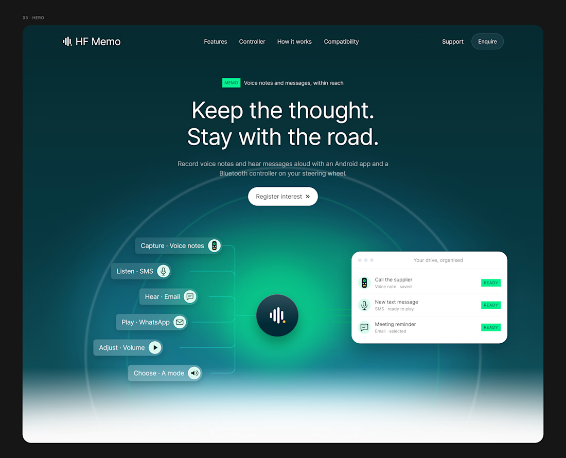
My latest redesign concept explores a new direction for HF Memo—an Android app and Bluetooth controller for recording voice notes and hearing messages aloud.
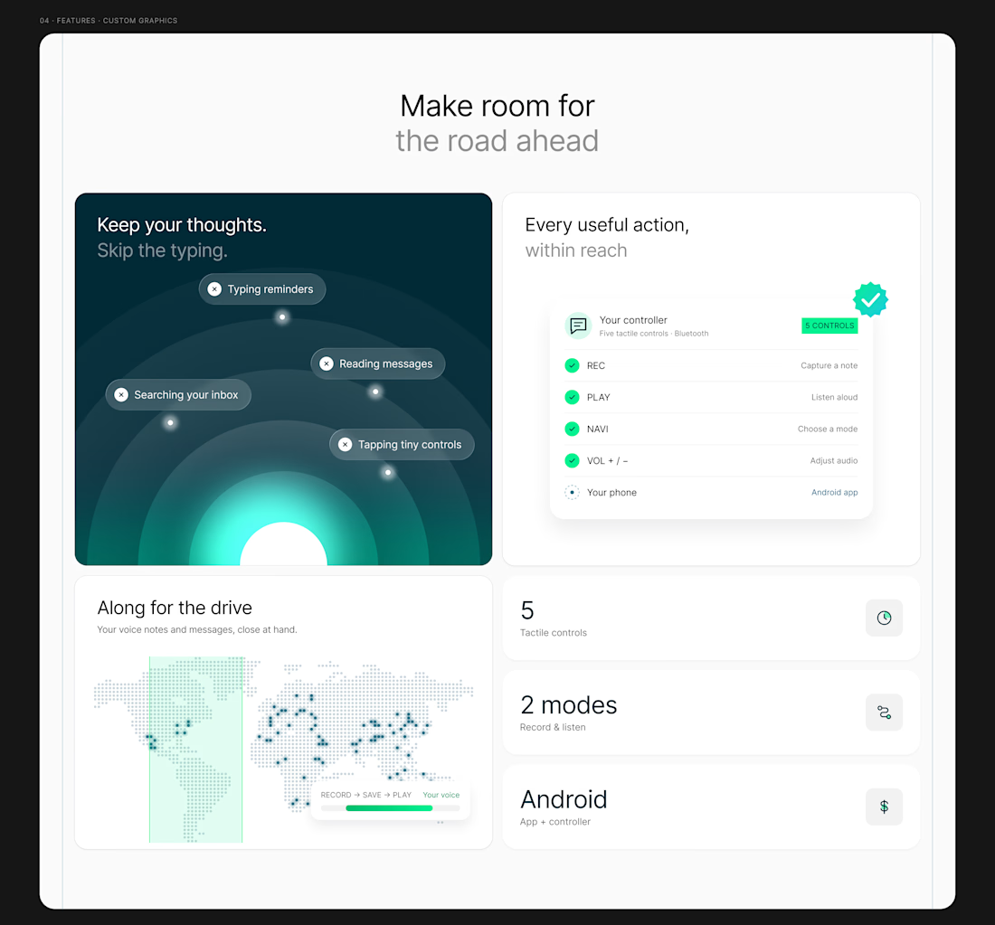
I focused on showing the experience: capture a thought, replay a recording, and understand what each controller button does.
Clean typography, light backgrounds, and lime accents give the product room to tell its story.
Designed in Figma, with editable layouts and custom graphics.
Have a product that needs a clearer website? Let’s connect.
#webdesign #uidesign #figma #productdesign