The network for creativity
Join 1.25M professional creatives like you
Connect with clients, get discovered, and run your business 100% commission-free
Creatives on Contra have earned over $150M and we are just getting started
Back to feedPost

A growth brand needs rules that let it scale without losing its edge.
These are the brand guidelines I created for INVEXA Capital, a growth equity platform built to understand, operate and scale technology businesses.
The guidelines turn one idea, Unlocked Growth, into a system any team can use:
Logo: the INVEXA X and its forward arrows, the journey from investment to acceleration to exit, with clear usage rules
Colour: deep slate, steel blue and soft white, balancing institutional trust with modern ambition
Typography: a confident, contemporary type system that keeps every message clean and assured
Visual language: chevrons, orbital curves, light and depth to keep layouts moving forward
Motion: how the arrows, light and horizon animate so the brand feels alive on screen
Applications: pitch decks, web, social, signage and investor communications
The result is a brand that stays consistent from the boardroom to the feed.
If your fintech or investment firm needs an identity built to scale, let’s talk.
#brandguidelines #brandidentity #fintechbranding #venturecapital


The network for creativity
Join 1.25M professional creatives like you
Connect with clients, get discovered, and run your business 100% commission-free
Creatives on Contra have earned over $150M and we are just getting started



Related posts


Which logo looks better for Lumia?
5 voted
56%

4 voted
44%

9 votes
Closed

Bold is heavy❤️

Bold Illustrations make an instant impact
See full case study here for the branding evolution and website redesign for a B2B SaaS startup!


I loved these colours. Looking Stunning 😍

Friday app: Understudy
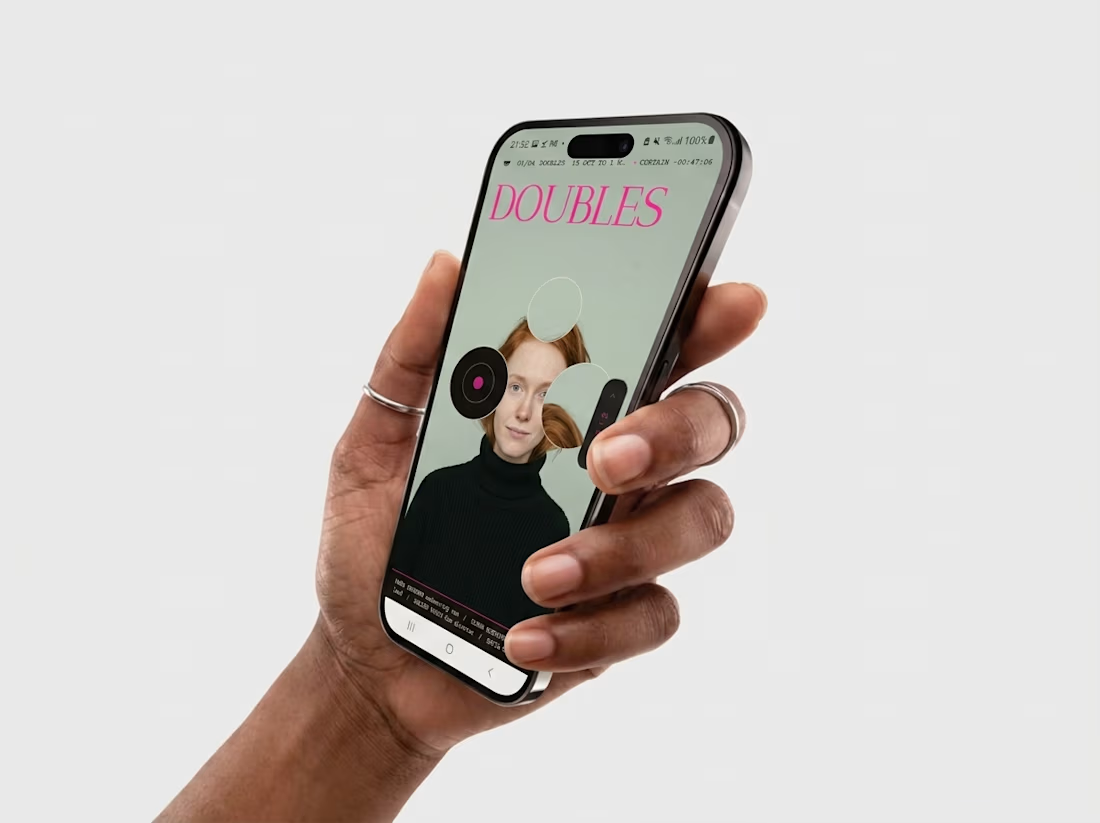
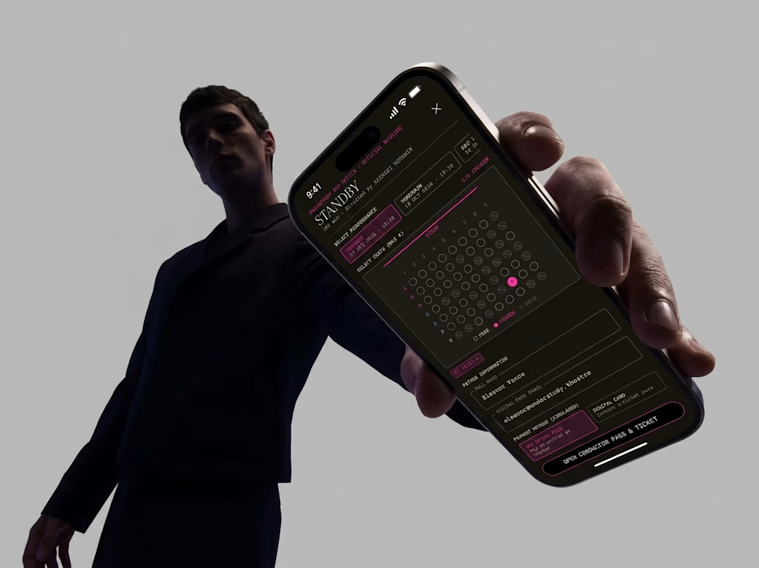
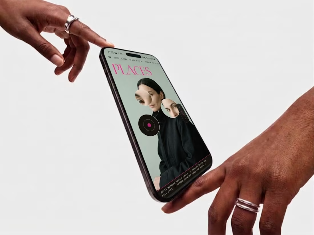
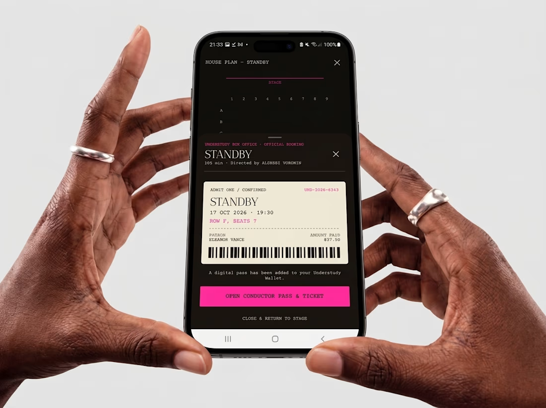
What if an app’s menu was a hole in a face?
UNDERSTUDY turns one circle into the interface: eyes open shows, voids open seat plans, and a typewriter clock counts down to curtain.