The network for creativity
Join 1.25M professional creatives like you
Connect with clients, get discovered, and run your business 100% commission-free
Creatives on Contra have earned over $150M and we are just getting started
Back to feedPost

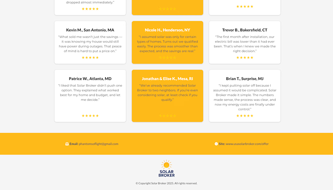
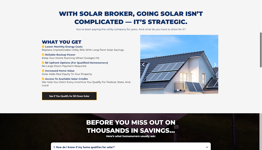
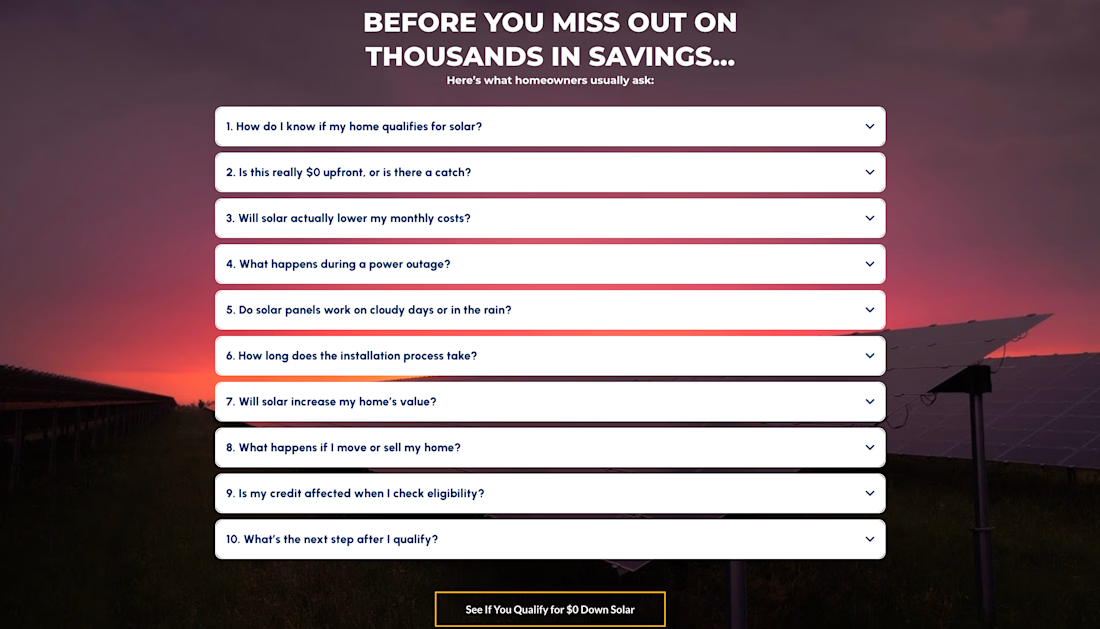
Funnel Design For A Solar Company


The network for creativity
Join 1.25M professional creatives like you
Connect with clients, get discovered, and run your business 100% commission-free
Creatives on Contra have earned over $150M and we are just getting started




Related posts


Ebook Funnel Opt-In Page Approved ✅
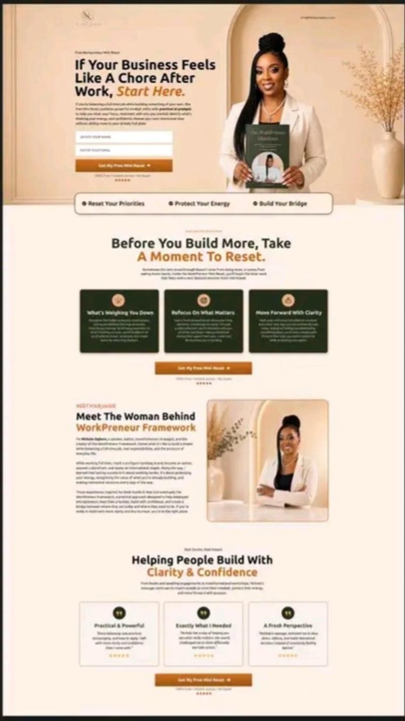
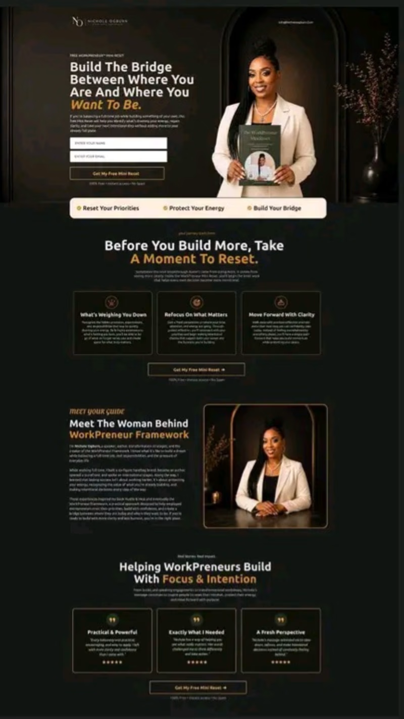
Just sharing a recent funnel design I worked on for a client. The client wanted something unique, so instead of using a regular ebook mockup, I had the client actually holding the ebook. That small detail makes the offer feel more personal and connects the product with the person behind the brand.
I also explored 2 visual directions: A — Light & Premium
B — Dark & Premium
Which one would you choose: A or B?

3 voted
33%
6 voted
67%
9 votes
Closed


Energy communities need to manage a lot at once: consumption, generation, members, billing, reports, alerts, and operational changes.
Wattbank explores a clearer SaaS dashboard experience for energy community operators. The interface brings key metrics, energy balancing, participant distribution, billing, reporting, and insights into one workspace that is easy to scan and act on.
The goal was to move away from heavy energy software and create something more visual, human, and operationally useful.


Creative Soap Packaging Design

Belia - Premium Soap Brand
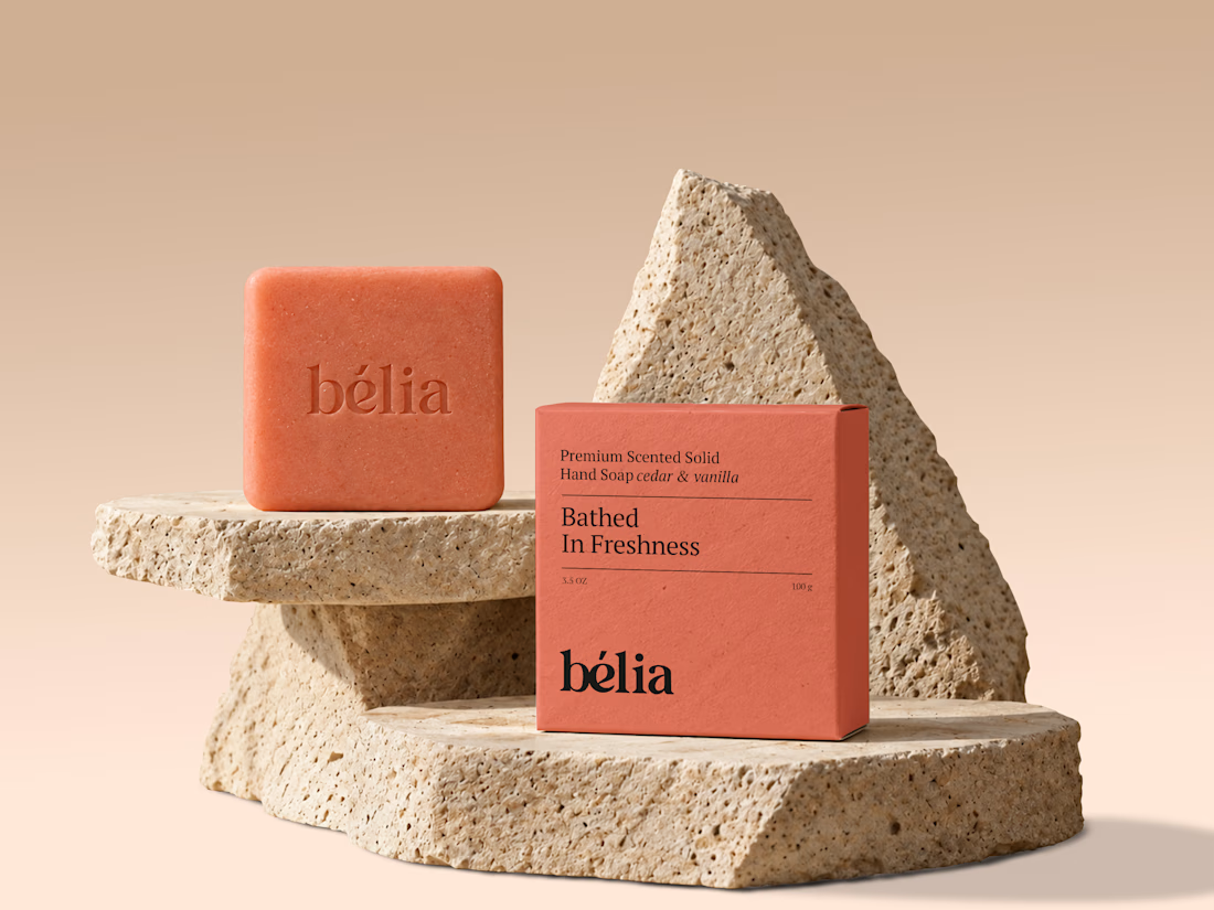
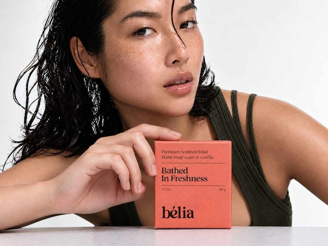

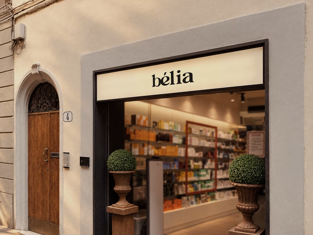

The packaging has a clean premium direction.