The network for creativity
Join 1.25M professional creatives like you
Connect with clients, get discovered, and run your business 100% commission-free
Creatives on Contra have earned over $150M and we are just getting started
Back to feedPost

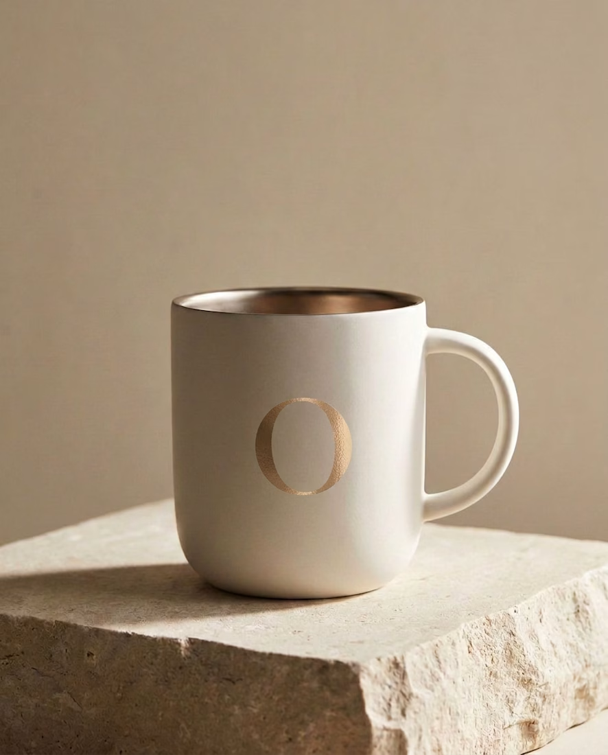
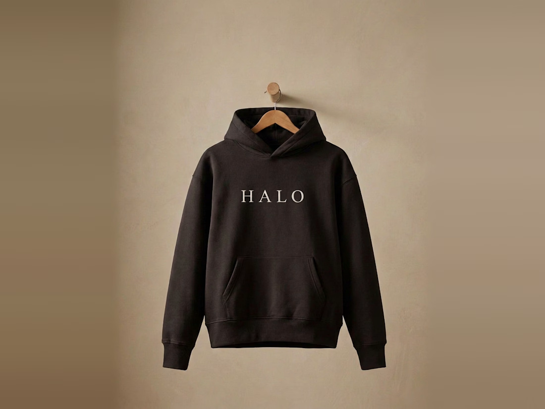
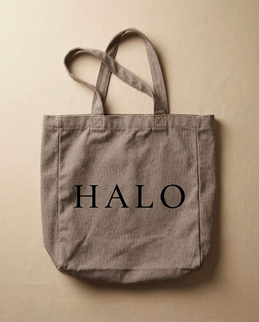
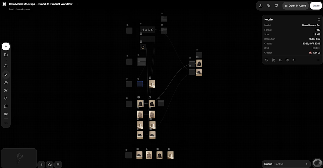
How I keep AI merch mockups brand-accurate:
Generate blank products first — never let AI draw the logo
Apply the real logo as a separate step
Check every output against the source file
Keep the failures on the canvas with notes on why they failed
The rejected column is my favorite part. It's where the quality comes from.
#aidesign #flora #brandidentity

Looking beautiful
The network for creativity
Join 1.25M professional creatives like you
Connect with clients, get discovered, and run your business 100% commission-free
Creatives on Contra have earned over $150M and we are just getting started



Related posts

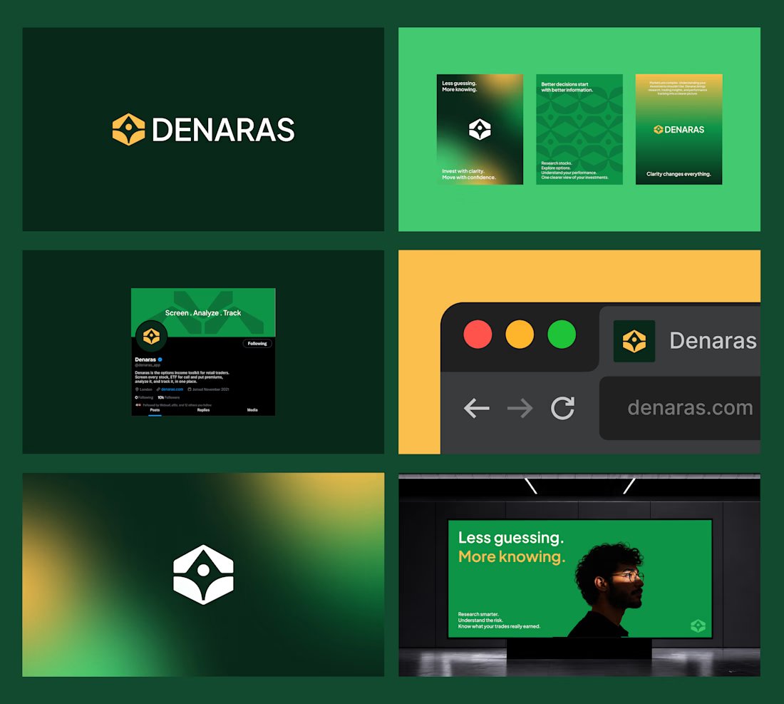
Denaras — Brand Identity Concept
Day 01/30 — Brand & Hero Redesign Series 🚧
An independent brand identity exploration for Denaras, an options income toolkit for retail traders.
The goal was to replace market complexity with a distinctive, grounded visual identity built around clarity and structure.
Design Direction:
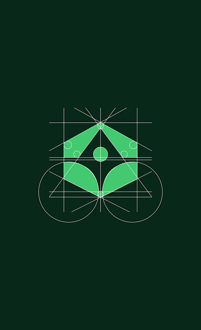
→ Geometric Symbol: Constructed on a strict grid to reflect balance, analytical precision, and stability.
→ Color Palette: A deep green and gold system designed to command trust and stand out in a crowded fintech landscape.
→ Visual System: A flexible identity applied across social assets, digital interfaces, and out-of-home advertising.
Core Positioning: Less guessing. More knowing.
Self-initiated concept project.
What do you think of this direction?

Sometimes one tiny detail is enough to build an entire brand identity.
Koto just redesigned Giffgaff, and my favourite part is how they've turned the final “f” in the logo into a small arrow.
That simple shape becomes the foundation of the whole visual system, appearing across the website, app, packaging, and marketing materials.
They've also introduced a bold acid-green palette, a custom typeface called Giffsans, and a more natural approach to photography.
What I like most is that the identity doesn't feel like a completely different brand. It's still recognizably Giffgaff, just more confident and expressive.
A good reminder that strong branding doesn't always require reinventing everything.

My favourite use is the arrow turning into the "Next" button in the app, so the logo literally becomes UI. I do something similar in presentation templates, where one shape from the logo ends up as the section divider.


Has AI taken my job yet? 👀
As a designer, I feel like I constantly need to keep up with new tools and products, if only to keep my "has a computer replaced me already?" anxiety under control
At first, we expected AI to do everything with one click
Then we moved on to writing ridiculously long and detailed prompts
And now I feel like we're finally getting to a healthier place with our expectations: build a good system → get good results
I went to play with Recraft's new Logo Maker to see if AI can actually make decent logos now
Weeeeell, you can see the result for yourself! 🤩
Sure, it's not a magic button that reads your mind and does everything for you. But if you have a clear sense of your brand's style and personality, the results can be surprisingly good
Left - my usual aesthetic. Right - Recraft's take on me
So, what do you think of my one-click logo?
Does it feel like me? 🪩✨


“Build a good system, get good results” is exactly where I’ve landed too. The tool only goes as far as your sense of what you’re after. How many tries did it take to get there?