The network for creativity
Join 1.25M professional creatives like you
Connect with clients, get discovered, and run your business 100% commission-free
Creatives on Contra have earned over $150M and we are just getting started
Back to feedPost

Very cool logo design ideas


How do you turn a brand mascot into a visual system people actually remember?
🐆 Our lynx represents sharp thinking, curiosity, and attention to detail.
For this motion experiment, we pushed the mark into a softer, unexpected direction - rebuilding it with different textures.
...
The network for creativity
Join 1.25M professional creatives like you
Connect with clients, get discovered, and run your business 100% commission-free
Creatives on Contra have earned over $150M and we are just getting started











Related posts

❝ A logo can look beautiful on a screen and still fail in the real world. ❞
Why does that happen? 🤔❗
◾️ Because a great logo isn't just about how it looks. It's about how well it works.
Imagine a real estate brand with an intricate logo filled with gradients, fine lines, and unnecessary details.
It looks impressive on a large screen. But what happens when it's printed on a business card, embroidered on a uniform, or reduced to a tiny app icon?
► The details disappear. The identity loses its impact.
That's why simplicity is not a lack of creativity. It's a sign of strategic design.
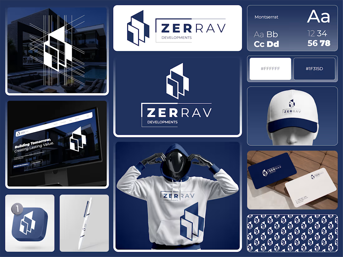
When developing the identity concept for (ZERRAV) Developments, I focused on three essential principles:
➊ Geometry with Purpose
Architectural angles and balanced geometric forms create a visual connection to modern real estate while keeping the symbol clean and recognizable.
➋ Color That Builds Trust
Deep Navy #1F315D paired with White #FFFFFF creates a confident, professional visual foundation suited to a premium property brand.
➌ Typography That Works Everywhere
⚫ Montserrat provides a clean, contemporary look with strong legibility across digital platforms and printed materials.
But a logo is only the beginning.
From property signage and website headers to business cards, uniforms, and branded materials, every application should feel like part of the same identity.
Because a premium brand shouldn't just look impressive. It should look consistent, recognizable, and trustworthy everywhere.
That's the difference between designing a logo and building a brand identity.
Here's a question for fellow founders and business owners:
If your logo were reduced to the size of a small app icon, would people still recognize it?
👉 Best Design: www.fiverr.com/sellers/rifatislam149/edit
👉 Portfolio: https://dribbble.com/artoryxrifat
#BrandIdentity #RealEstateBranding #LogoDesign #VisualIdentity #ZERRAVDevelopments #BrandStrategy #GraphicDesign #CorporateIdentity


Little did I know this logo I designed would be seen billions of times.
And that kids would walk on the street rocking the logo on their chest 🤯

Seeing kids wear your logo on the street must be such a surreal feeling. Amazing work Tim!

Which N works better? 🗳️
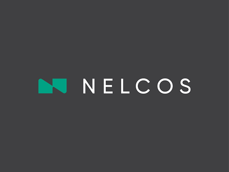
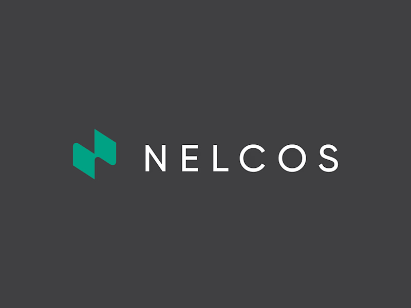
Worked on a logo for Nelcos, a Canadian company that refinishes interiors with architectural film instead of replacing them.
The idea: an unrolled roll of film that turns into the letter N.
The green is there to highlight eco-friendliness: less demolition, less waste.
Two directions for the symbol:
A: rectangular, compact
B: hexagonal, more dynamic
Vote and tell me why in the comments 👇
logodesignlogodesignerbrandidentityLogo DesignBrand DesignGraphic DesignAdobe IllustratorAdobe Photoshop


6 voted
43%
8 voted
57%
14 votes
Closed

Love the concept! The rectangular N feels more architectural and stable, which fits interiors. Hexagonal feels too techy. The unrolled film idea is brilliant - green for eco is perfect. I'd vote rectangular for this brand. Great work! 👏