The network for creativity
Join 1.25M professional creatives like you
Connect with clients, get discovered, and run your business 100% commission-free
Creatives on Contra have earned over $150M and we are just getting started
Back to feedPost
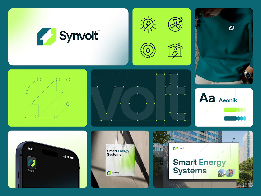
Synvolt is a modern energy brand focused on synchronized power systems.
Logo Concept Story
The Synvolt logo is built around the idea of synchronized energy. The mark combines a strong outer structure with a dynamic inner cut that represents a lightning bolt and energy flow.
The form subtly reads as an abstract “S”, reinforcing the brand name while avoiding a literal lettermark. Sharp angles communicate power and speed. Balanced geometry adds stability and trust.
The result is a symbol that feels electric, controlled, and future-ready designed to scale across digital, infrastructure, and hardware environments.



amazinggg

Thanks so much, I appreciate it
The network for creativity
Join 1.25M professional creatives like you
Connect with clients, get discovered, and run your business 100% commission-free
Creatives on Contra have earned over $150M and we are just getting started







Related posts

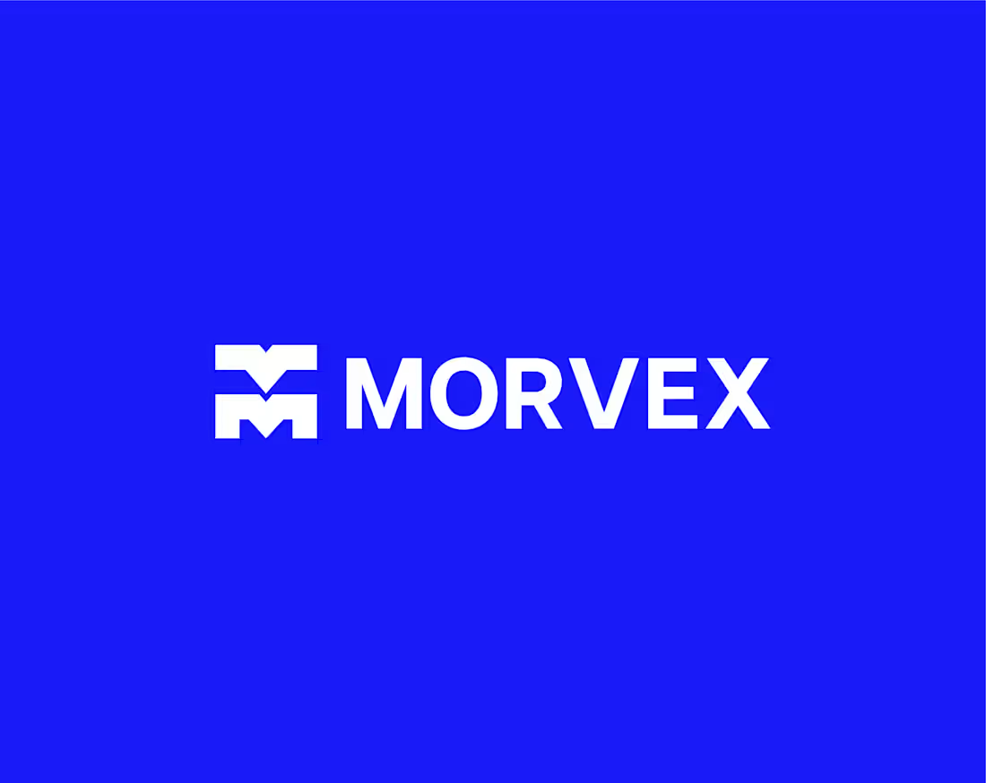
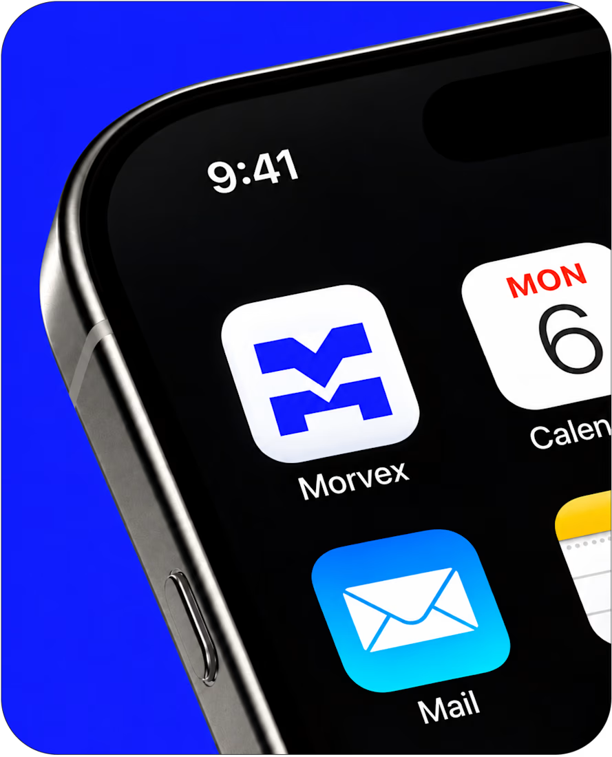
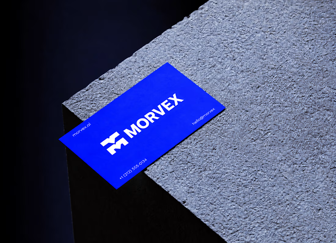
Morvex is a cybersecurity brand with a strong, bold visual identity. The idea behind the logo was to create something simple but recognizable, using a custom geometric M with sharp angles and carefully balanced shapes.
The identity brings together electric blue, bold typography, and a dark visual style to give the brand a modern, confident look. I carried the same design approach across the brand applications, keeping everything clean, consistent, and easy to recognize.



This is a really creative piece! I love how the visual elements come together to create something that feels distinctive rather than predictable. The composition, the overall visual direction, and the way the idea has been executed all contribute to making this stand out. It’s a...

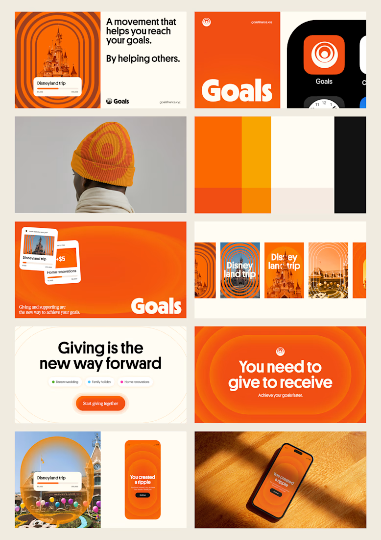
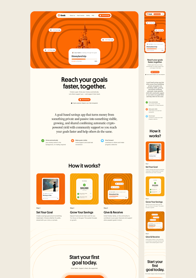
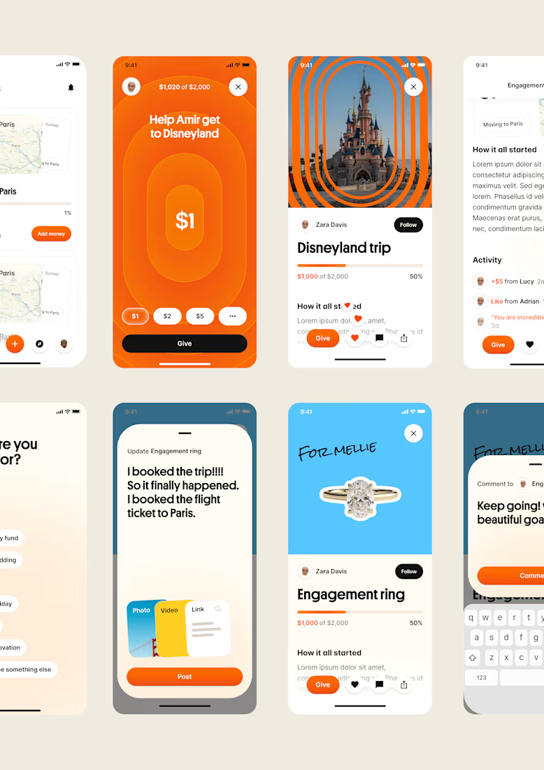
one of my favourite things about running a one-person studio is that nothing gets lost in translation.
the idea behind the brand is the same idea that shapes the website and the product.
no handovers, no starting from scratch, no trying to explain the vision to someone new.
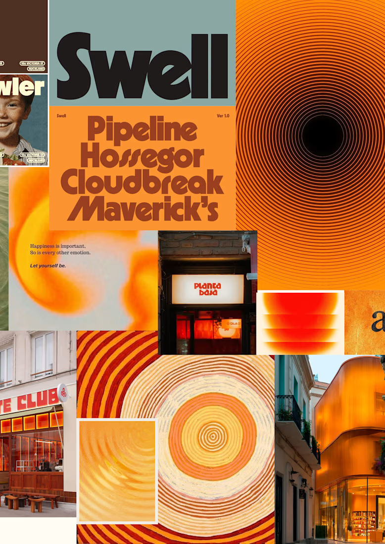
a little look at how that came together for goals, from the first moodboard to the app ↓

Love it!


Check it out
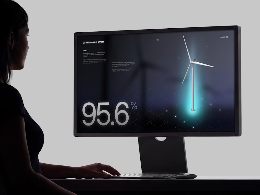
Just published: 0-1 design for an Energy Management System (EMS) ⚡
Designed a desktop platform monitoring wind turbines, PV parks, and battery storage across multiple sites. Keeping the interface mostly white, so green and red status indicators do the talking.
Operators managing critical infrastructure need to assess system health instantly. No visual noise, no cognitive overload. Just unmistakable state communication.


Cool work 👌