The network for creativity
Join 1.25M professional creatives like you
Connect with clients, get discovered, and run your business 100% commission-free
Creatives on Contra have earned over $150M and we are just getting started
Back to feedPost

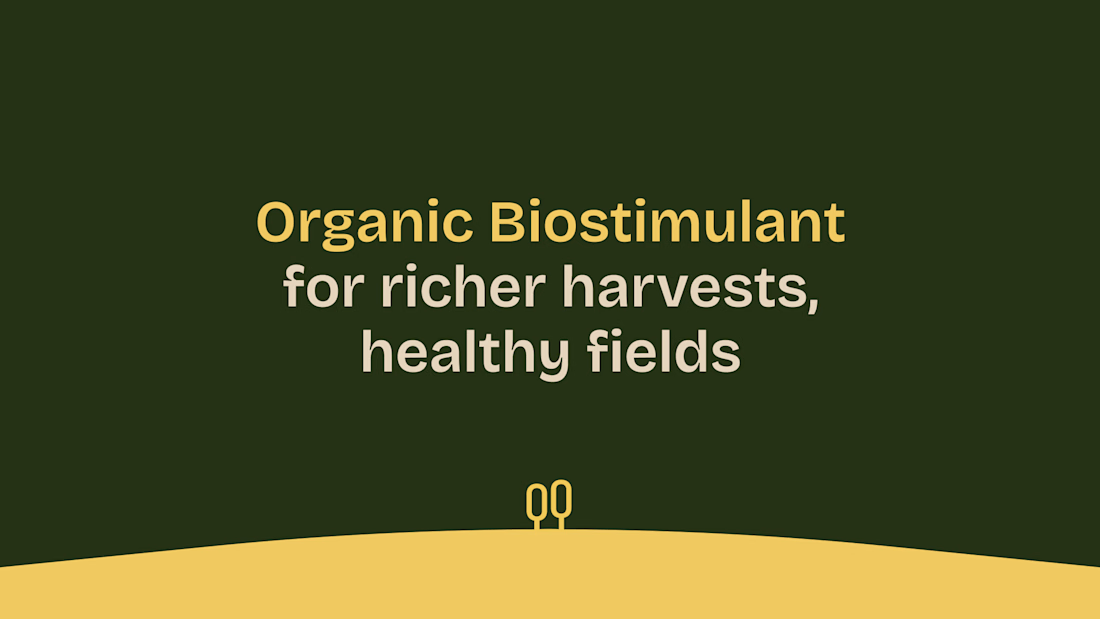
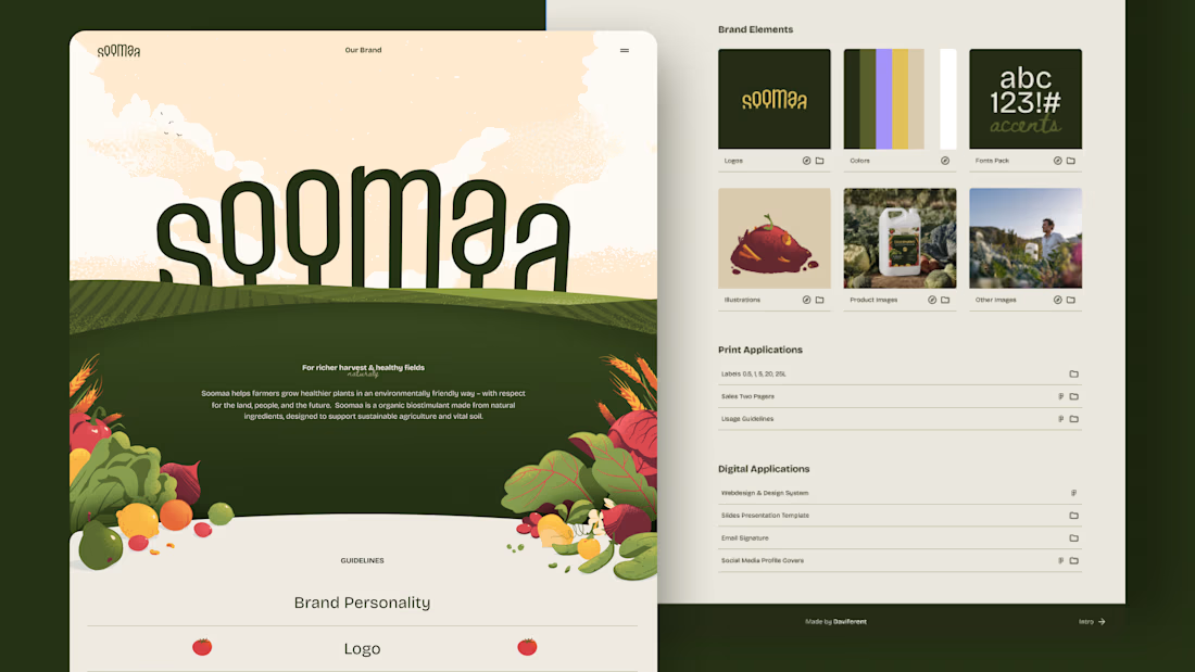
This is the brand identity we created for Soomaa. It started from two ideas: growth you can see, and care for the land.
The Soomaa team came to us with a technical formula, derived from pure peat and enhanced with patented cavitation technology, and no brand yet. We built one that feels natural, human and performance-led.
An arc in the wordmark represents growth. Handcrafted, textured illustrations and an earthy but colourful palette show what matters most to a farmer: an abundant, healthy harvest.
What we did: Naming · Brand identity · Packaging · Presentation template · Sales materials · Website (Webflow)
Read the full case study: Soomaa Case Study


soomaa looks lovely
The network for creativity
Join 1.25M professional creatives like you
Connect with clients, get discovered, and run your business 100% commission-free
Creatives on Contra have earned over $150M and we are just getting started



Related posts


Niceee

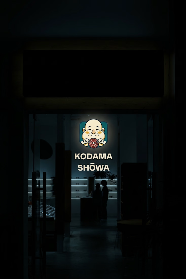
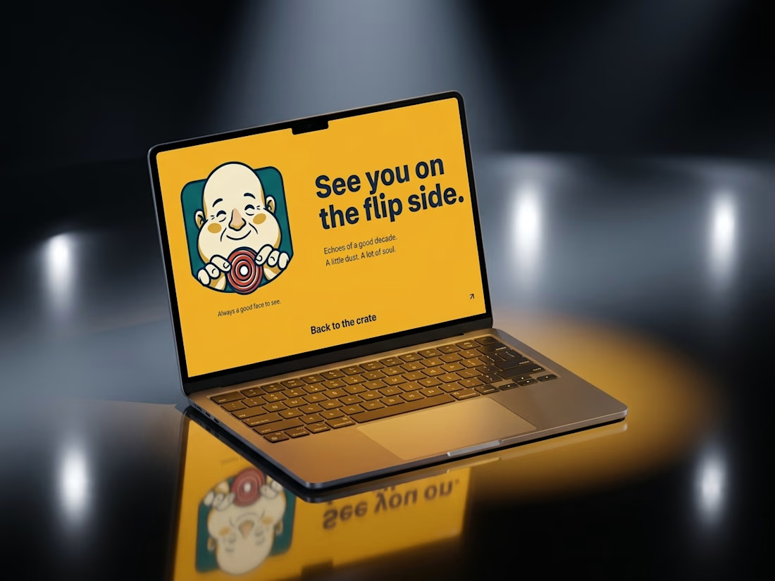
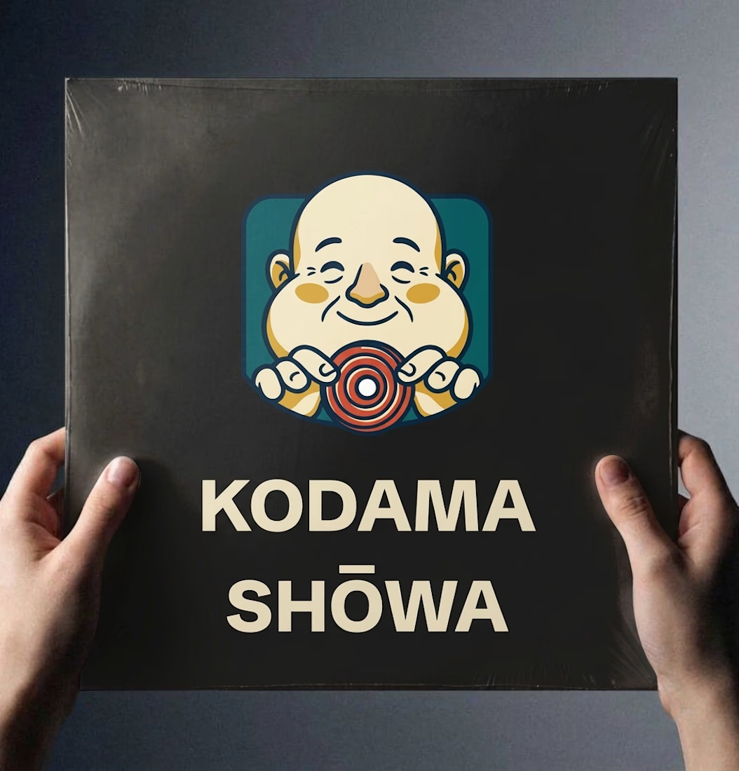
Ever wondered what a 1974 record shop would look like if it had a brand system?
Kodama Shōwa is coming soon: one old shopkeeper, five inks, and a camera at knee height.

Nice!

These designs were made by the AI in my upcoming design tool for designers.
I don't know which is better, help me decide.
For those wondering where the remaining designs are, I'll drop it in my next post.
2 voted
40%
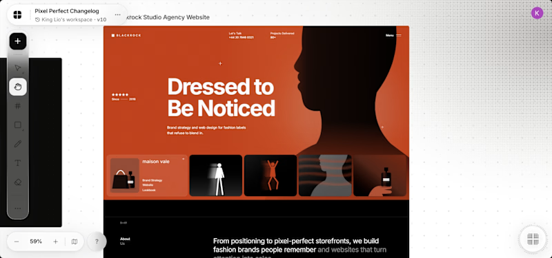
3 voted
60%
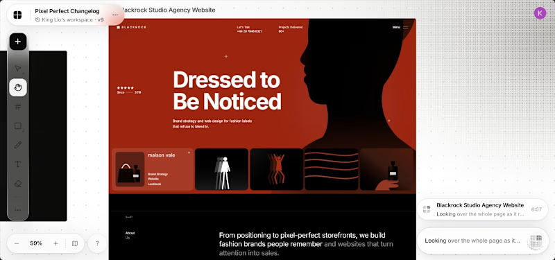
5 votes
Closed
It's the red one for me... Passed the message a lot better than the Orange


