The network for creativity
Join 1.25M professional creatives like you
Connect with clients, get discovered, and run your business 100% commission-free
Creatives on Contra have earned over $150M and we are just getting started
Back to feedPost

Nine2 Outdoors — Custom Shopify Storefront (Live)
Designed and built a full custom Shopify storefront for a veteran-owned outdoor apparel brand, including custom theme sections, homepage, product catalog, and checkout flow — built from scratch rather than a modified stock theme. Integrated Printify print-on-demand fulfillment and connected TikTok Shop for cross-platform sales.


The network for creativity
Join 1.25M professional creatives like you
Connect with clients, get discovered, and run your business 100% commission-free
Creatives on Contra have earned over $150M and we are just getting started
Related posts


I felt something was off with my own website.
Too plain. Not how I envisioned the brand.
So I added more creative touches and built a real story into it. Now everything makes sense.
It finally feels like Outredge 🚀
https://outredge.com/


That big bold wordmark with the corner brackets gives it so much more character. "A marketing site as good as your product" is a strong line too, says exactly what you do.

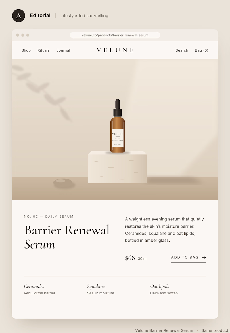
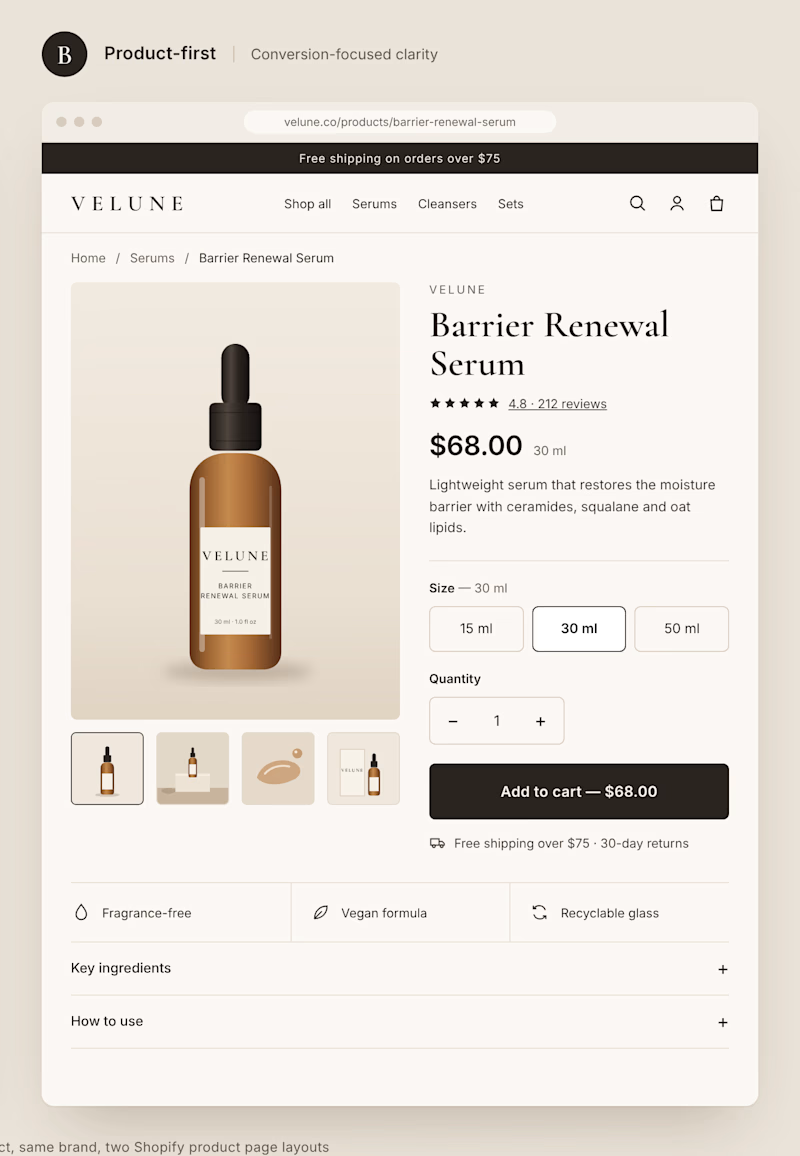
Two different approaches to the same Shopify product page.
Option A: Editorial layout. Large imagery, generous spacing, and a stronger focus on brand storytelling.
Option B: Product-first layout. Clear pricing, visible product options, and a prominent Add to Cart button.
Both can look great, but they create very different shopping experiences.
If you were building a premium DTC brand, which direction would you choose?
A or B? And why?
1 voted
11%
8 voted
89%
9 votes
Closed


What happens when one website has to talk to two different people?
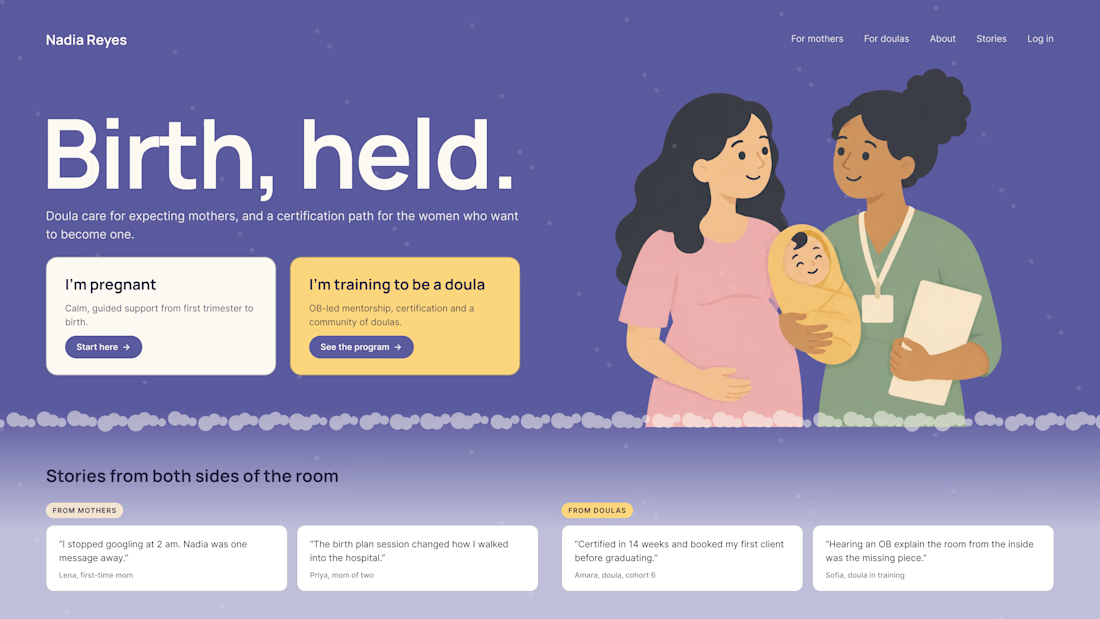
A client of ours teaches two audiences at once: expecting mothers who want a calm pregnancy, and women who want to become doulas. One brand, one site, two very different reasons to visit.
The usual fix is a hero that speaks to "everyone" and lands with no one. We designed it as a fork in the road instead:
1. Two doors in the hero. "I'm pregnant" and "I'm training to be a doula", side by side, equal weight. The visitor picks a path in one click, and the headline above them stays about the shared value.
2. One voice, two tones. The mothers' path is softer: fewer words, more room, gentle photos. The doula path is more structured: modules, certification, dates. Same fonts, same colors, different rhythm.
One proof section, split in two. Testimonials from mothers on the left, from doulas on the right. Each visitor sees people like them before the price.
Writing for everyone is writing for no one. Give each reader a door.
Have you ever designed a page for two audiences at once? How did you split it?


Love that purple hero with the two cards right up top.