The network for creativity
Join 1.25M professional creatives like you
Connect with clients, get discovered, and run your business 100% commission-free
Creatives on Contra have earned over $150M and we are just getting started
Back to feedPost
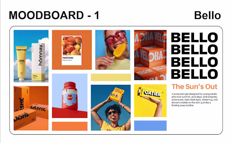
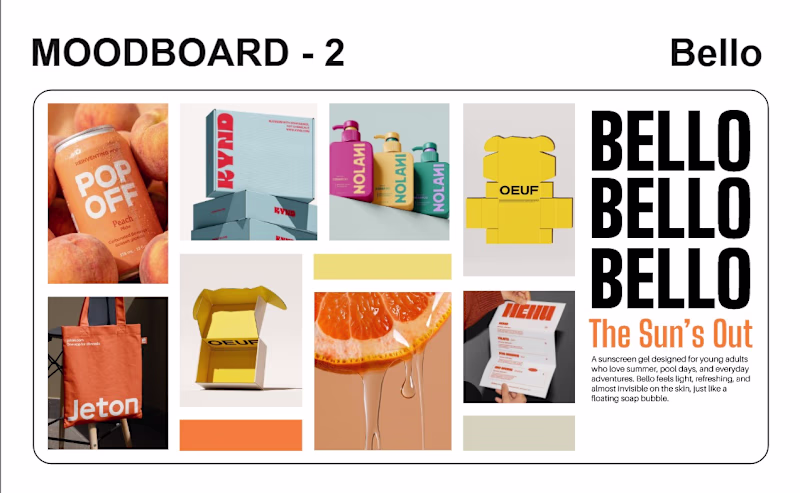
Taste Test
Which Mood board you like the most??
I got into a redesign of a packaging for a sunscreen brand. The brand name is Bello. The client want a Minimal but bold packaging, the goal is to standout on selves but also being minimal. So I made 2 moodboards one focuses on the "Standout" side and the other on the minimal side.
Before I share these with my client I want to know what my professionals has to say.
9 voted
90%
1 voted
10%
10 votes
Closed
I'd go with Moodboard 1.
For a sunscreen brand, visibility is part of the product. The brighter palette feels more energetic, memorable, and shelf-friendly while still leaving room for a clean, minimal packaging system.
Moodboard 2 feels more premium and restrained, but Moodboard...
Going for the brighter colour
Moodboad 1
The network for creativity
Join 1.25M professional creatives like you
Connect with clients, get discovered, and run your business 100% commission-free
Creatives on Contra have earned over $150M and we are just getting started
Related posts
Bona One — Brand Identity & Packaging Design
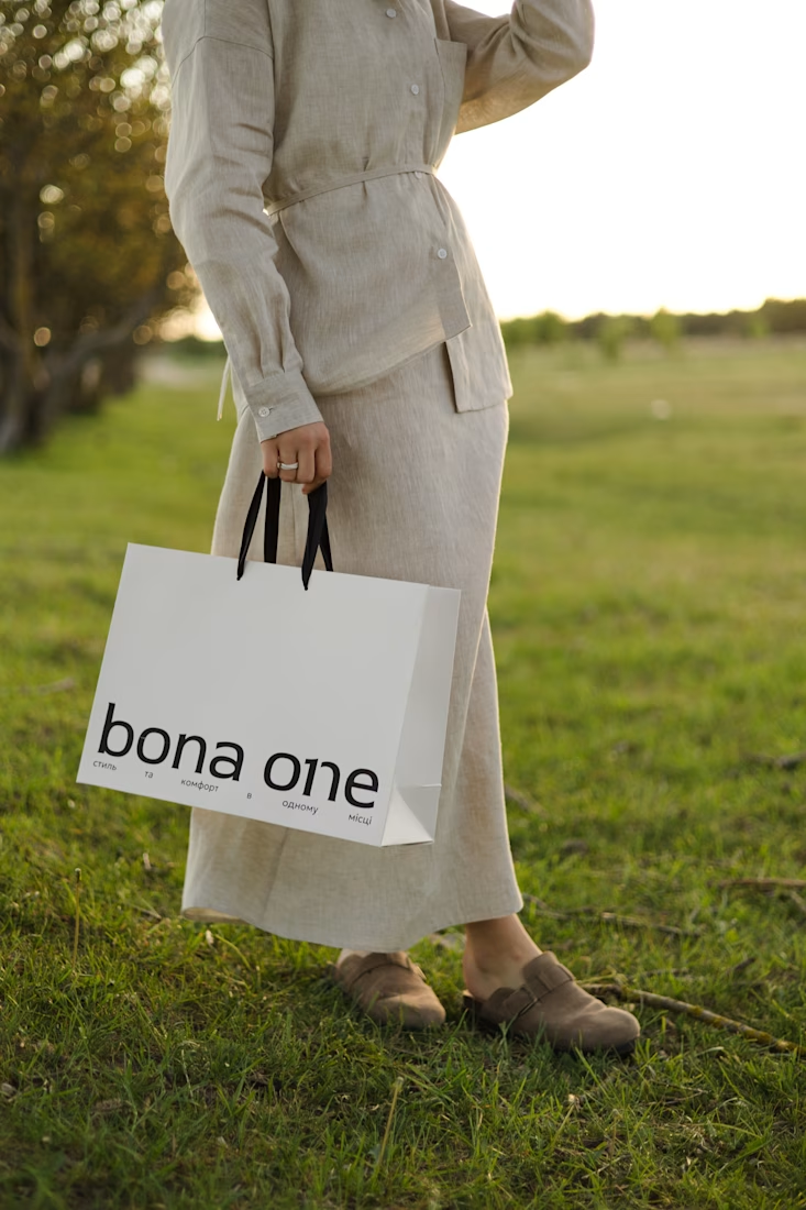
Неймовірна робота 👏
Another project, another set of brand guidelines, another brand recap.
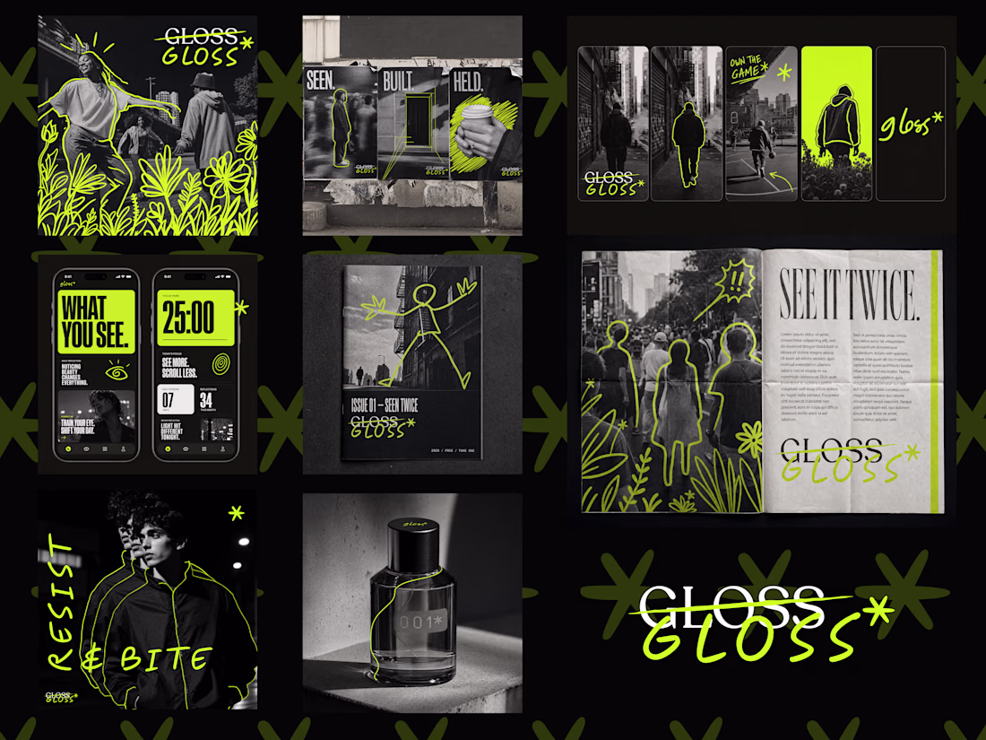
Great work 🔥 The overall experience feels refined and very well considered.
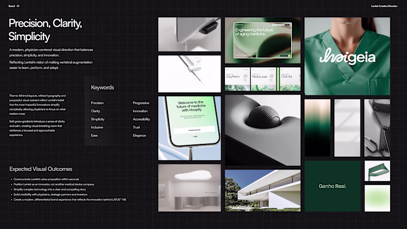
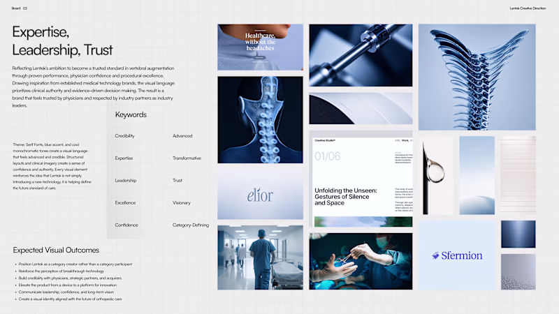
Shared two moodboards for brand direction with client. Which one would you choose?
9 voted
82%
2 voted
18%
11 votes
Closed
Enterprise has it in opinion
Trending
Claude
Claude has entered the design space. How are you using Claude Design?
Contra University
Learn from expert creatives how to earn more using next-gen AI tools.
MagicPath
The canvas is infinite, and exploration is becoming the workflow. How are you using MagicPath?
creativeaiflow
Creative AI workflows are evolving. What tools do you use, and what are their strengths and weaknesses?
freelancerlife
Freelancer life is wins, pivots, and everything in between. What’s yours right now?