The network for creativity
Join 1.25M professional creatives like you
Connect with clients, get discovered, and run your business 100% commission-free
Creatives on Contra have earned over $150M and we are just getting started
Back to feedPost
Introducing CORINTH, a premium men’s health brand designed by Asad FaizUllah
The symbol brings together a “+” sign representing health and care, and an arrow inspired by the male symbol, reflecting the brand’s focus on men’s health.
#BrandIdentity #LogoDesign #MensHealth #GraphicDesign


The plus sign fused with the arrow is doing clever double duty. Health plus masculinity without either shouting, that balance is the hard part. Did the mark come together quickly, or was it one of those concepts that needed a lot of rounds to land?

Thank you so much.
Surprisingly, the concept was approved on the first go 😊

Plus sign with an arrow is a simple idea for men's health. Clear reasoning behind the mark.
Thank you.
The goal was to make both elements feel like one cohesive symbol rather than two separate ideas. Glad the concept comes across clearly 😊
The network for creativity
Join 1.25M professional creatives like you
Connect with clients, get discovered, and run your business 100% commission-free
Creatives on Contra have earned over $150M and we are just getting started
Related posts

What if indigo is just ink that got patient?
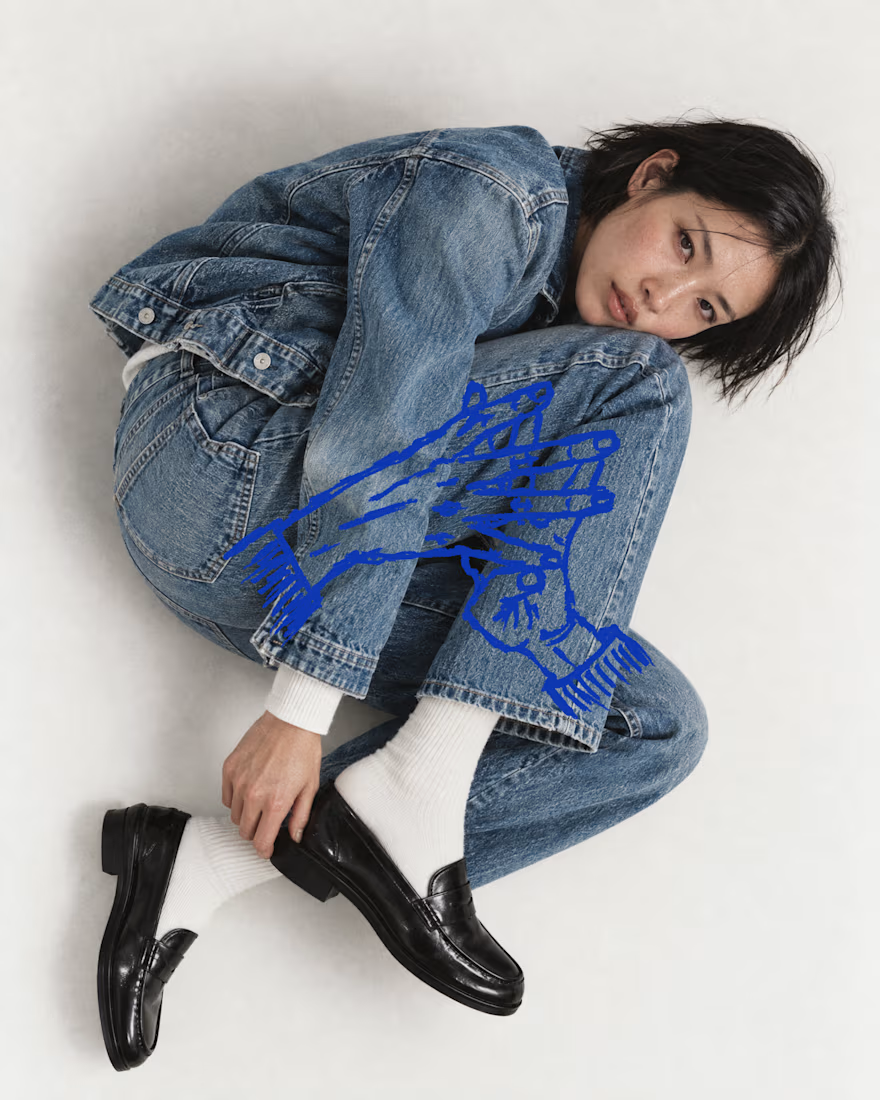
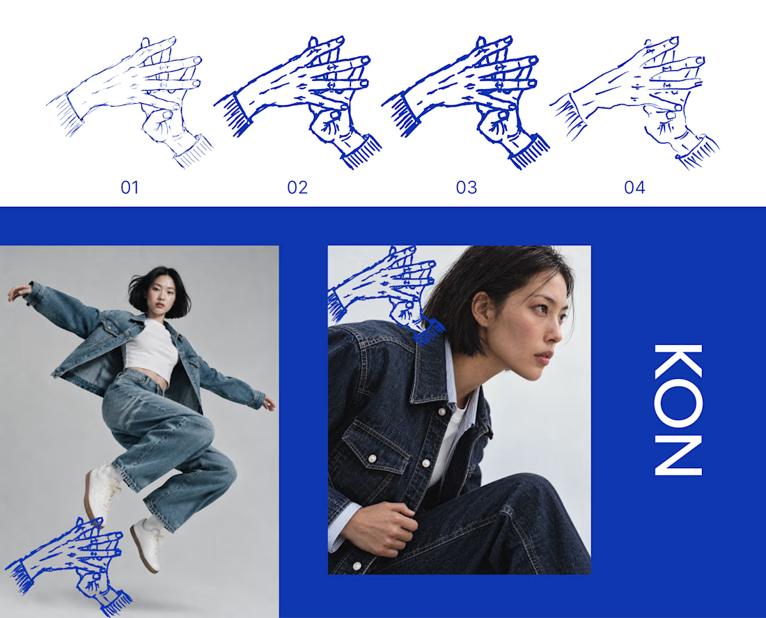
KON is a denim and streetwear label for people who live in hip hop and care how things are made. For Inktober’s final stretch, I took its hand mark through four ink passes, from a fine line to a heavy stroke to a dry brush. Each one sits on the last, the way cloth gets dipped again and again until the color holds.
Swipe to see the passes, then the mark out in the world on denim.
The full KON case study is coming soon.
Which part of your process do you repeat until it hits? Show me yours.


That's really great specially the photography


Healthcare web design collection. Four clients, one category, very different briefs.
Good Company Dental: warm and community-first. Dark tones, real patient photos, trust built through storytelling.
Carolin Schrinner: professional interpreter and translator. Clean navy and teal, credential-forward, built for international clients.
Vineland Dental: neighbourhood practice with 26 years in the community. Approachable layout, bilingual, patient-centred copy.
COVA Dental: premium and editorial. Sage and warm neutrals, before/after showcases, feels more like a lifestyle brand than a clinic.
Every brief in healthcare comes down to the same thing. Make people feel safe before they even book. That is what good design does here 🩺

this is amazing design