The network for creativity
Join 1.25M professional creatives like you
Connect with clients, get discovered, and run your business 100% commission-free
Creatives on Contra have earned over $150M and we are just getting started
Back to feedPost

I designed this in 2020.
An old charity web design from my design archive.
Six years later, I’m not sure I’d design it the same way.
The interesting part?
I’m not sure I’d change everything either.
What still works and what feels outdated to you?😍

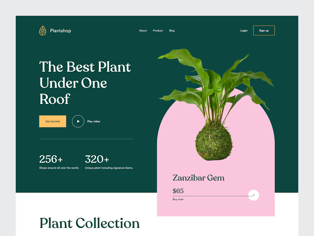

Nostalgia 😁
The network for creativity
Join 1.25M professional creatives like you
Connect with clients, get discovered, and run your business 100% commission-free
Creatives on Contra have earned over $150M and we are just getting started
Related posts

Over the past month, I've been spending more time exploring Shopify store design and thinking about what makes an online store work well.
One thing that stands out to me is that good e-commerce design involves much more than appearance.
I've been paying closer attention to:
→ How a homepage guides visitors
→ How product pages present important information
→ How collections help customers discover products
→ How navigation affects the shopping experience
→ How a store adapts to mobile screens
→ How consistent design builds a stronger brand experience
I'm also learning to think more carefully about the purpose behind each section instead of designing just because something looks good.
Every page should have a reason to exist, and every design decision should contribute to the overall experience.
I still have more to learn and improve, but each project gives me another opportunity to practice, experiment, and develop my approach.
My biggest takeaway so far: good Shopify design brings visual presentation, usability, and the customer's journey together.
What's one thing you believe every e-commerce designer should understand?


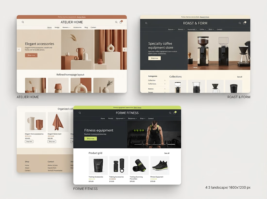

Understanding customer behavior is key to creating better shopping experiences. 👏

Healthcare web design collection. Four clients, one category, very different briefs.
Good Company Dental: warm and community-first. Dark tones, real patient photos, trust built through storytelling.
Carolin Schrinner: professional interpreter and translator. Clean navy and teal, credential-forward, built for international clients.
Vineland Dental: neighbourhood practice with 26 years in the community. Approachable layout, bilingual, patient-centred copy.
COVA Dental: premium and editorial. Sage and warm neutrals, before/after showcases, feels more like a lifestyle brand than a clinic.
Every brief in healthcare comes down to the same thing. Make people feel safe before they even book. That is what good design does here 🩺

this is amazing design

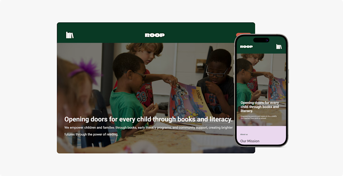
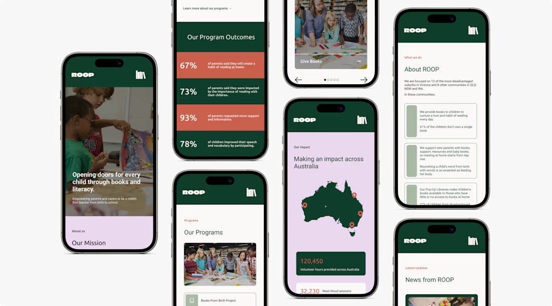
Sharing a homepage redesign concept for ROOP (Reading Out Of Poverty) 📚
I explored how visual hierarchy, colour and layout could help communicate the organisation's mission and impact more clearly.
A few areas I focused on were making key information easier to find, creating a more cohesive visual identity and considering the experience across desktop and mobile.
I’ve shared the design process and final screens in the full case study below.
#WebDesign #UIDesign #UXDesign

Very nice 👍🏻