The network for creativity
Join 1.25M professional creatives like you
Connect with clients, get discovered, and run your business 100% commission-free
Creatives on Contra have earned over $150M and we are just getting started
Back to feedPost

Just finished this café promotional design in Canva ☕✨
I focused on keeping the layout clean, making the 20% OFF offer stand out, and creating a simple but eye-catching social media post.
Would love to hear your feedback—what would you improve?

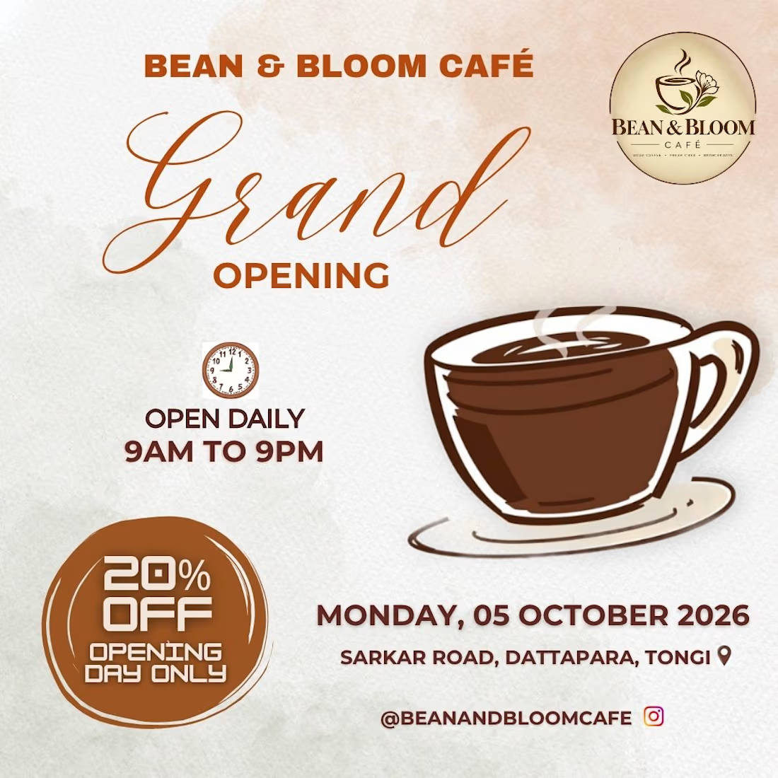

Since you asked: the script "Grand" and the 20% badge are both competing to be read first, and the script is winning even though the discount is the actual hook. I'd give the badge the upper-right space where the eye lands after the logo, and push the address line up one weight step, since that's the bit people screenshot.
The network for creativity
Join 1.25M professional creatives like you
Connect with clients, get discovered, and run your business 100% commission-free
Creatives on Contra have earned over $150M and we are just getting started

Challenges
View all


Related posts


Marigold is a one day concept for envato's human by design challenge. i set the direction in real photography first then generated against that standard.

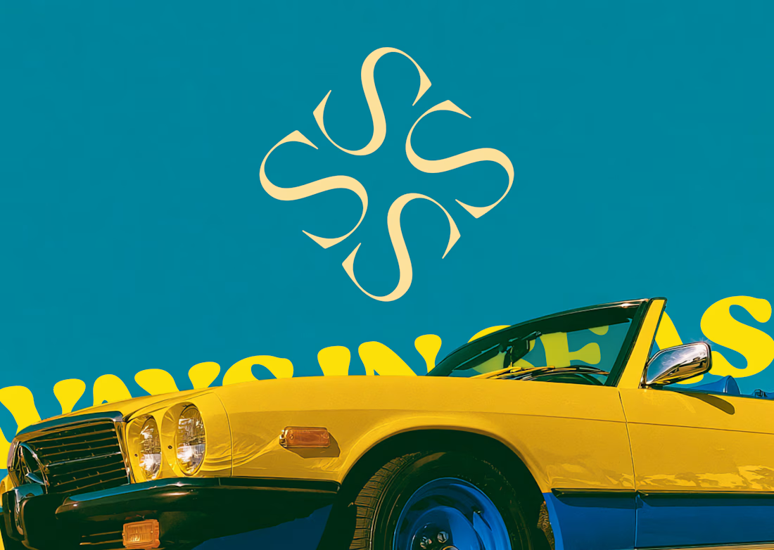
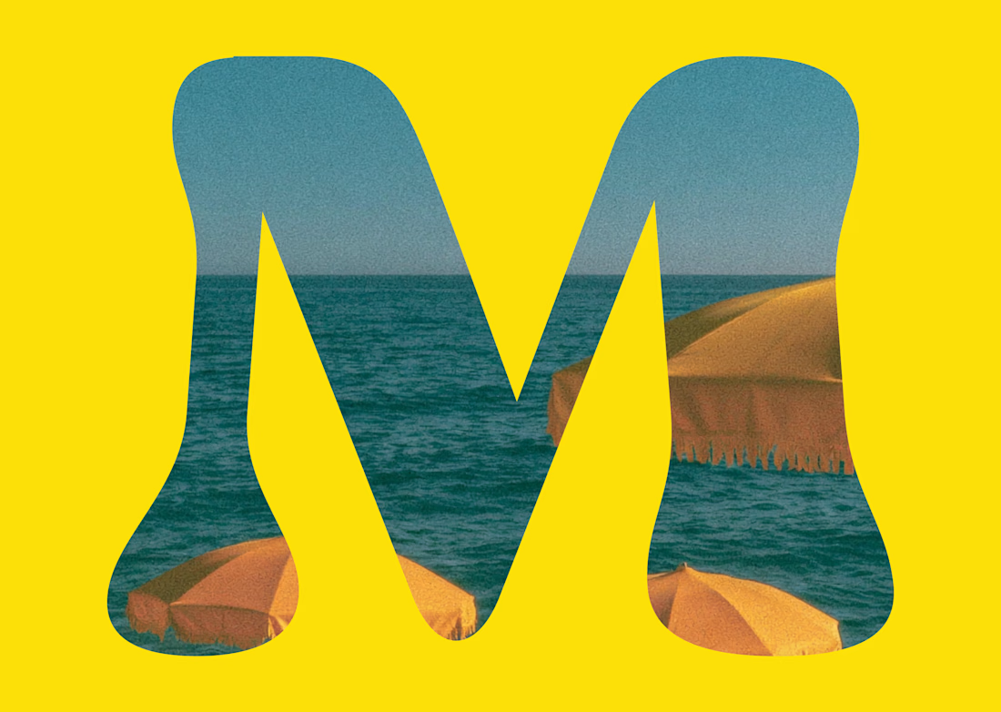
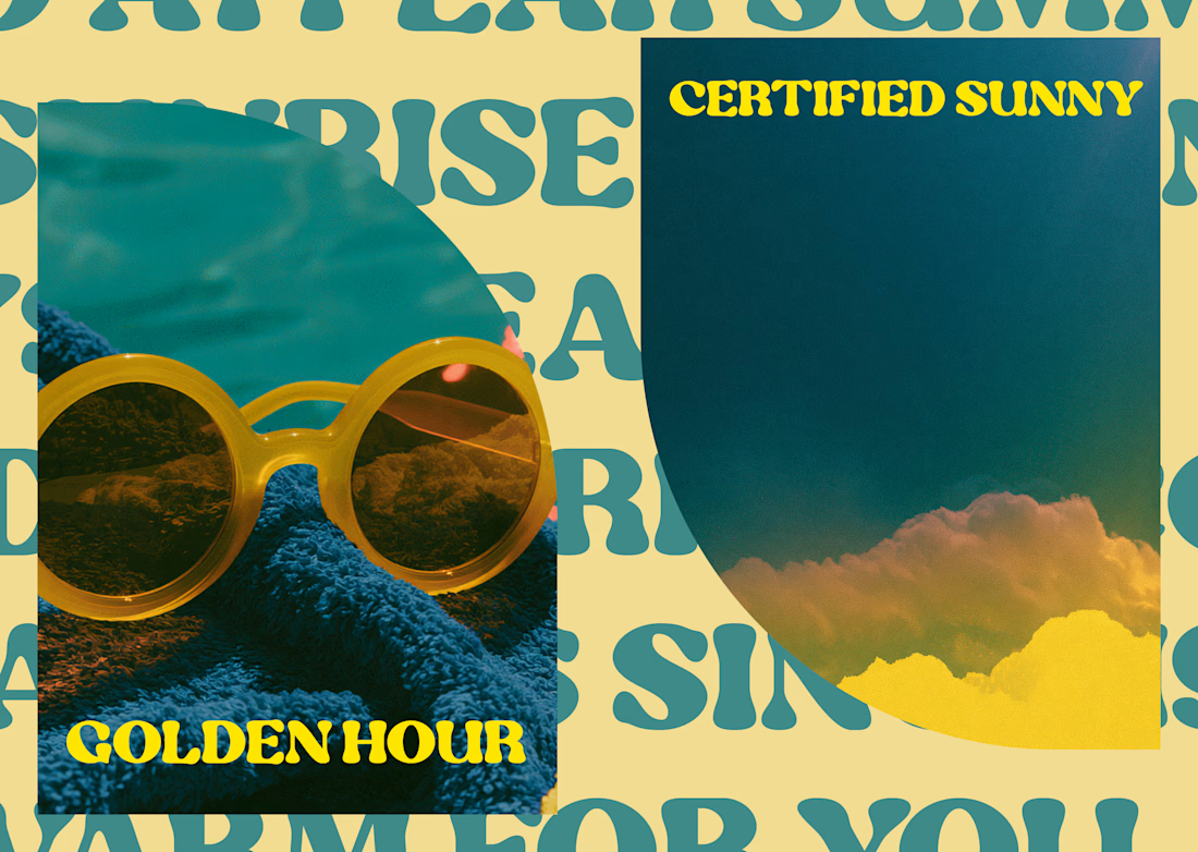
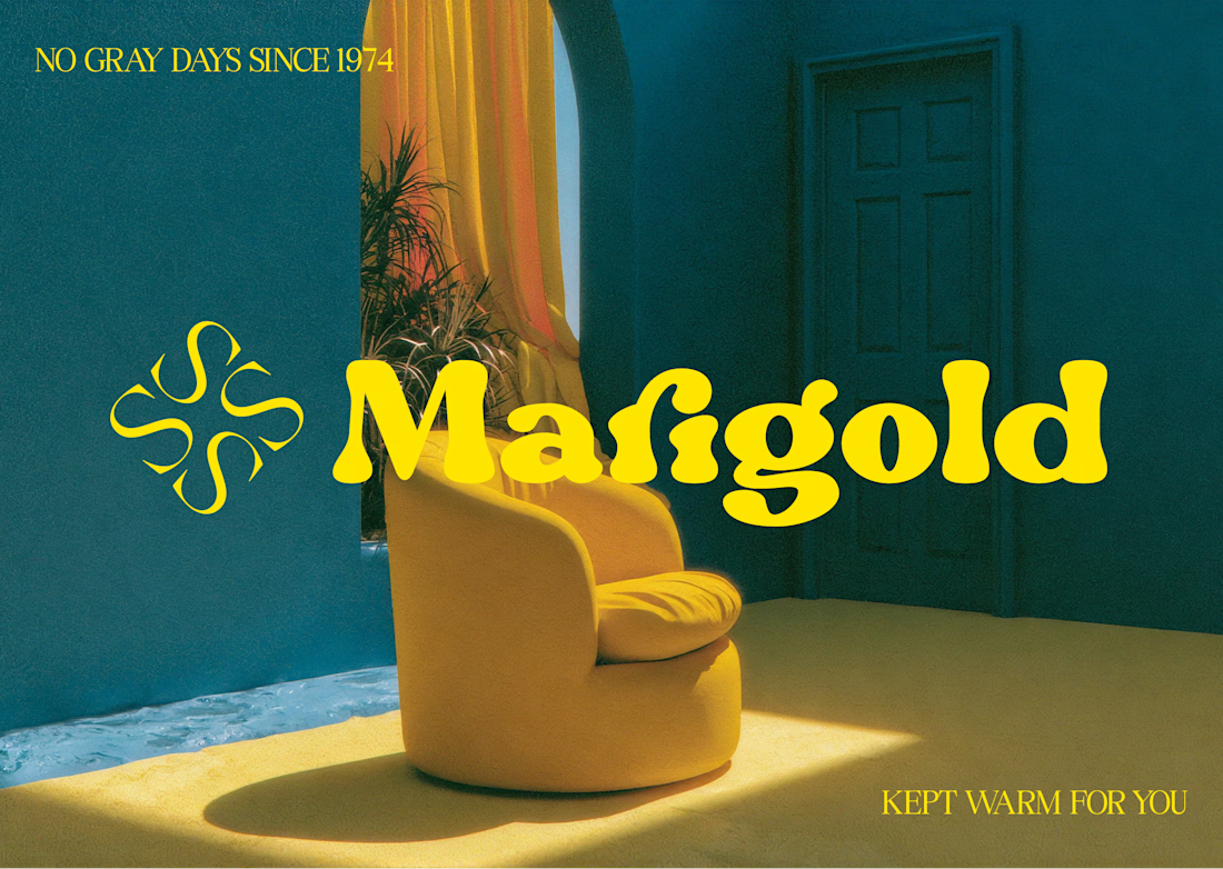


One idea, held all the way through: name, object, photography, palette, motion.
That's the whole pitch for how I work.
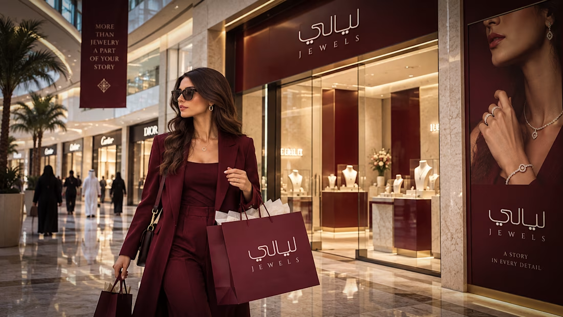
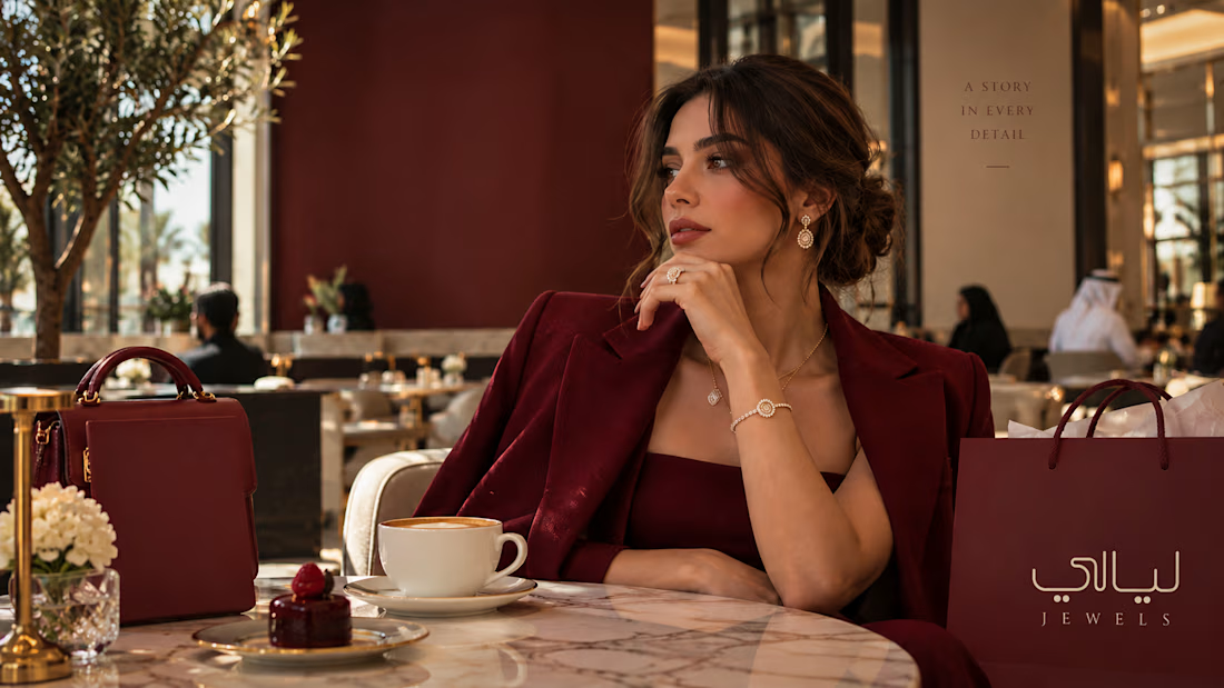
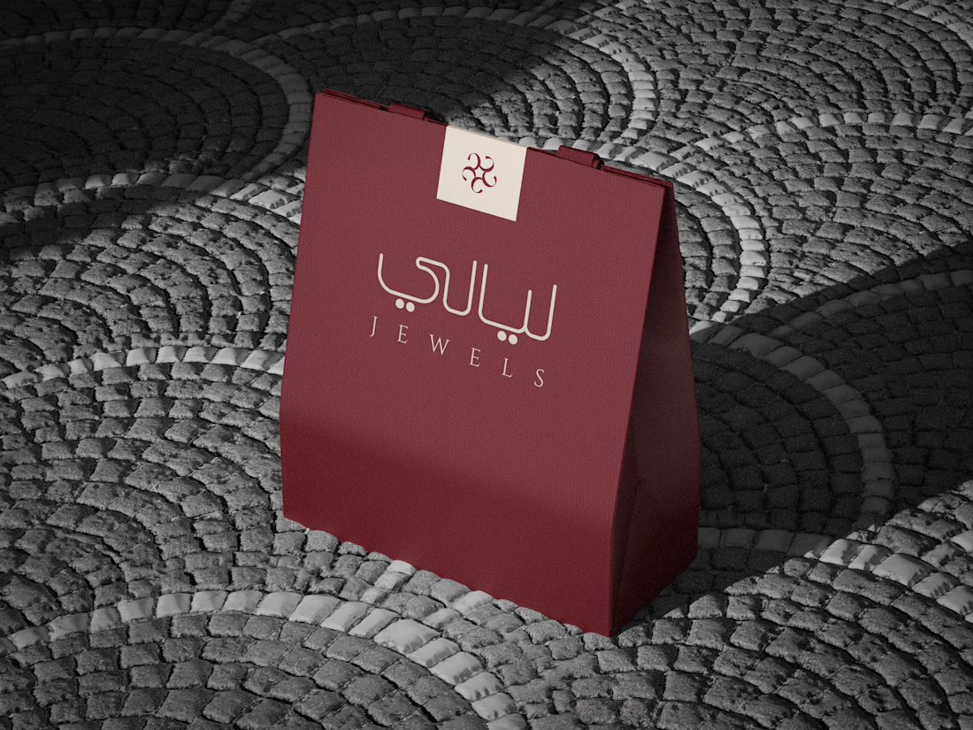
AQUILIFER — a brand I built around this: jewelry as something carried, not worn.
The name comes from Roman military rank. The aquilifer carried the standard, the one thing the legion couldn't afford to drop.



the burgundy color looks so good