The network for creativity
Join 1.25M professional creatives like you
Connect with clients, get discovered, and run your business 100% commission-free
Creatives on Contra have earned over $150M and we are just getting started
Back to feedPost


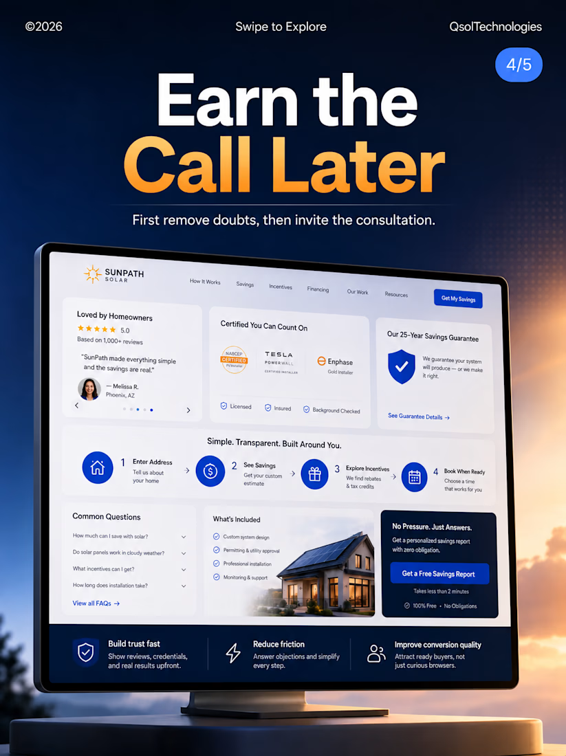
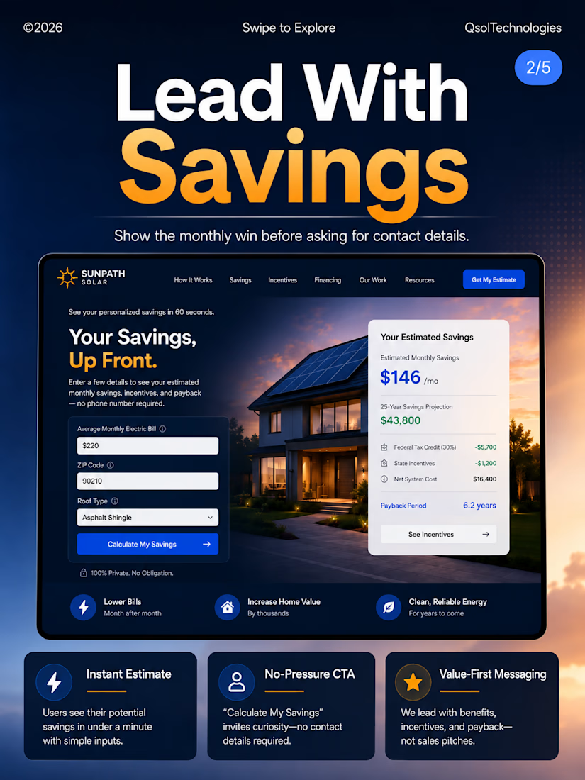
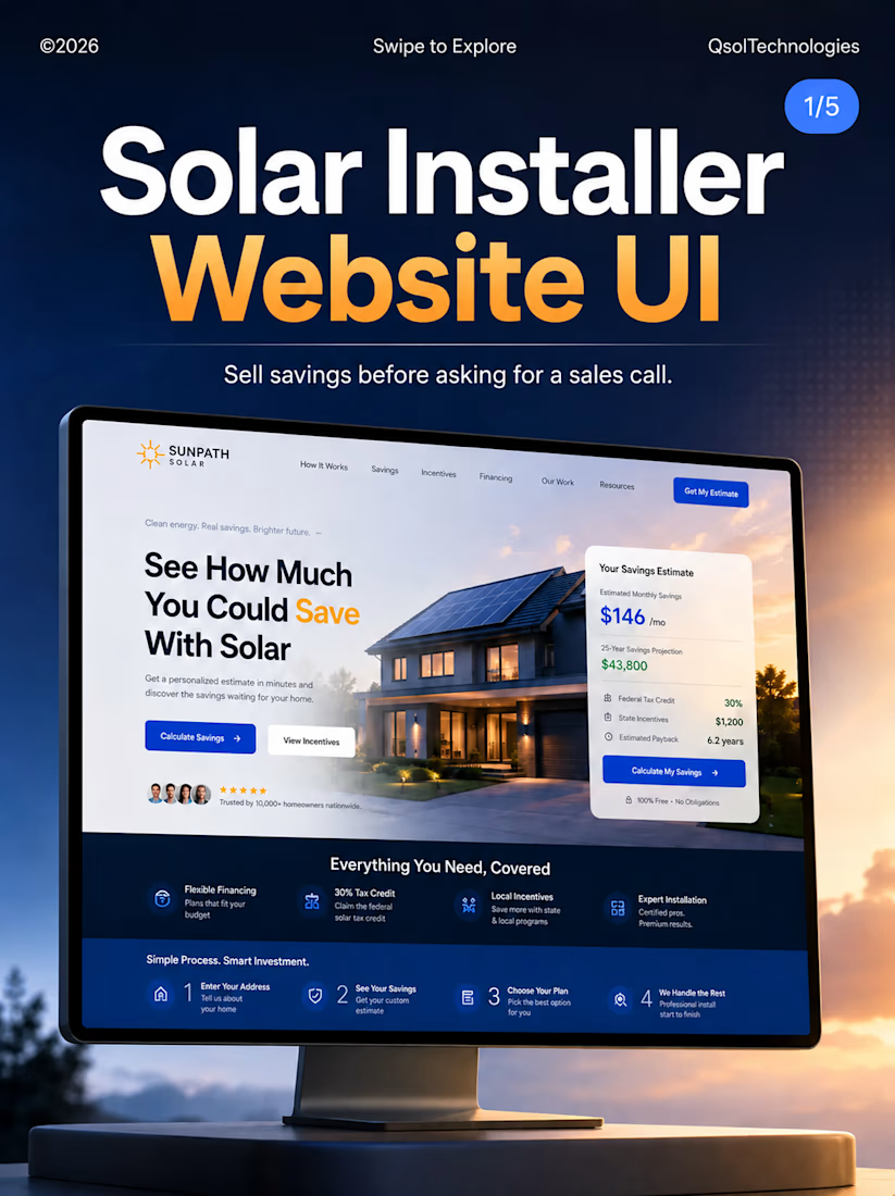
Excited to share my latest Solar Installer Website UI concept!
The goal was simple: create a clean, modern, and conversion-focused experience that helps users understand solar savings before booking a consultation.
Every section is designed to build trust, simplify decision-making, and drive more qualified leads.
Great design isn't just about aesthetics—it's about solving business problems.
I'd love to hear your feedback!
#UIUX #WebDesign #SolarEnergy #Figma #ProductDesign #LandingPage #UIDesign #UXDesign #QsolTechnologies



The network for creativity
Join 1.25M professional creatives like you
Connect with clients, get discovered, and run your business 100% commission-free
Creatives on Contra have earned over $150M and we are just getting started







Related posts

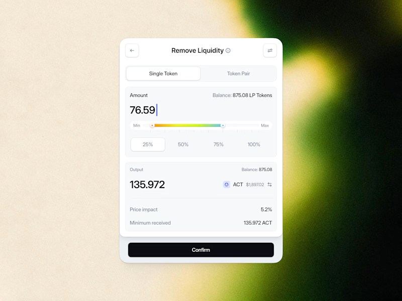
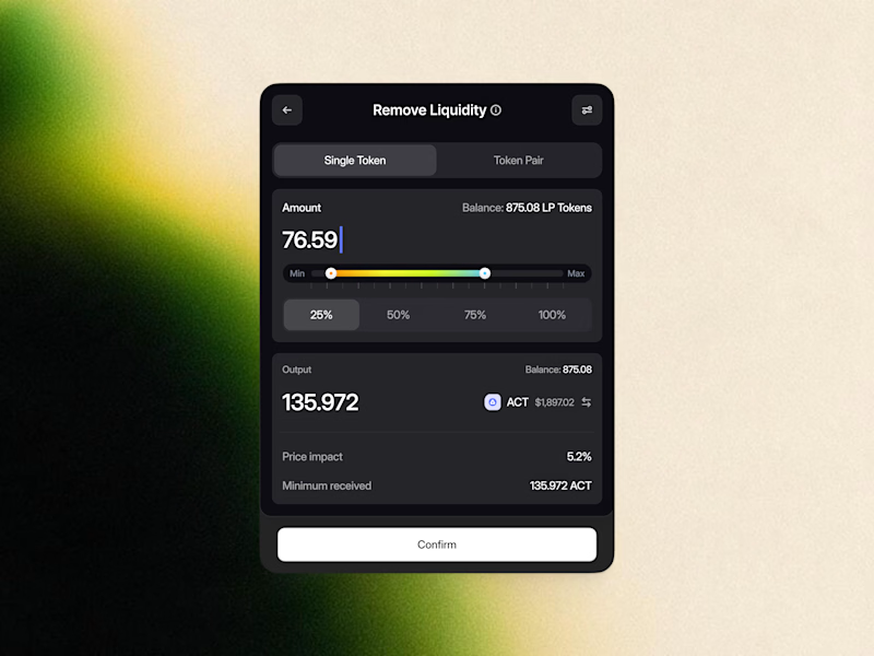
Remove Liquidity component cards for a recent Web3 design project—what would be the best direction for readability and focus? Dark Mode or Light Mode? ⚡️
12 voted
40%
18 voted
60%
30 votes
Closed

White one need bit more darker bg on elements to make them visible like the dark more does.

This is how a clean cybersecurity website should look 👌
Our work for Netability.
www.netability.ch


looks great

Built the site for Linea — a boutique rail brand where the whole UI is made of the same rule as the print system.
Every route card's red line isn't decoration, it's that route's actual elevation profile. Fare tiers aren't styled, they're the same data at different density.
The logo's sparkle mark even resolves from the exact same contour-drawing logic, live on the page.
One idea, all the way down → Here