The network for creativity
Join 1.25M professional creatives like you
Connect with clients, get discovered, and run your business 100% commission-free
Creatives on Contra have earned over $150M and we are just getting started
Back to feedPost
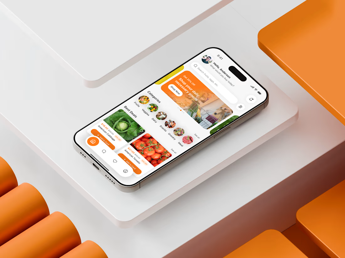
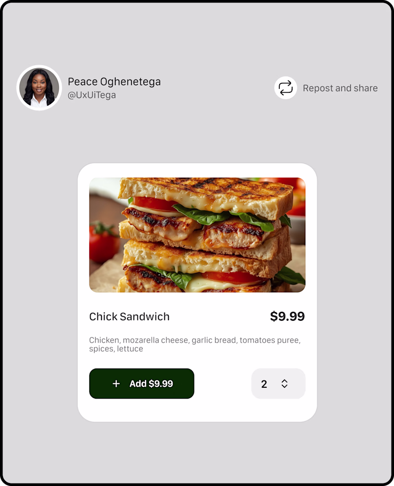
Recently, I designed a Grocery Shopping Mobile App Home Screen that focuses on reducing friction in the first 10 seconds of user interaction. My goal was simple: help users find essentials fast, feel in control, and trust the interface instantly. I started by mapping real user behaviors—quick scanning, category jumping, and deal hunting. That inspired the clean top search bar, the bold “Best Deals” visual section, and simplified categories that guide users without cognitive overload.
I chose warm, energetic tones to spark visual attention while keeping spacing breathable for a calm browsing experience. The card layout wasn’t just aesthetic—it solved a real usability challenge: giving users product clarity while maintaining fast scrollability. Micro-interactions were built around reducing decision time and building confidence.
The network for creativity
Join 1.25M professional creatives like you
Connect with clients, get discovered, and run your business 100% commission-free
Creatives on Contra have earned over $150M and we are just getting started
Related posts
A throwback to when I designed the new Onefootball website! It was a honor to be able to work with the brand designed by DesignStudio!
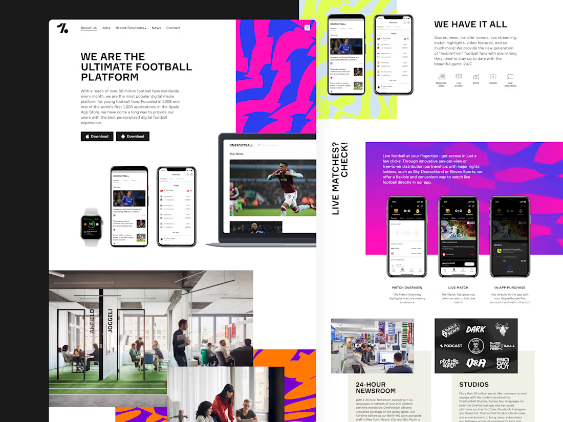
Great work! The bold colors and layout really capture the energy of football while keeping the interface clean and easy to navigate. Awesome project
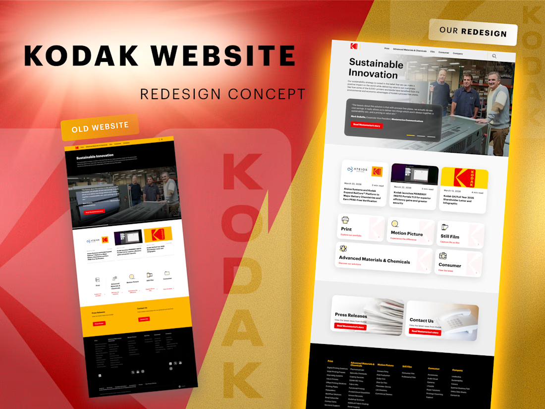
🔍 We explored how the Kodak website could look with a more modern interface while keeping the brand recognizable.
The goal of this concept redesign was not to reinvent the brand, but to refine the experience and make the interface feel lighter, clearer, and more contemporary.
In this concept we focused on:
• improving visual hierarchy 📐
•simplifying the card layout and navigation blocks
• adding more whitespace for better readability ✨
• introducing softer UI elements and cleaner structure
At the same time, it was important to keep Kodak’s strong visual identity – especially the iconic color palette 🎞️
This is a concept redesign created as a design exploration of how the website could evolve today.
💬 What do you think – new version works better?
good
Took a short break but I am happy to be back to my contra community.
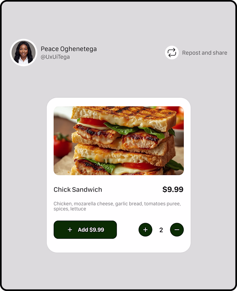
I am working on a new project, and I need your input for this A and B TESTING OF A PRODUCT CARD,
Which has better UX?
52 voted
76%
16 voted
24%
68 votes
Closed
Challenges
View allFuser Co-create
$5K6h 16m left344 participants
Morphic Workflows
$10K3d left271 participants
Zo Computer Challenge
$10K3d left561 participants
Anything Ship & Sell Remixathon
$10K10d left189 participants
Impossible UI with Rive
$10K10d left121 participants
Runway $100k Big Pitch Challenge
$100K10d left194 participants
Trending
Runway
AI video generation is exploding. What are you dreaming up in Runway?
Contra University
Learn from expert creatives how to earn more using next-gen AI tools.
creativeaiflow
Creative AI workflows are evolving. What tools do you use, and what are their strengths and weaknesses?
portfolioreview
The best portfolios tell a story, not just show a grid. Share yours for feedback.
freelancerlife
Freelancer life is wins, pivots, and everything in between. What’s yours right now?