The network for creativity
Join 1.25M professional creatives like you
Connect with clients, get discovered, and run your business 100% commission-free
Creatives on Contra have earned over $150M and we are just getting started
Back to feedPost

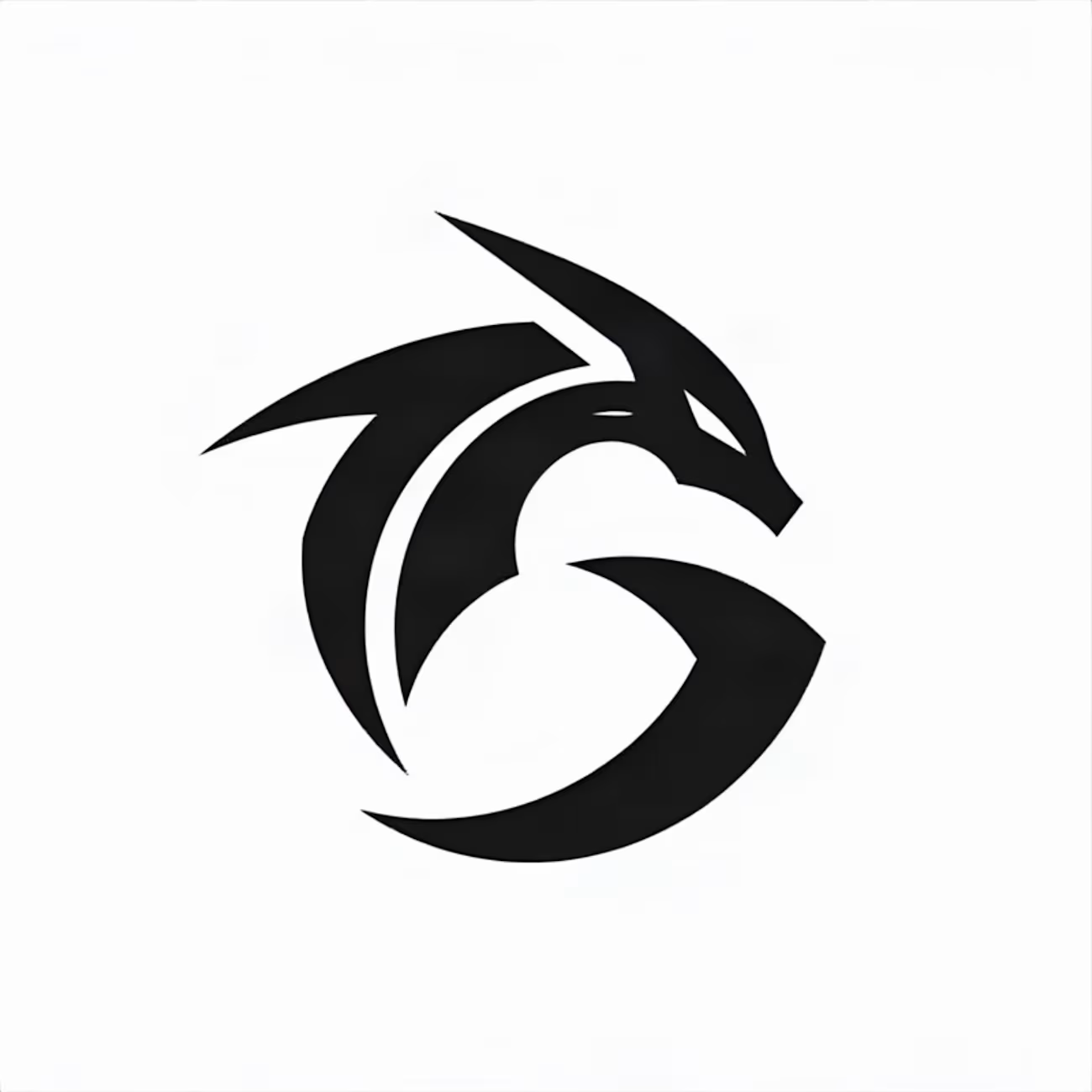
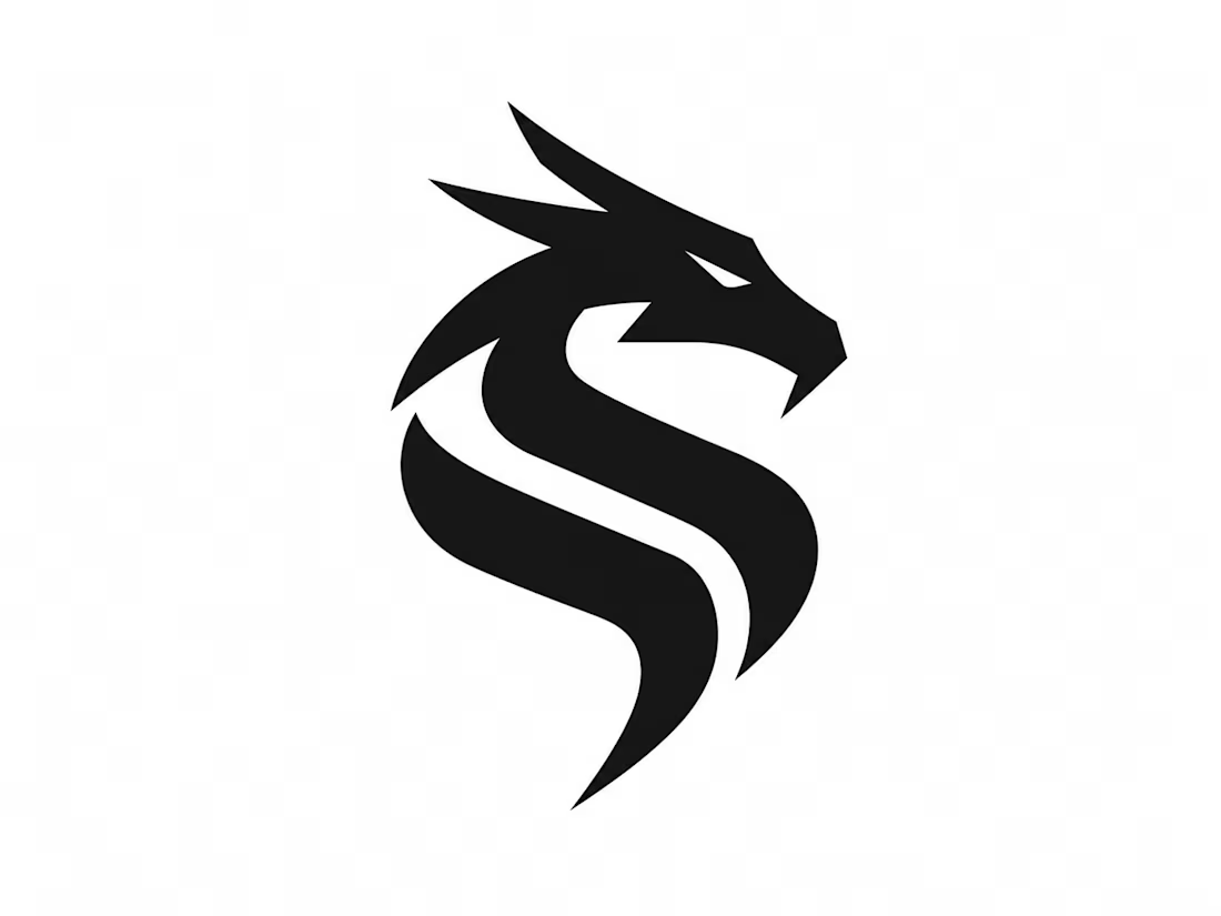
DRAKON — Premium Dragon Logo Design
A bold dragon-inspired logo representing power, strength, leadership, and transformation.


The network for creativity
Join 1.25M professional creatives like you
Connect with clients, get discovered, and run your business 100% commission-free
Creatives on Contra have earned over $150M and we are just getting started
Challenges
View all


Related posts


One of my first identity projects from 2021. 🥹
SVNT was a skincare brand built around inclusivity, accessibility, and shaping the future of beauty. My goal was to reflect that through a futuristic but clean visual identity, keeping the system modern and simple while giving the brand room to celebrate individuality.
Looking back at this project four years later, it’s interesting to see what decisions still feel relevant to me today.
Do you ever revisit your early work and realize your design instincts were already there?

Curious - how did you approach making futuristic not feel cold, to keep the inclusivity/accessibility warm? The balance here is really nice.

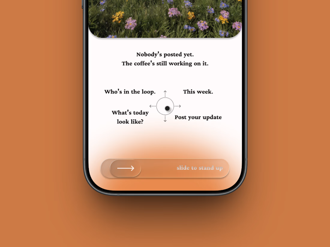
The 9am standup, replaced by a thumb.
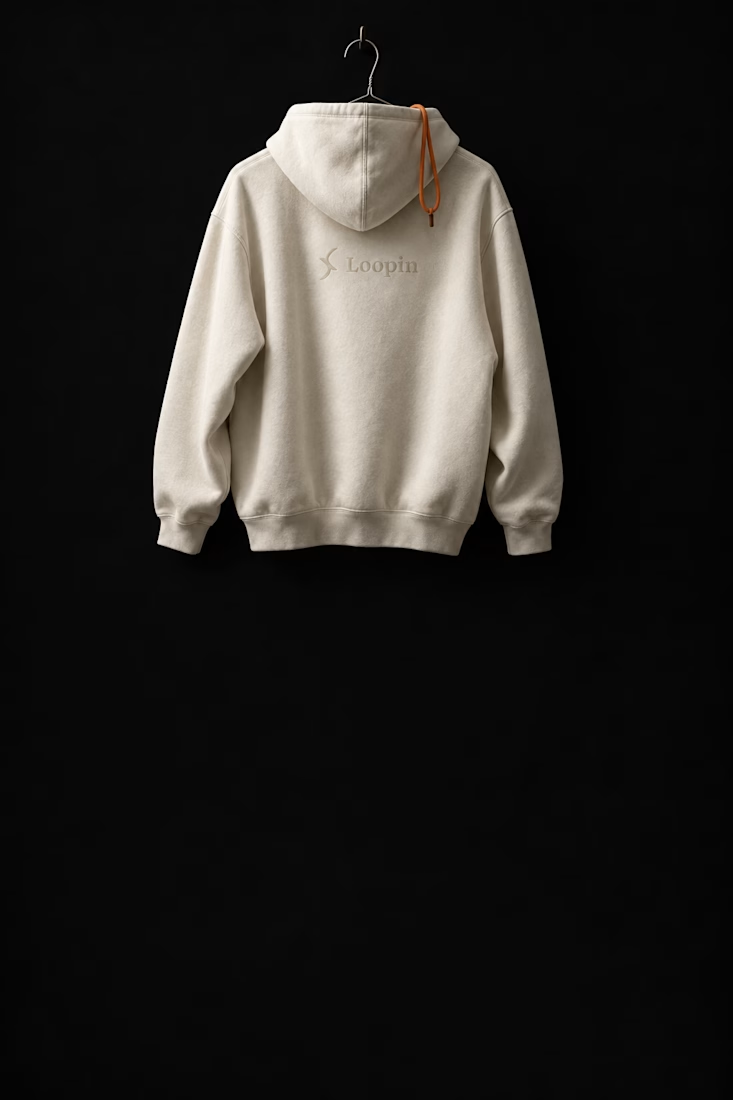
Loopin (a self intiated project): brand, campaign, merch, app and site for an async standup tool that arrives at 7am and asks you to slide to stand up.

SYSTEM IN MOTION — Exploring Responsive Graphic Design
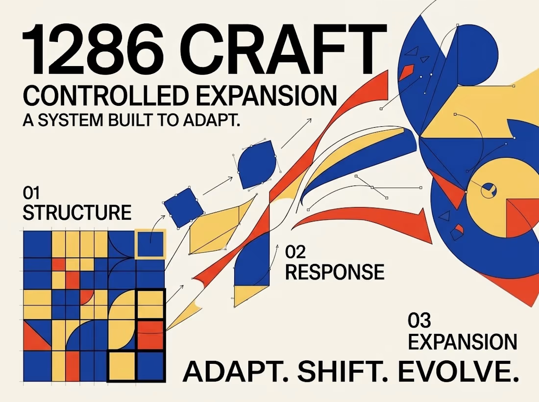
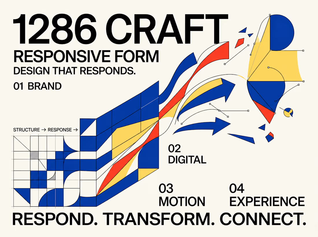
What happens when a visual identity moves beyond static composition and becomes a dynamic, responsive design system?
This experimental graphic design project for 1286 CRAFT explores the relationship between bold typography, geometric structures, elastic grids, and kinetic motion.
Built around a distinctive visual language of cobalt blue, vibrant red-orange, warm yellow, and high-contrast black, the project transforms rigid graphic elements into expressive, adaptable compositions.
The Creative Direction
The concept begins with structured grids, modular geometry, and strong typographic hierarchy. These foundational elements gradually evolve into fluid forms, curved pathways, directional movements, and interconnected visual systems.
Each composition investigates a different aspect of transformation, demonstrating how consistent design principles can support both precision and creative flexibility.
From Static Design to Motion
The project extends beyond traditional poster design through a short motion sequence that brings the visual system to life.
Geometric forms expand, intersect, rotate, and transition into flowing compositions, creating a seamless relationship between static graphic design and motion-driven storytelling.
The Design Philosophy
Great visual systems should do more than look consistent. They should communicate, respond, evolve, and create meaningful connections across different formats and experiences.
This exploration brings together experimental typography, editorial composition, modular design, and motion principles to demonstrate how a single creative direction can become a cohesive visual language.
RESPOND. TRANSFORM. CONNECT.
BUILT TO MOVE. DESIGNED TO EVOLVE.
Creative Direction & Visual Design — 1286 CRAFT
#GraphicDesign #BrandIdentity #MotionDesign #VisualSystems #Typography #CreativeDirection #1286CRAFT


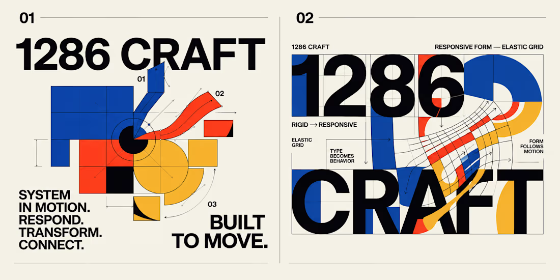

When the grid starts bending into those curved pathways, what keeps it reading as 1286 CRAFT, the palette or the type? Curious which one you treated as the non-negotiable.