The network for creativity
Join 1.25M professional creatives like you
Connect with clients, get discovered, and run your business 100% commission-free
Creatives on Contra have earned over $150M and we are just getting started
Back to feedPost

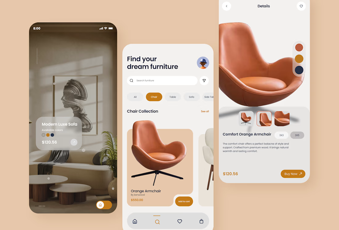

Amazing Design
The network for creativity
Join 1.25M professional creatives like you
Connect with clients, get discovered, and run your business 100% commission-free
Creatives on Contra have earned over $150M and we are just getting started

Challenges
View all


Related posts

Hello, did you missed this design inspo yesterday??
Check it out

Notification panel/drawer, desktop view

Wow... You design such an Easy to use Ui/UX. Everything looking organized as per priority.

Took a little time to challenge my motion design skills.
I recreated a Spotify app concept to explore how UI elements, motion, timing, and transitions can come together to create a more engaging product experience.
This was a self initiated practice project, but I treated it like a real product animation project.
Always looking for ways to make interfaces feel more alive through motion.
#MotionDesign #MotionGraphics #UIAnimation #AppAnimation #AfterEffects #ProductDesign #VideoEditing #Animation


NICE WORK REALLY LOVE IT

Airbnb 3d icon I created a while back.
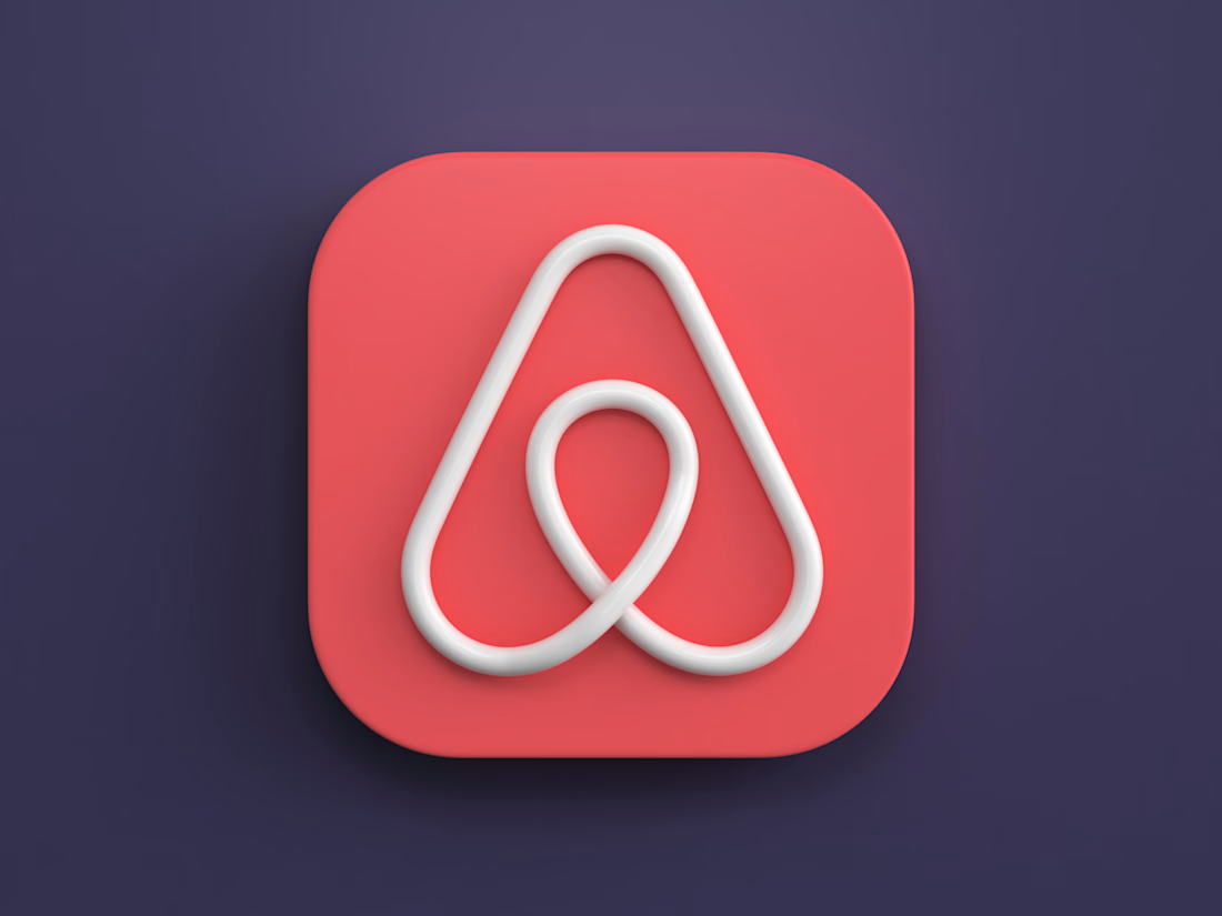

The soft bevels and controlled shadowing give the mark a convincing physical presence without muddying the silhouette. The coral-on-indigo palette also makes the icon pop beautifully.