The network for creativity
Join 1.25M professional creatives like you
Connect with clients, get discovered, and run your business 100% commission-free
Creatives on Contra have earned over $150M and we are just getting started
Back to feedPost

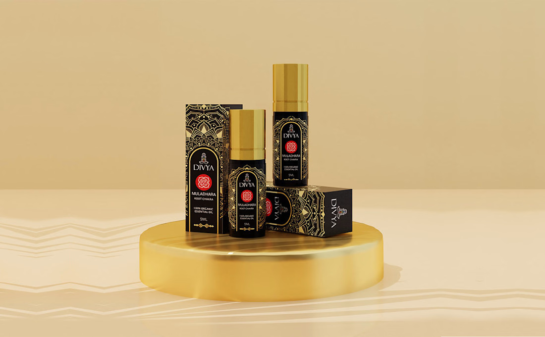
When the client approached me, they wanted their product to feel premium, meaningful, and deeply connected to its spiritual roots. My role was to design the labelling and packaging in a way that instantly communicates quality and trust.
I created a refined black and gold design inspired by traditional and sacred aesthetics, giving the product a luxurious yet grounded identity.
The final outcome aligns with high-end wellness brands and speaks directly to a mindful audience that values elegance, authenticity, and intention.
The network for creativity
Join 1.25M professional creatives like you
Connect with clients, get discovered, and run your business 100% commission-free
Creatives on Contra have earned over $150M and we are just getting started







Related posts

Rhyen Lab: Brand Identity & Packaging for a Skincare Brand
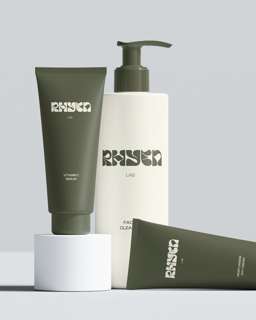
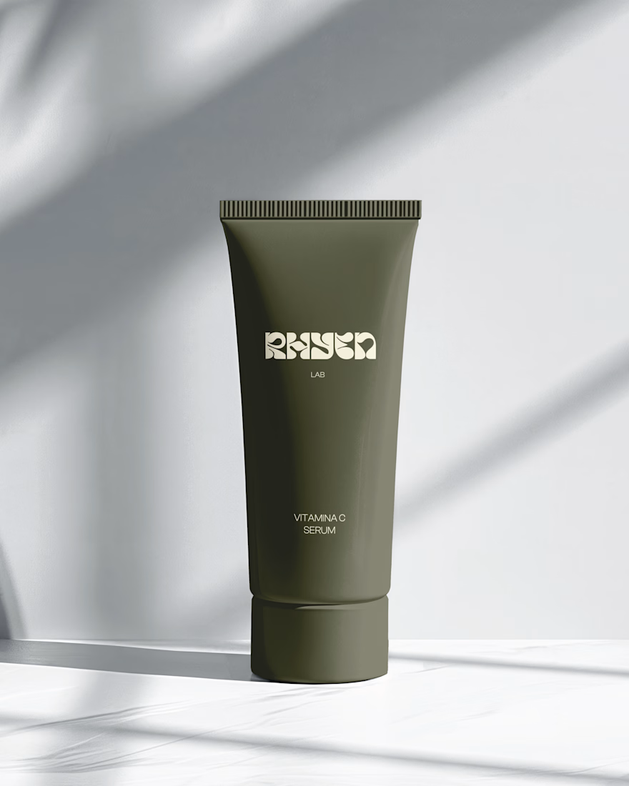
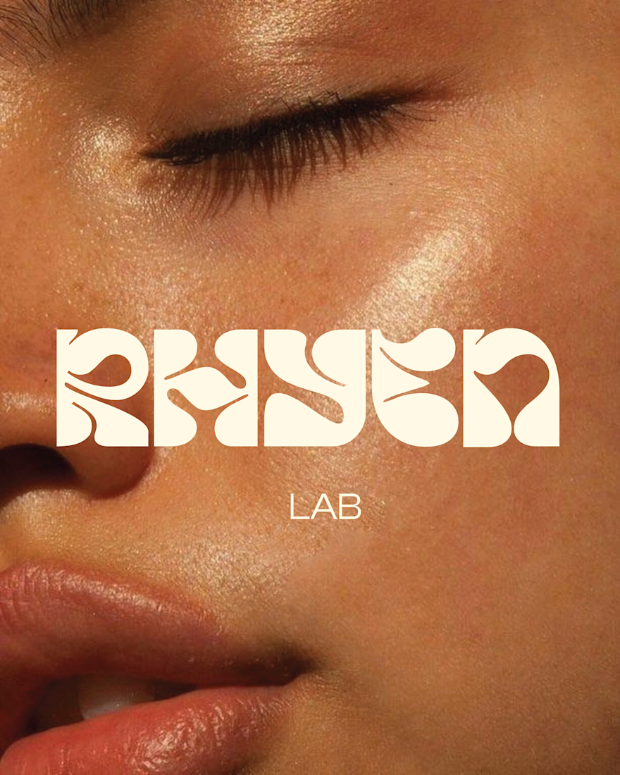
Rhyen Lab is a skincare brand built around science-backed formulas and a sensorial, human approach to beauty. The challenge was to create an identity that feels clinical enough to be trusted, yet warm and expressive enough to stand out in a crowded market.
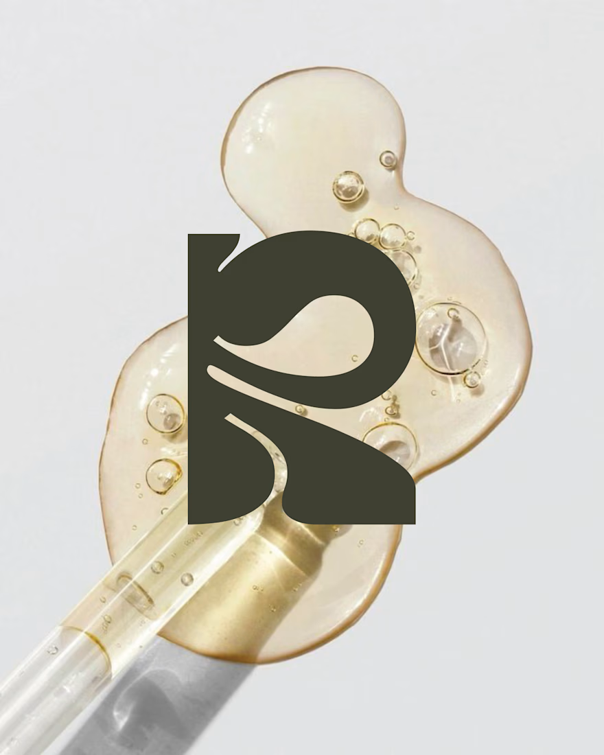
I designed a custom wordmark with fluid, organic letterforms that echo the texture of serums and oils, paired with a bold monogram “R” for compact applications. A palette of deep olive green and soft cream keeps the brand grounded, natural and premium, while macro photography of skin and product textures reinforces the sensorial tone.
The system was applied across packaging for the Vitamin C Serum, Facial Cleanser and Moisturising Day Cream, ensuring consistency across tubes and bottles.
Deliverables: Logo & monogram · Visual identity · Color palette · Packaging design · Art direction




Real eggs. No apologies 🥚
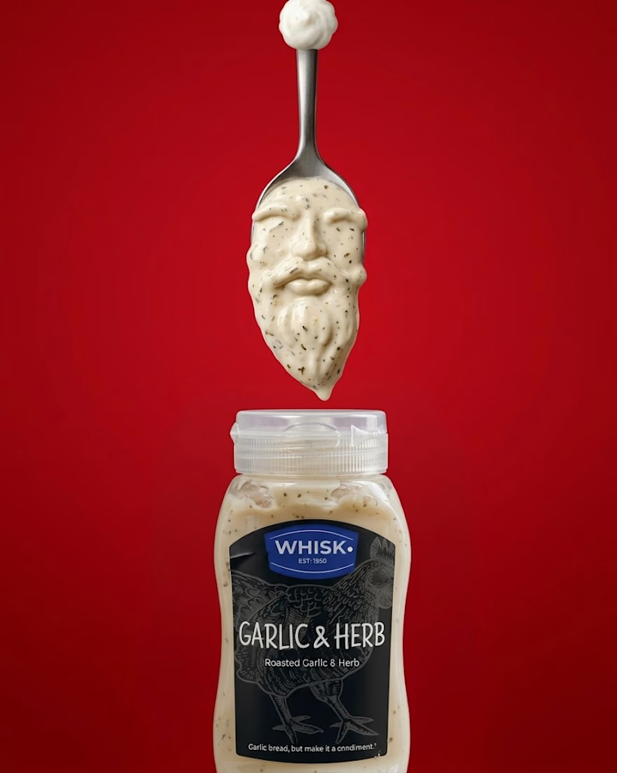
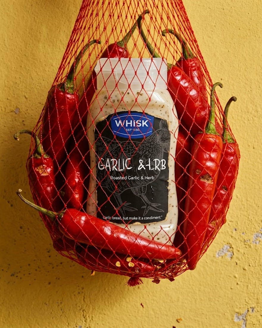
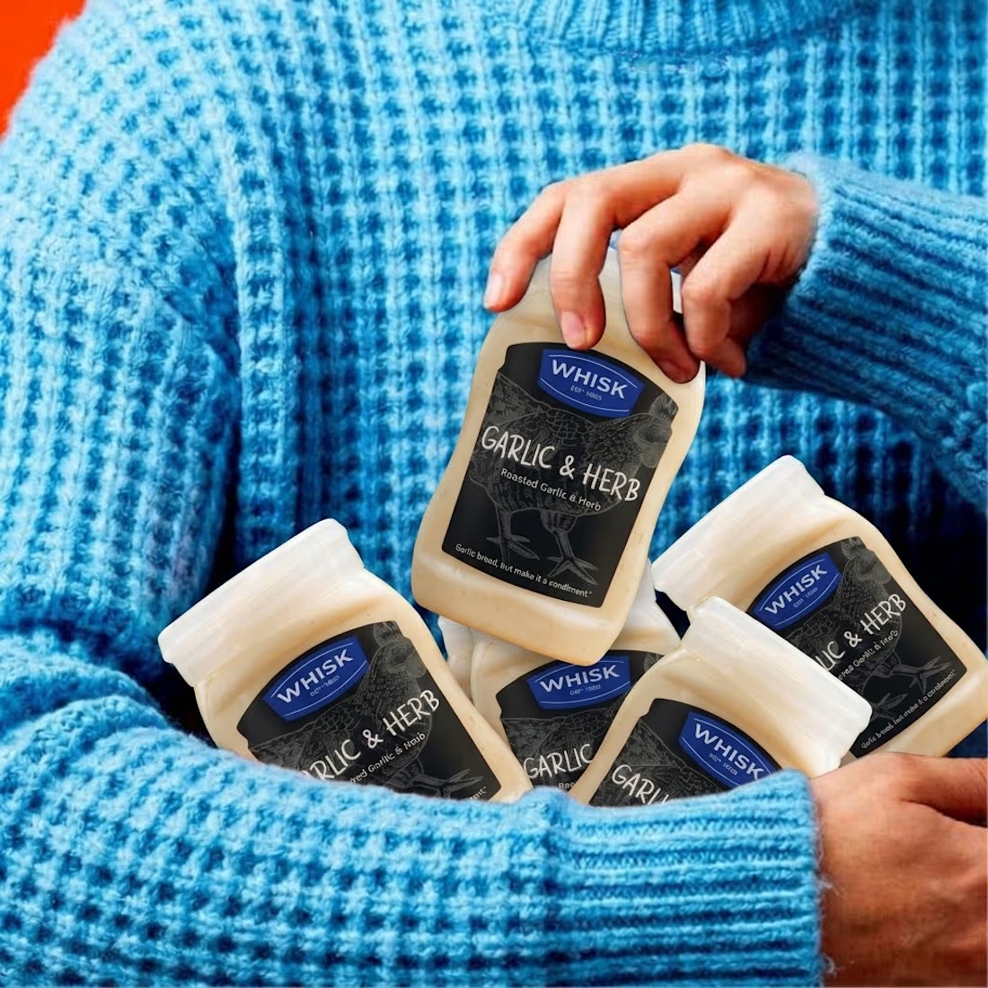
Spent the past week designing WHISK, an artisan mayonnaise brand built on one idea: even the most overlooked item in the fridge deserves a brand that takes it seriously.
No squeeze bottle, no label built to disappear into the shelf. Just a glass jar, a short ingredient list, and four flavors told apart by one accent color each. Classic, garlic and herb, smoked chili, vegan. 🫙
Sometimes the boldest thing a condiment can do is be particular about itself.


The animation looks top tier! Nice work


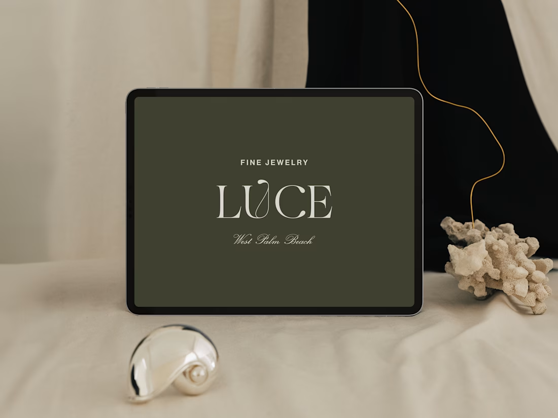
Introducing LUCE, a fresh chapter in four generations of fine jewelry.
Earthy greens, expressive typography, and thoughtful packaging bring warmth and personality to a brand rooted in heritage.
I worked with LUCE across brand strategy, visual identity, packaging experience, and full Shopify website design and development, bringing every detail into one cohesive world.


NEAT