The network for creativity
Join 1.25M professional creatives like you
Connect with clients, get discovered, and run your business 100% commission-free
Creatives on Contra have earned over $150M and we are just getting started
Back to feedPost

A Kajabi website doesn’t need more sections. It needs better decisions.
We recently worked on a course website where the original structure had too many navigation options, pricing was difficult to find, and the strongest social proof was nowhere near the purchase decision.
The fix wasn’t adding more content.
We simplified the navigation, made the main CTA obvious, brought testimonials closer to the offer, and made the path to checkout much shorter.
That’s one of the biggest things we’ve learned from working on Kajabi websites:
If everything is important, nothing is.
A premium course website should guide visitors toward one clear next step without making them figure it out themselves.



The network for creativity
Join 1.25M professional creatives like you
Connect with clients, get discovered, and run your business 100% commission-free
Creatives on Contra have earned over $150M and we are just getting started
Trending
retrofuturism
Share your favorite designs from the past exploring the distant future. Or your own take on the aesthetic 🚀
halftone
Dots. Texture. Grain. Let's see your designs using the halftone technique.

Midjourney
Creatives are showing off what they're making with Midjourney.
colorgrade
Video editors sound off: How do you enhance the mood of your video in color grading?


Related posts


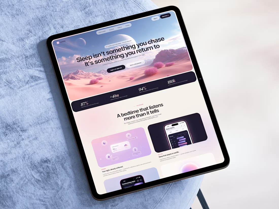
Just shared concept for a sleeping app website. 🌙
Would you use a website like this? I’d love to hear your thoughts! 💙


A truly inspiring project with outstanding creative direction.

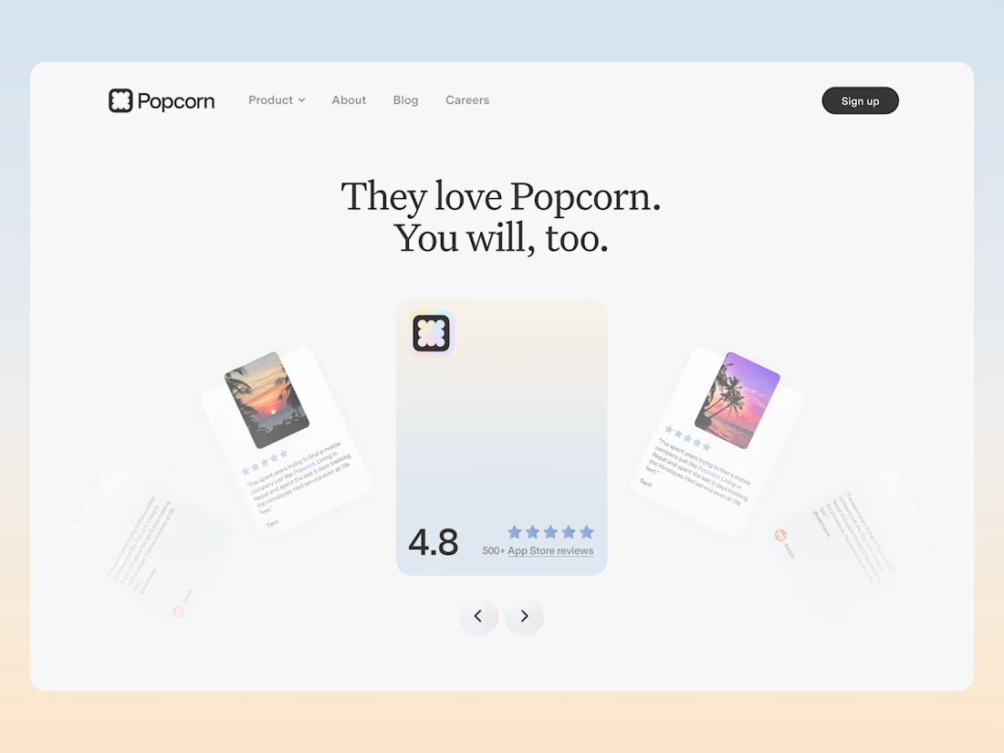
An exploration for the review section of Popcorn. Didn't make it live but i really liked it!


Yoo seems goood


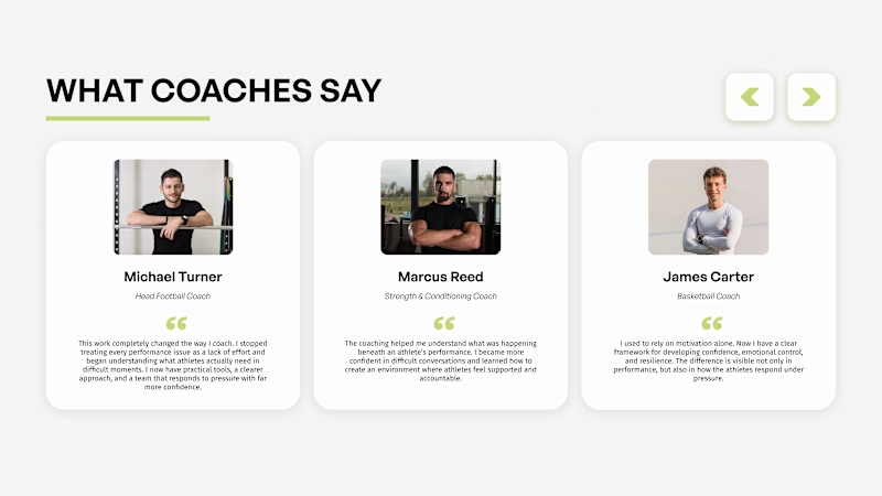
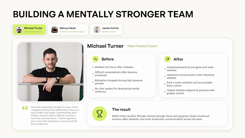
Which testimonial format actually builds more trust?
Three cards = fast trust. A visitor scans it in 3 seconds and thinks: "okay, multiple people vouch for this." Good for quick credibility on a landing page.
One detailed case study = deep trust. Before/after, specific context, a real transformation. It doesn't just say "this works" – it shows how and why. That's what turns a skeptical visitor into someone who actually reads to the end.
Short testimonials answer: "Do people like this?"
A case study answers: "Will this work for someone like me?"
Which format would make you trust the specialist more: three short testimonials or one detailed case study?

24 voted
28%
61 voted
72%
85 votes
Closed

single card looks great design