The network for creativity
Join 1.25M professional creatives like you
Connect with clients, get discovered, and run your business 100% commission-free
Creatives on Contra have earned over $150M and we are just getting started
Back to feedPost

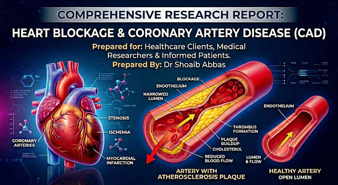
The Silent Killer: A Clinical Deep-Dive into Coronary Artery Disease & Heart Blockage.💢
Every 34 seconds, someone dies from heart disease. Most never saw it coming.🧠🩸

The network for creativity
Join 1.25M professional creatives like you
Connect with clients, get discovered, and run your business 100% commission-free
Creatives on Contra have earned over $150M and we are just getting started











Related posts

Your stationery is more than paper — it's an extension of your brand identity.
I design premium, classic, and modern stationery for businesses of all sizes, creating cohesive designs that reflect your brand's personality and professionalism.
My stationery design services include:
✦ Business cards
✦ Letterheads and envelopes
✦ Corporate folders and presentation sets
✦ Notepads and compliment slips
✦ Custom branded stationery collections
From individual stationery pieces to a complete corporate identity suite, every detail matters.
Looking to give your brand a more polished, professional appearance? Let's connect!
#StationeryDesign #BrandIdentity #GraphicDesign #BusinessBranding #CanvaDesigner #CorporateDesign #BrandDesign

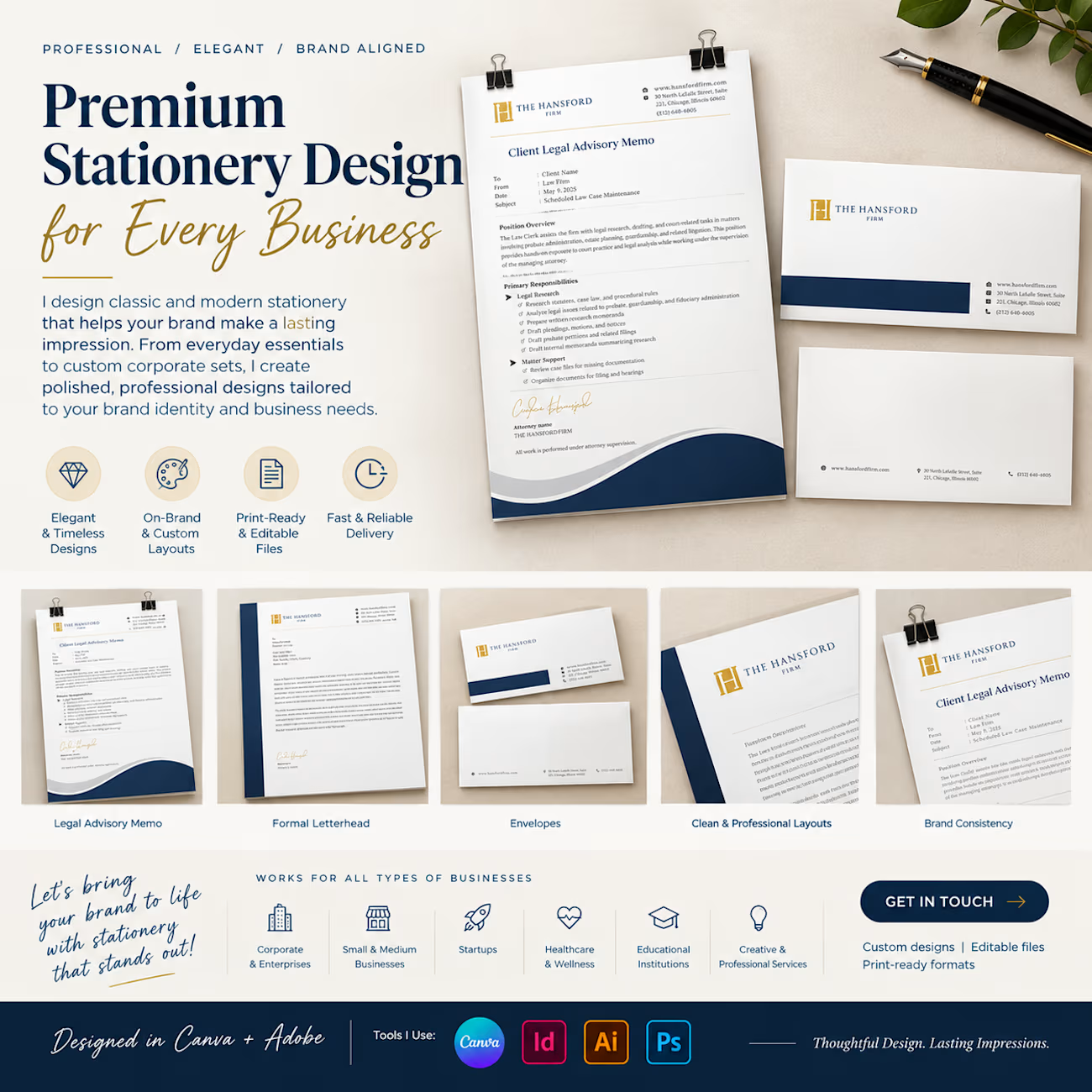


a full matching set like this just makes a desk feel put together.. compliment slips included

sentences
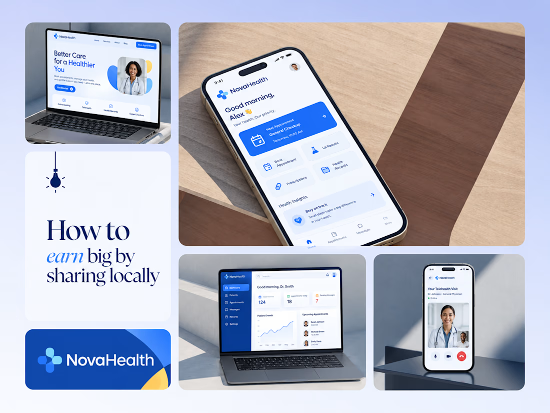
One brand, three screens: patient, doctor, and the video call between them.
NovaHealth is a healthcare brand and product system I designed from logo to apps. Healthcare software tends to feel either cold and clinical or too cluttered to open. I wanted something calm for a worried patient and quick for a doctor between appointments.
The logo breaks the classic medical cross into soft, rounded blocks in two blues, so it reads as “health” without feeling sterile.
The patient app opens with one thing: a solid blue card showing your next appointment. It’s the only fully saturated block on the screen, so nothing competes with it.
The doctor dashboard is built for a glance. Total patients, today’s appointments, and pending messages come first, in the same blue and rounded style as the patient app.
The telehealth screen has almost no UI. The doctor’s face fills the screen, with just three controls: mic, camera, and a red end-call button, the only red in the whole system.
One rule ties it together: blue means action, white space means calm, and yellow is a small spark of warmth.
Which screen should I break down next? 👇



Great medical brand design specially the phone app UI and top left laptop dashboard 🔥🔥🔥
great job Joshua ❤️🎉

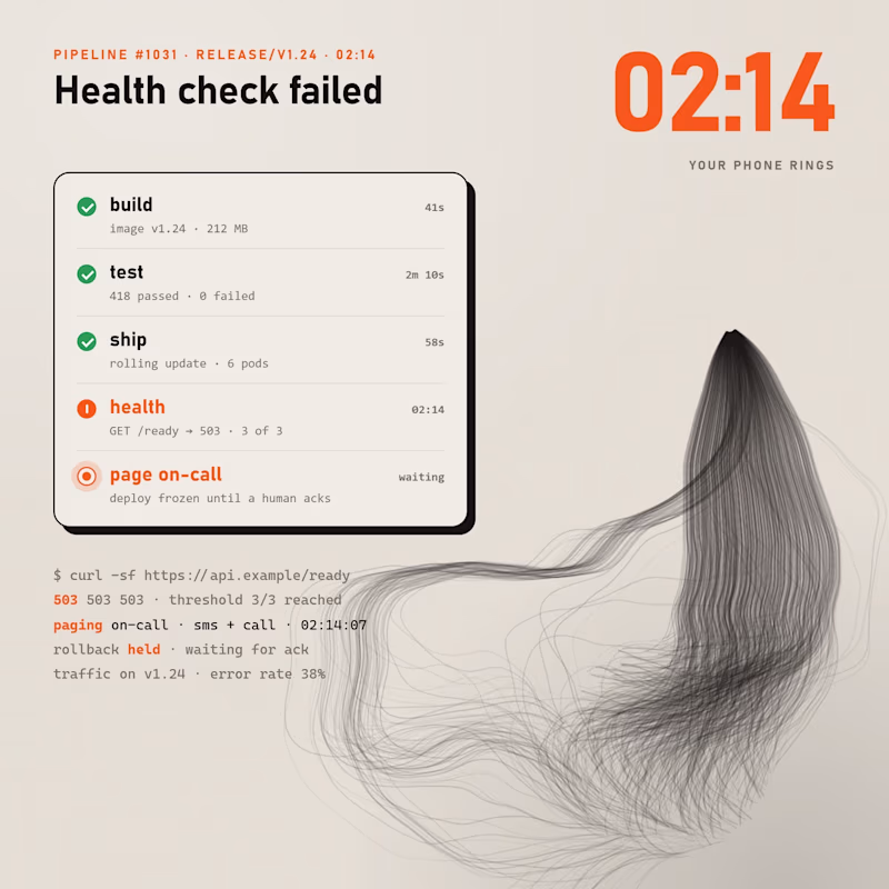
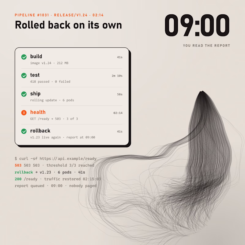
Health check fails at 2am. Left wakes a human and holds the rollback until someone acks. Right rolls back on its own in 41 seconds and you read about it at 9.
Same pipeline, same failure, drawn in the style of my CapCut World LA film.
Which one would you let touch production, and what would you need to see in the logs before trusting it?
0 voted
0%
1 voted
100%
1 vote
Closed