The network for creativity
Join 1.25M professional creatives like you
Connect with clients, get discovered, and run your business 100% commission-free
Creatives on Contra have earned over $150M and we are just getting started
Back to feedPost
From Default to Deliberate — An AI Design Critique . A structured before/after case study demonstrating how to diagnose and correct common AI-generated design failures


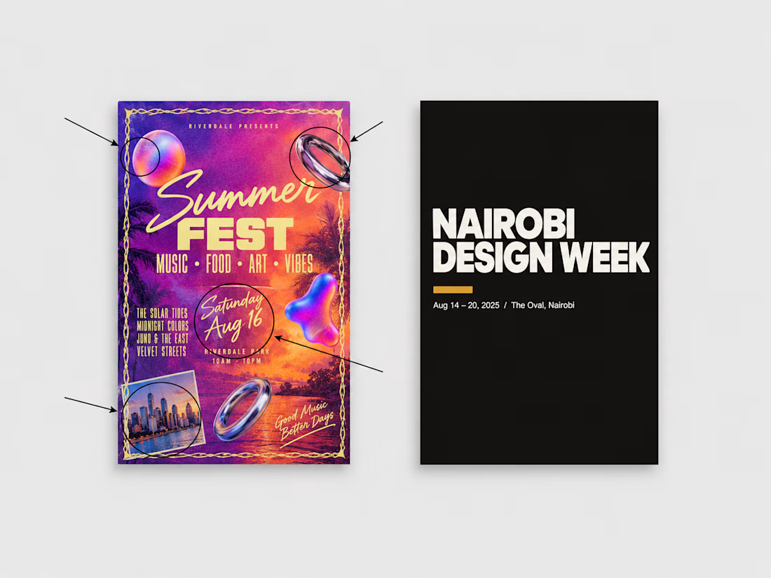

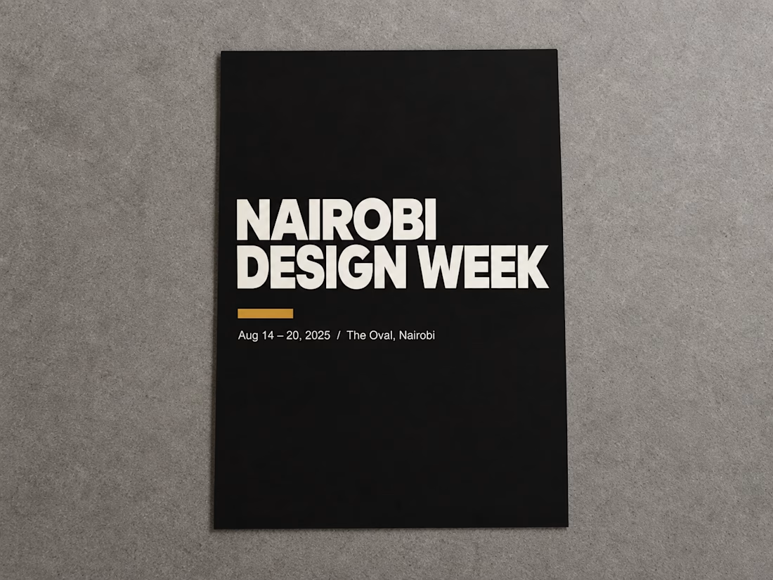

The pair makes a point that is easy to miss: the AI default isn't ugly, it's that every element is emphasized, so nothing is - and the fix is a hierarchy decision rather than a taste one. Which failure did you find hardest to name in a way a client could actually act on, the type hierarchy or the spacing?

Definitely the spacing. Type hierarchy is usually easier to point out because you can show exactly what needs to lead. Spacing feels more subjective to clients, even when it’s actually creating the same “everything is emphasized” problem.
The network for creativity
Join 1.25M professional creatives like you
Connect with clients, get discovered, and run your business 100% commission-free
Creatives on Contra have earned over $150M and we are just getting started



Related posts


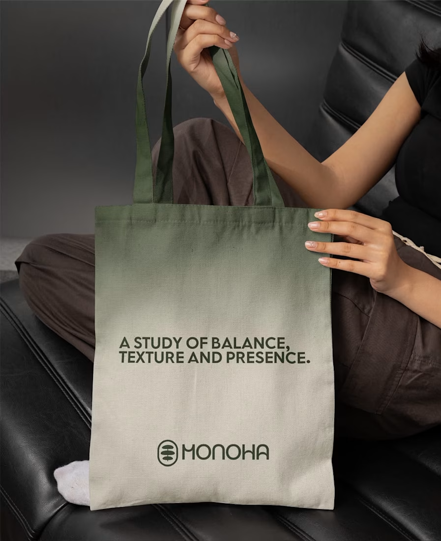
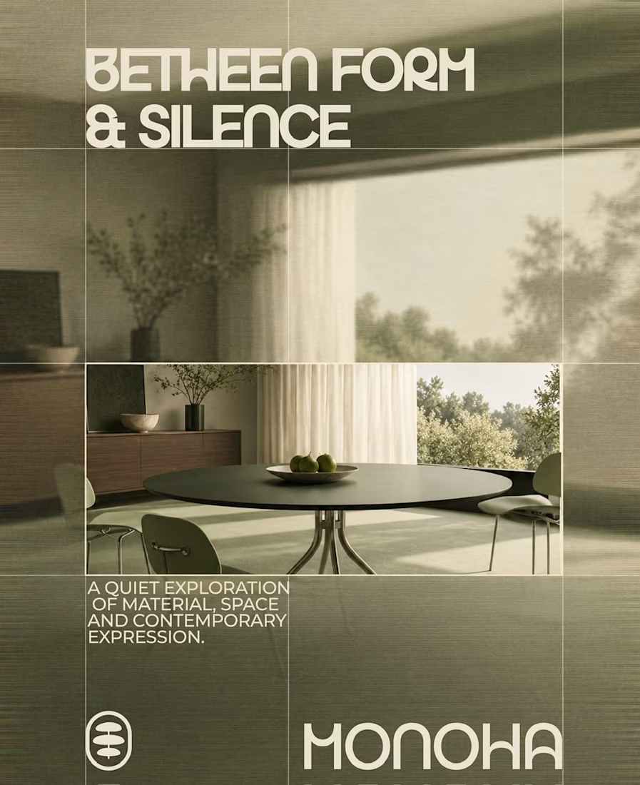
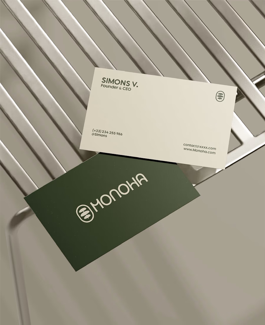

Great branding kit Alex 🎉🎉

Jordan Racing concept.
What if Jordan Brand launched its own racing team? We imagined the full launch, from the Speed Demon campaign and posters to a telemetry inspired website, racing streetwear and a flagship research facility. Basketball heritage meets Formula 1 speed.
Designed by Studio /03
Concept project, not affiliated with Nike or Jordan Brand.
Art Direction, Brand Identity, Campaign Design, Web Design, Poster Design, Apparel Graphics, Motorsport, Concept

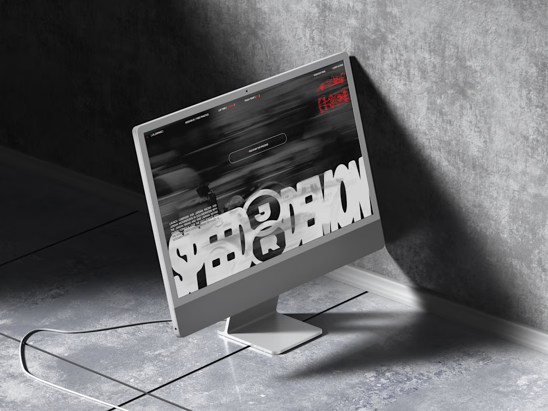
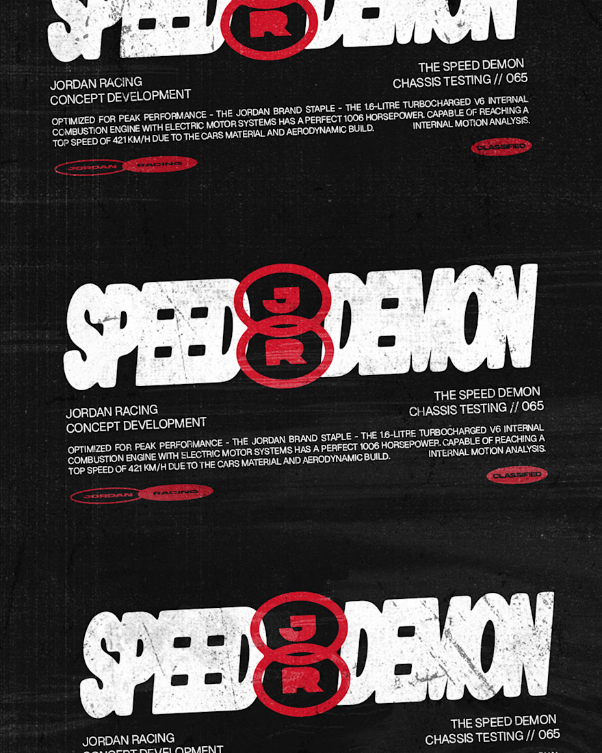
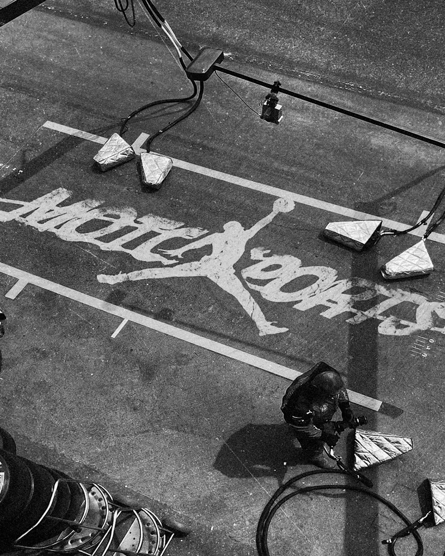
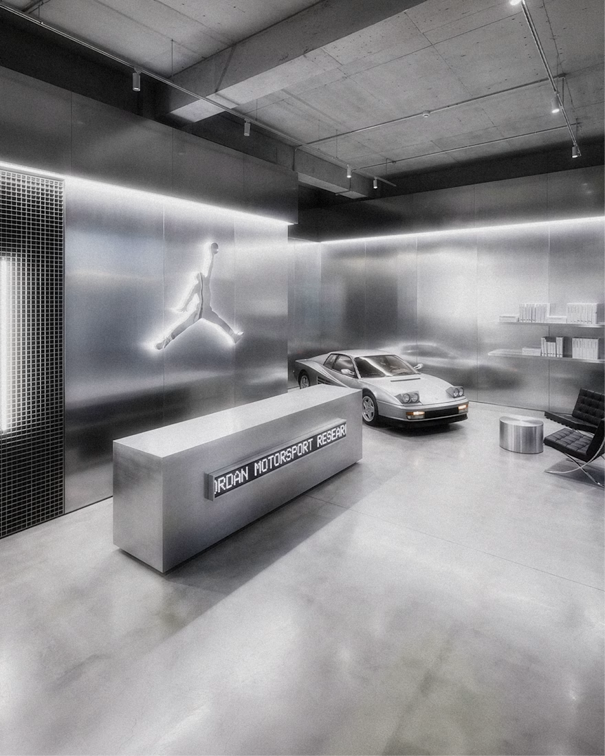

The grayscale with that one red accent keeps the whole system tight. Telemetry style site is a smart touch.

Which N works better? 🗳️
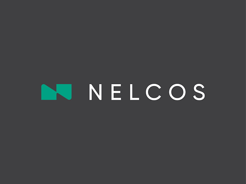
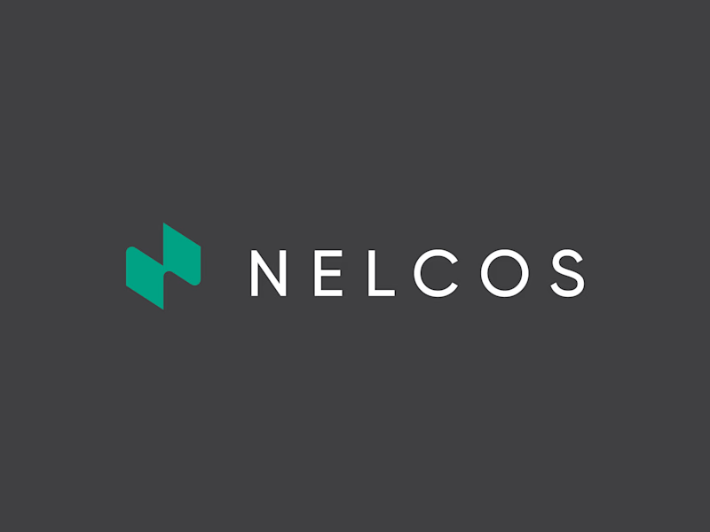
Worked on a logo for Nelcos, a Canadian company that refinishes interiors with architectural film instead of replacing them.
The idea: an unrolled roll of film that turns into the letter N.
The green is there to highlight eco-friendliness: less demolition, less waste.
Two directions for the symbol:
A: rectangular, compact
B: hexagonal, more dynamic
Vote and tell me why in the comments 👇
logodesignlogodesignerbrandidentityLogo DesignBrand DesignGraphic DesignAdobe IllustratorAdobe Photoshop
6 voted
43%
8 voted
57%
14 votes
Closed

Love the concept! The rectangular N feels more architectural and stable, which fits interiors. Hexagonal feels too techy. The unrolled film idea is brilliant - green for eco is perfect. I'd vote rectangular for this brand. Great work! 👏