The network for creativity
Join 1.25M professional creatives like you
Connect with clients, get discovered, and run your business 100% commission-free
Creatives on Contra have earned over $150M and we are just getting started
Back to feedPost
Image Vs Design 😊
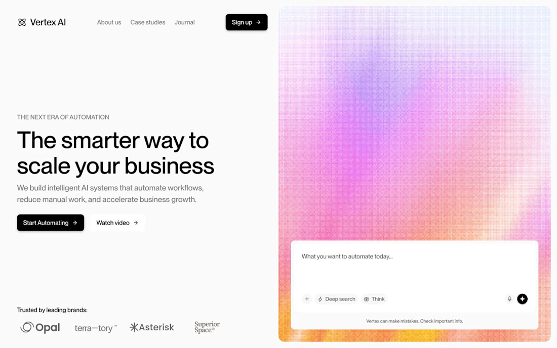

haha that left image is me before coffee and right one after. design always wins over raw image

Hahah good one
The network for creativity
Join 1.25M professional creatives like you
Connect with clients, get discovered, and run your business 100% commission-free
Creatives on Contra have earned over $150M and we are just getting started
Related posts

Everything starts from DESIGN. ✨
No product, no story without design.
Design is the foundation for everything,
and it starts with MIND. 🧠
If you agree, comment "YES" 👇

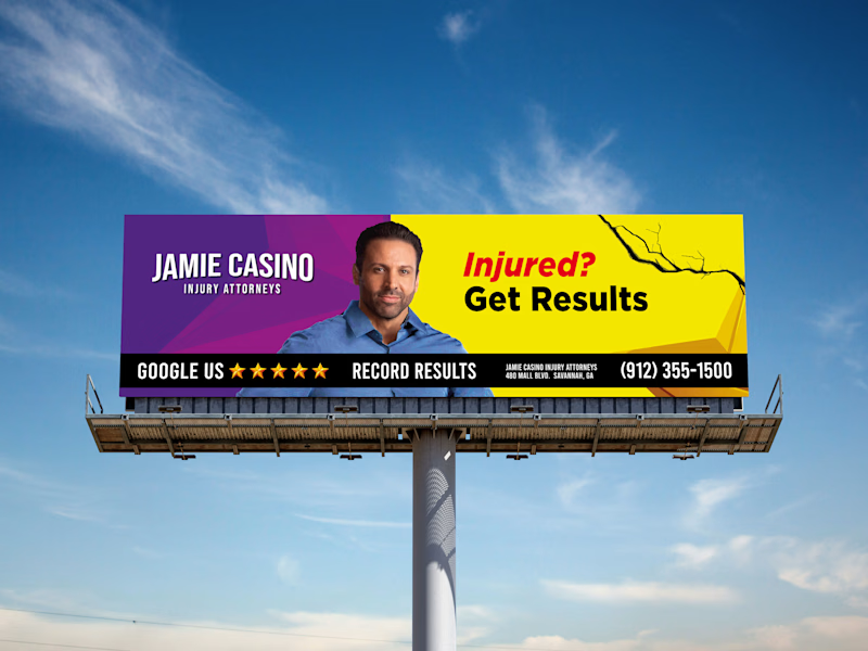
Design A vs. Design B — Which One Wins?
Every design decision makes a difference. I'd love to hear your perspective!
Which concept do you think works best in terms of visual impact, layout, and overall effectiveness?
🔹 Option A
🔹 Option B
Drop your choice in the comments and tell me why. I'd love to hear your thoughts!
0 voted
0%

3 voted
100%
3 votes
Closed

I'd go B: the yellow headline pops against the blue sky and the phone number gives drivers a next step. Did you test a version with fewer words in the small print line?

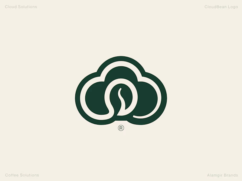
Human Design vs. AI: CloudBean Logo Concept ☁️☕️
When building a brand identity, execution and detail make all the difference. I put together two concepts for CloudBean—one crafted by hand (forest green) and another generated with AI.
The Handcrafted Version (Forest Green): Features a refined, balanced monogram seamlessly integrating the cloud shape with a coffee bean, complete with thoughtful typography styling and a polished mark.
The AI Version (Brown Gradient): Offers a quick interpretation, placing a tilted bean inside an open cloud outline with a standard gradient.
Which direction feels stronger for the brand? Let me know your thoughts in the comments! 👇
#Branding #LogoDesign #DesignProcess #VisualIdentity #Contra
3 voted
100%
0 voted
0%

3 votes
Closed

Handcrafted wins! That cloud + bean lockup is clever and the detail in execution shows. Human touch still unbeatable for brand identity. 🔥