The network for creativity
Join 1.25M professional creatives like you
Connect with clients, get discovered, and run your business 100% commission-free
Creatives on Contra have earned over $150M and we are just getting started
Back to feedPost

A landing page concept for an AI-powered precision agriculture platform.
Combining satellite hyperspectral imaging, drone technology, IoT integration, and clean SaaS UI to create a modern digital experience for the future of farming.
Designed with a minimalist layout, strong typography, immersive imagery, and data-focused components.


The network for creativity
Join 1.25M professional creatives like you
Connect with clients, get discovered, and run your business 100% commission-free
Creatives on Contra have earned over $150M and we are just getting started

Related posts

Same company, two different concepts for an AI storytelling platform. Which one suits better?
31 voted
86%
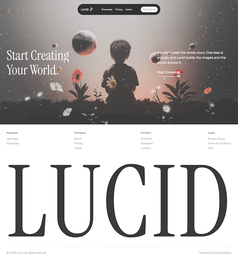
5 voted
14%
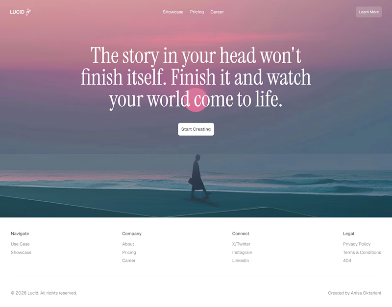
36 votes
Closed

Left!

I've spent years obsessing over the stuff nobody notices on a website. Until it's missing.
AI can now build a whole site in an afternoon. I think that's great.
But it still can't decide what feels right.
I don't think AI is the problem. It just stops at "it works". The last part, the spacing, the type, the way things move when you scroll, still needs someone who cares about it.
That's the part I've always loved doing. So I made a small thing around it: you bring the site AI built, I finish it in Webflow.
It's called Verdikt https://verdikt.studio


Agreed. AI gets you a working layout fast, but spacing and type rhythm are where it still feels off. I'd add forms and mobile checks to that list too. What's the most common fix people bring you?

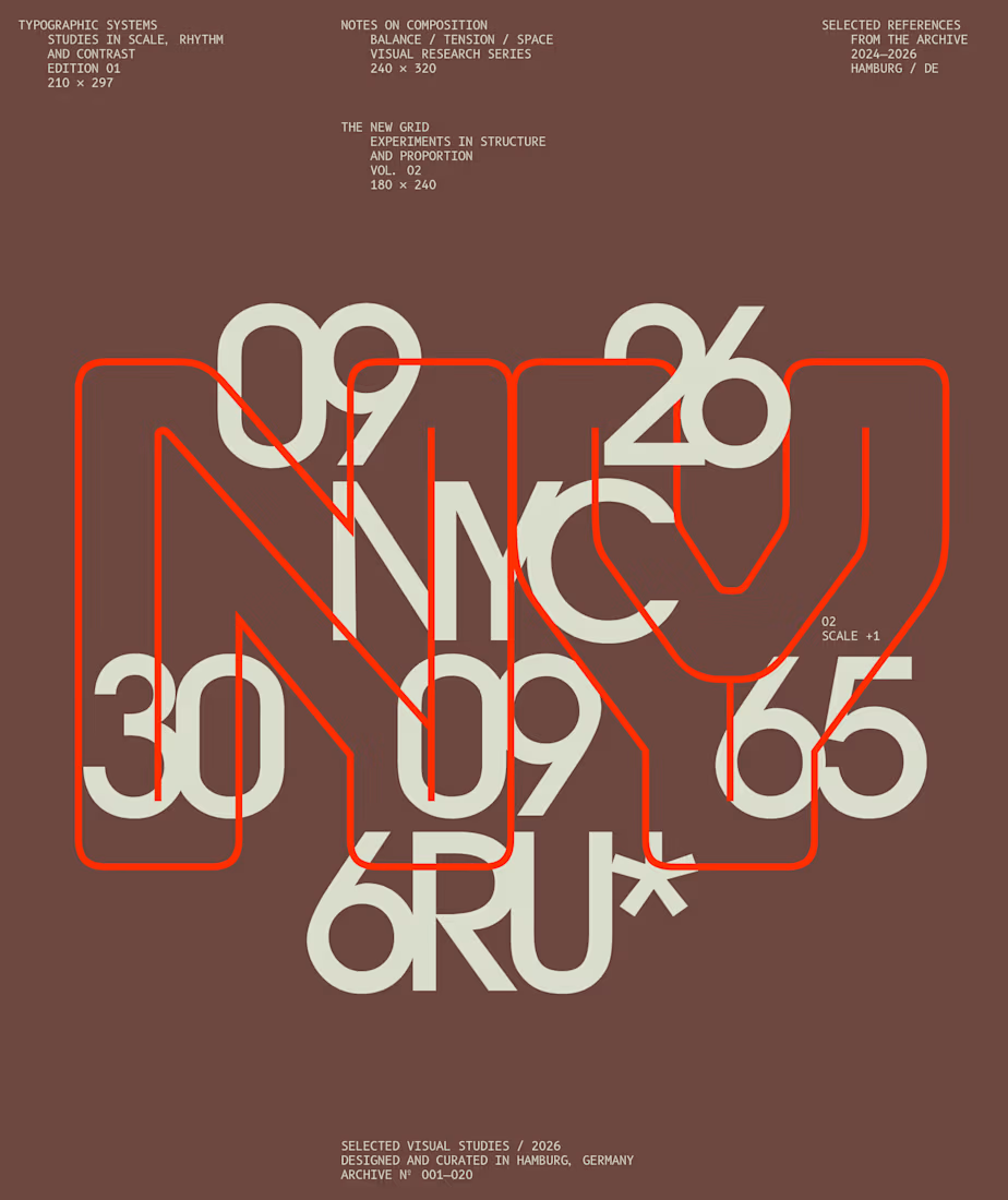
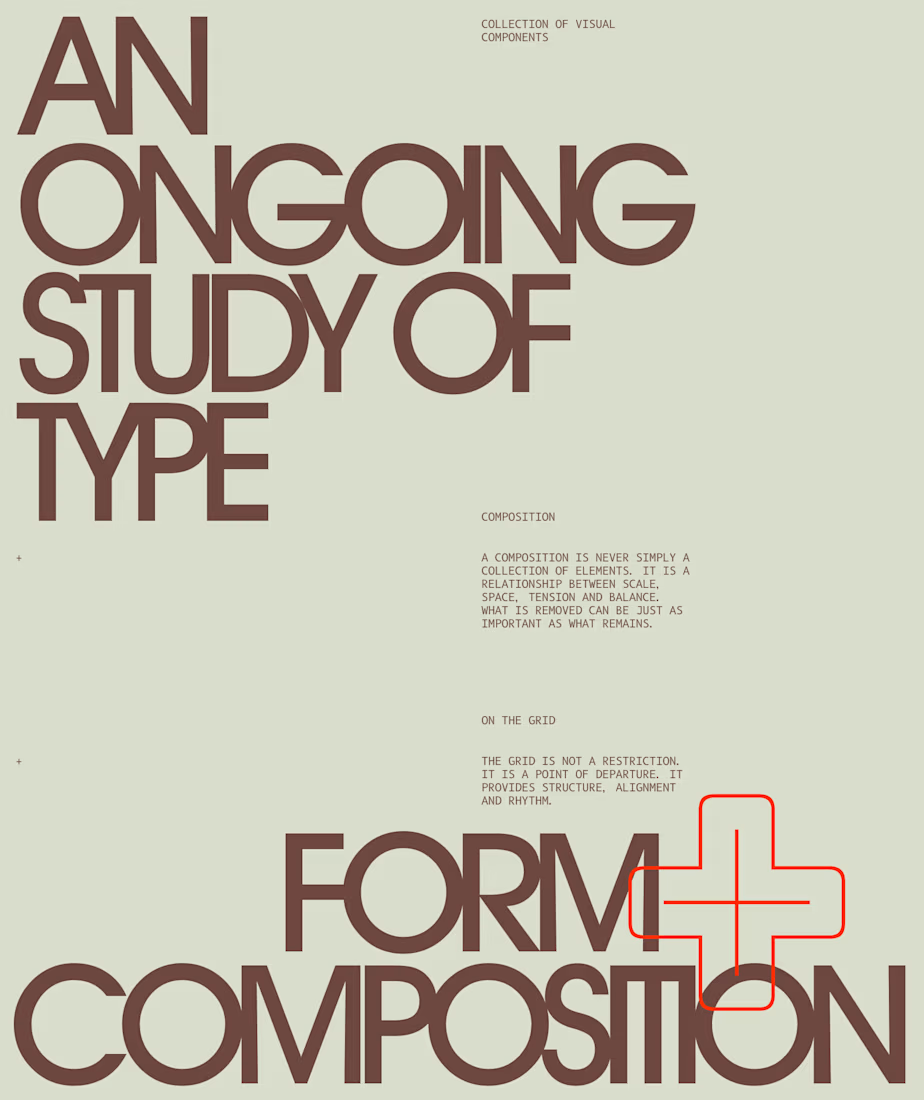
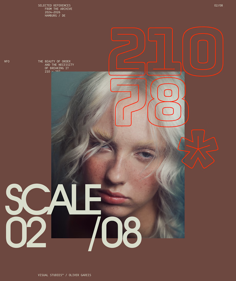
I designed these typographic layouts as part of my ongoing visual series on scale, grid and rhythm
↳ Master typography & layout - The foundation of timeless web design. Join 350+ designers inside my 13-hour online course https://typomonday.com/course

Beautiful wo