The network for creativity
Join 1.25M professional creatives like you
Connect with clients, get discovered, and run your business 100% commission-free
Creatives on Contra have earned over $150M and we are just getting started
Back to feedPost
Taste Test
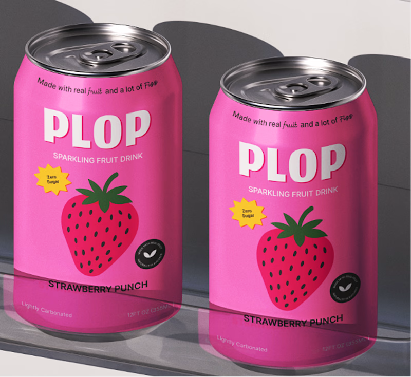
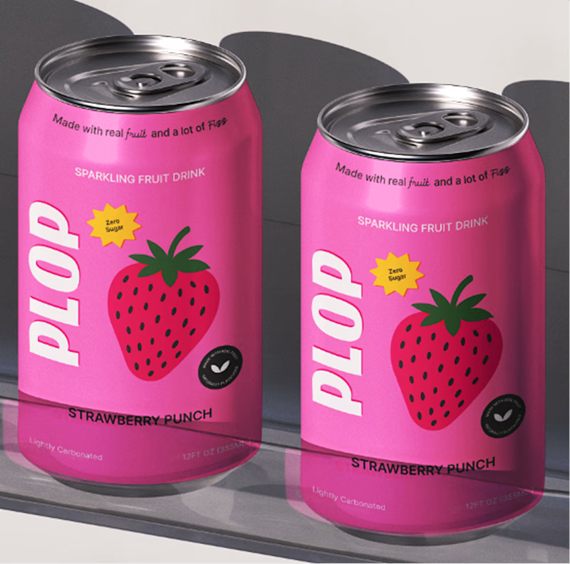
I’m working on the packaging for PLOP, a playful sparkling fruit drink, and I’ve been experimenting with the front-of-can layout.
Which one feels stronger?
15 votes
Ends in 1d

Option B looks much better. The one with the Plop placed on the side just doesnt feel right


I agree Abdul the first one seems more playful to me what about you.
I agree with you Karan!

Curious what are your views about option 1
The network for creativity
Join 1.25M professional creatives like you
Connect with clients, get discovered, and run your business 100% commission-free
Creatives on Contra have earned over $150M and we are just getting started
Trending
retrofuturism
Share your favorite designs from the past exploring the distant future. Or your own take on the aesthetic 🚀
halftone
Dots. Texture. Grain. Let's see your designs using the halftone technique.

Midjourney
Creatives are showing off what they're making with Midjourney.
colorgrade
Video editors sound off: How do you enhance the mood of your video in color grading?
Related posts



1, great work 🙌

Can't choose the cover, need you guys!

18 voted
33%
37 voted
67%
55 votes
Closed

Toast for Golden Hour 🍩

Two Framer projects. Two completely different directions.
Same tool. Different visual language.
COVEX — dark, editorial, premium.
Built for AI agencies, automation studios, and technology brands.
FORMA — bold, colorful, expressive.
Built for creative studios, design agencies, and multidisciplinary teams.
I like working across different styles instead of forcing every project into the same visual system.
Both are built in Framer and available to use for free.
Which direction do you prefer — COVEX or FORMA?
#Framer #FramerDesigner #WebDesign #UIUX #CreativeStudio #WebDesignInspiration

16 voted
80%
4 voted
20%
20 votes
Closed

I personally like warm colors.. But I this case I like the layout of the Forma Atelier more.