The network for creativity
Join 1.25M professional creatives like you
Connect with clients, get discovered, and run your business 100% commission-free
Creatives on Contra have earned over $150M and we are just getting started
Back to feedPost
Taste Test
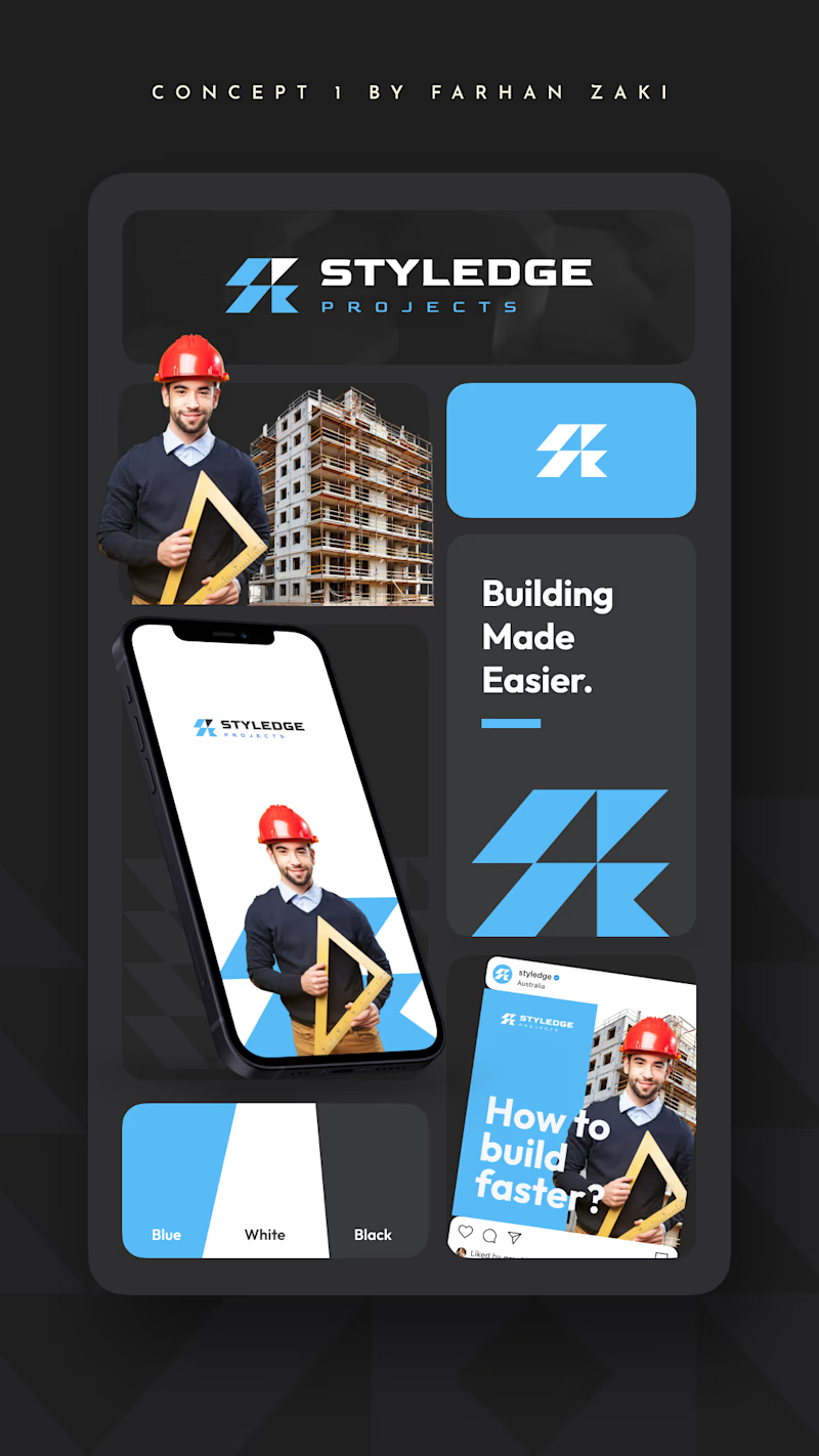
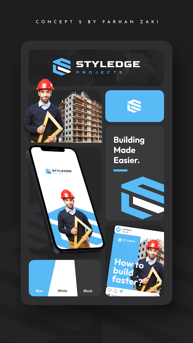
If you are the logo designer, which one do you choose for a building company in 2026? And whats your reason?
1 vote
Ends in 23h

Concept 2 for me. The stacked planes inside the hexagon read as structure and layers, which suits a construction brand, while Concept 1's mark could belong to a tech or logistics company just as easily. One thing I'd check is whether the S in Concept 2 stays readable next to the wordmark, since it's fairly abstract.

Nice explanation! Thank you

Concept 2 logo is better in it's design and details ❤️❤️
Great job Farhan🎉🎉🎉
Thank you Mostafa!
Pardon Farhan ❤️
The network for creativity
Join 1.25M professional creatives like you
Connect with clients, get discovered, and run your business 100% commission-free
Creatives on Contra have earned over $150M and we are just getting started







Related posts


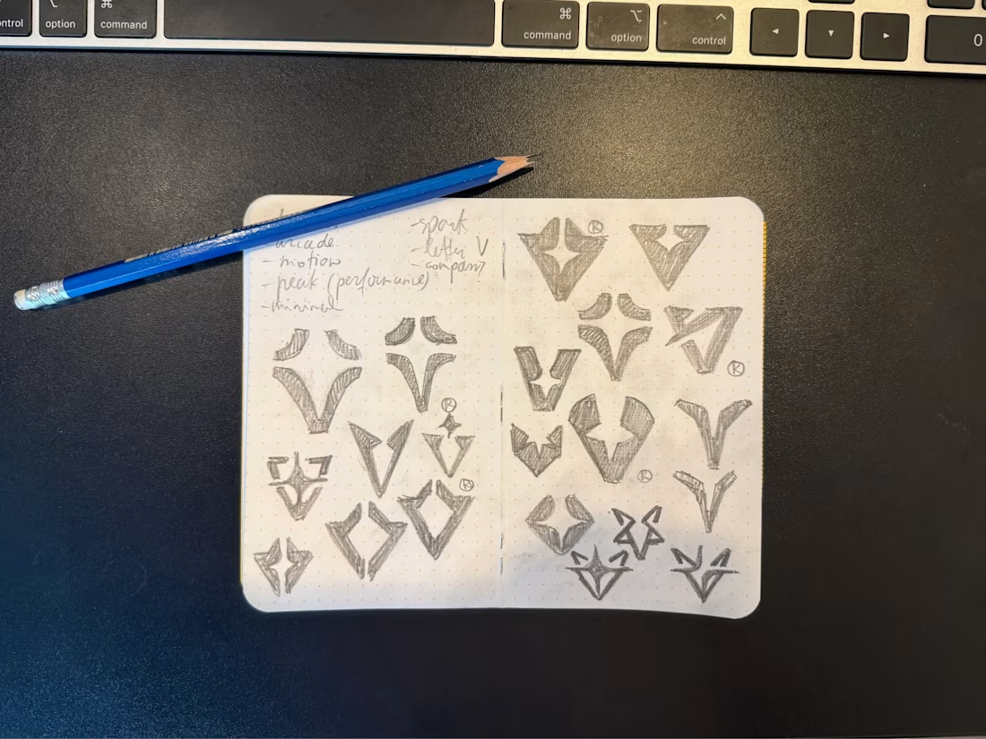

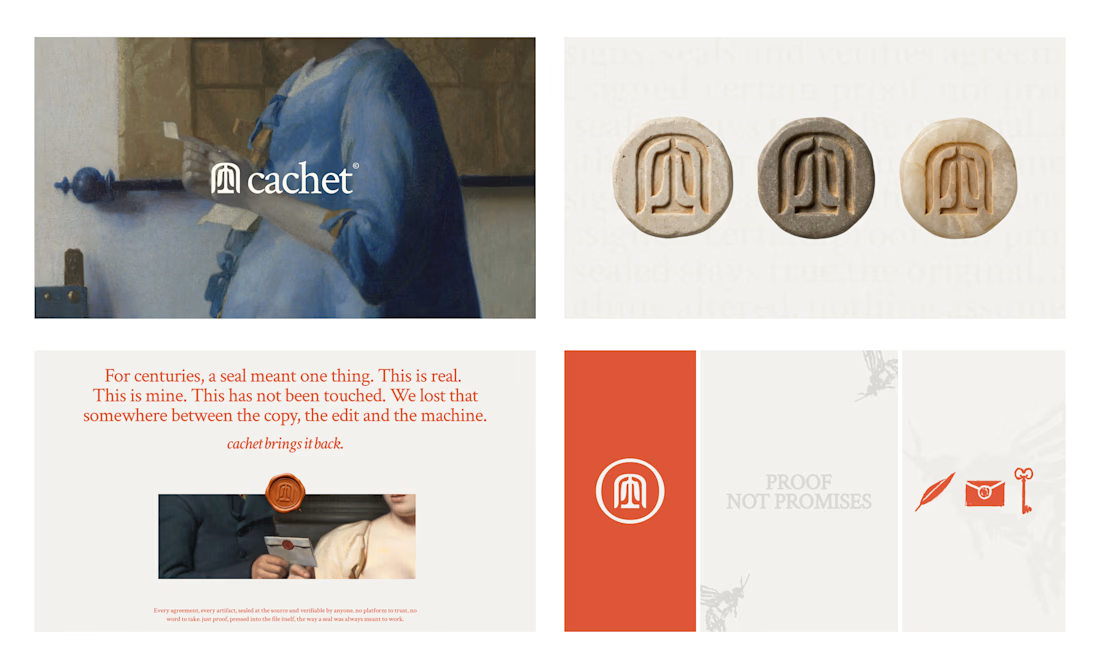
Cachet brand exploration.
Exploring patterns, textures, materials and hand-drawn illustrations
That's interesting I like it that's really unique ❤️❤️🎉🎉

Branding identity completed for Spotlesz in just few days!