The network for creativity
Join 1.25M professional creatives like you
Connect with clients, get discovered, and run your business 100% commission-free
Creatives on Contra have earned over $150M and we are just getting started
Back to feedPost
Same brand. Completely different presence.
Crafted Comfort had the products — but the website wasn’t doing them justice.
I reworked it from a catalogue-style storefront into a warmer, more editorial ecommerce experience built around space, context and product storytelling.
Before → After
Independent concept redesign.

Very nice 👌

Thanks
The network for creativity
Join 1.25M professional creatives like you
Connect with clients, get discovered, and run your business 100% commission-free
Creatives on Contra have earned over $150M and we are just getting started











Related posts


Gorgeous 😍


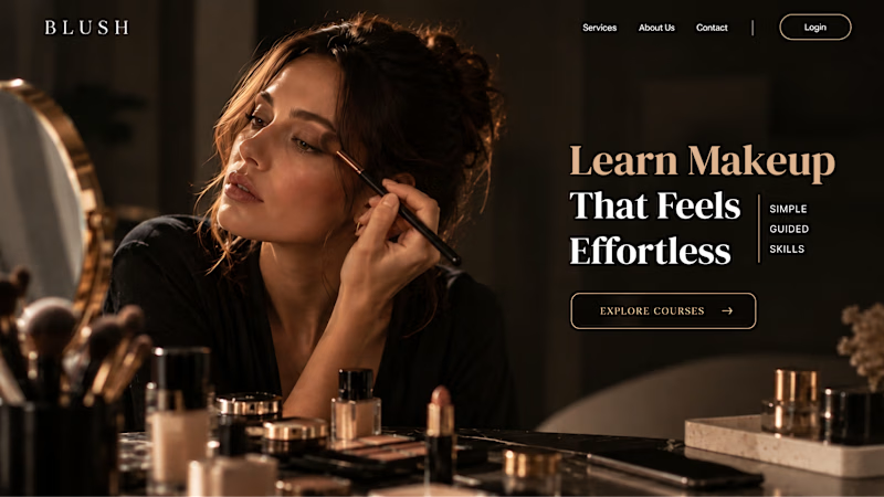
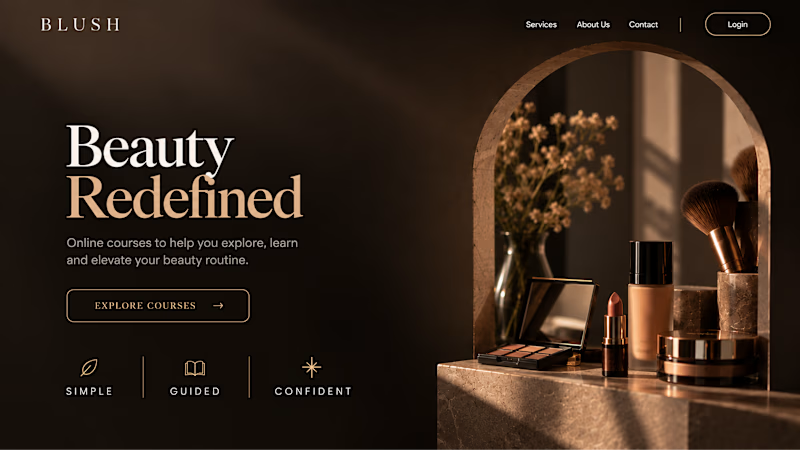
Your Hero Section Has One Job: Be Clear.
You don’t need huge headlines or long explanations. You need the right image + short headline + clear offer.
For the first version, we worked on the branding, the image and the copy together, so at first glance it’s clear: this is a makeup course, and here’s what you’ll get.
The second version is still beautiful and still feels like beauty. But what are you actually getting? A makeup course? Products? A store? That’s the problem with a Hero that looks good but isn’t thought through.
Your first screen doesn’t need to say everything. It just needs to say the right thing.

22 voted
61%
14 voted
39%
36 votes
Closed


What makes someone stop scrolling and imagine themselves living in a property?
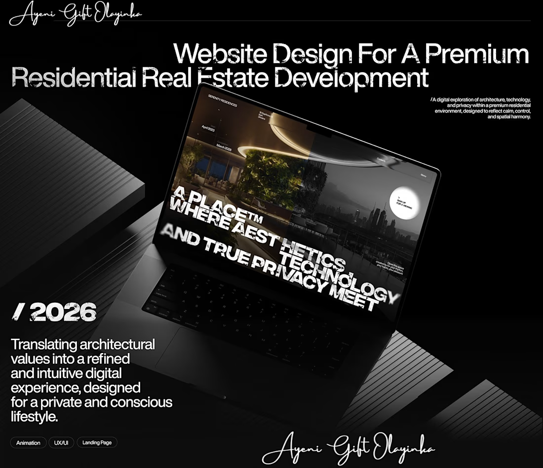
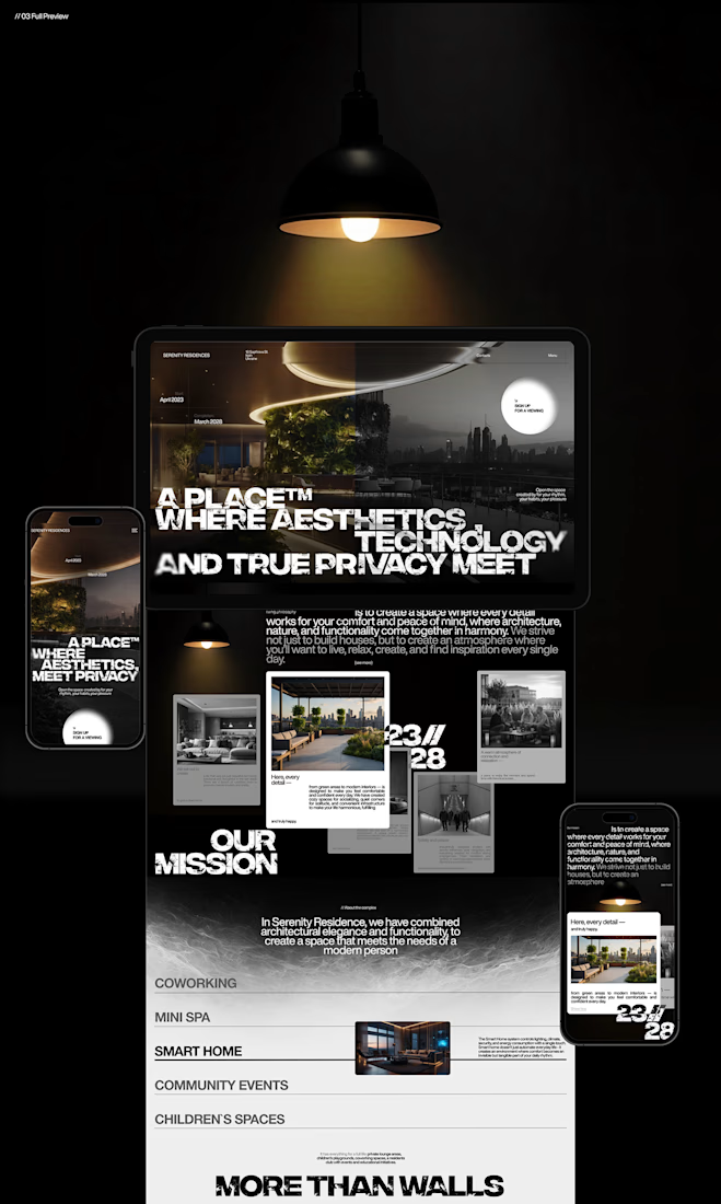
That's something I kept in mind while working on this luxury real estate website concept.
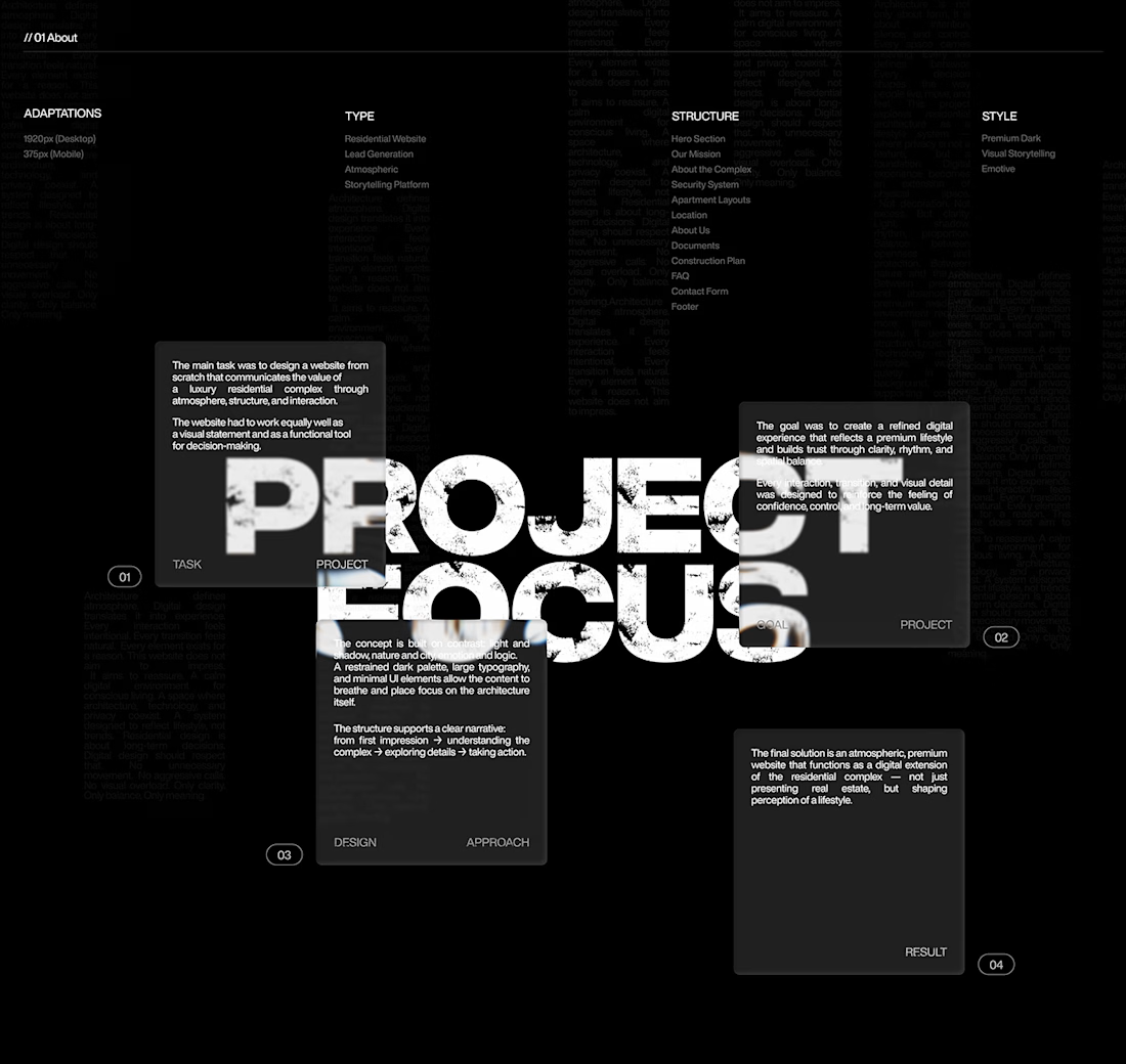
I wanted the design to feel premium without making the experience complicated. The focus was on strong visuals, clean layouts, and a clear structure that lets the properties speak for themselves.
I also paid attention to how visitors move through the website, from their first impression to exploring the properties and taking the next step.
Because when someone is looking for a home, the experience matters just as much as the presentation.
I couldn't fit every screen into this post, so I'll share more of the design in the comments. 👇
I'm curious: when you visit a real estate website, what makes you want to explore further?
#WebDesign #Architecture #LuxuryRealEstate #UIUXDesign #RealEstate #Figma



nice work