The network for creativity
Join 1.25M professional creatives like you
Connect with clients, get discovered, and run your business 100% commission-free
Creatives on Contra have earned over $150M and we are just getting started
Back to feedPost

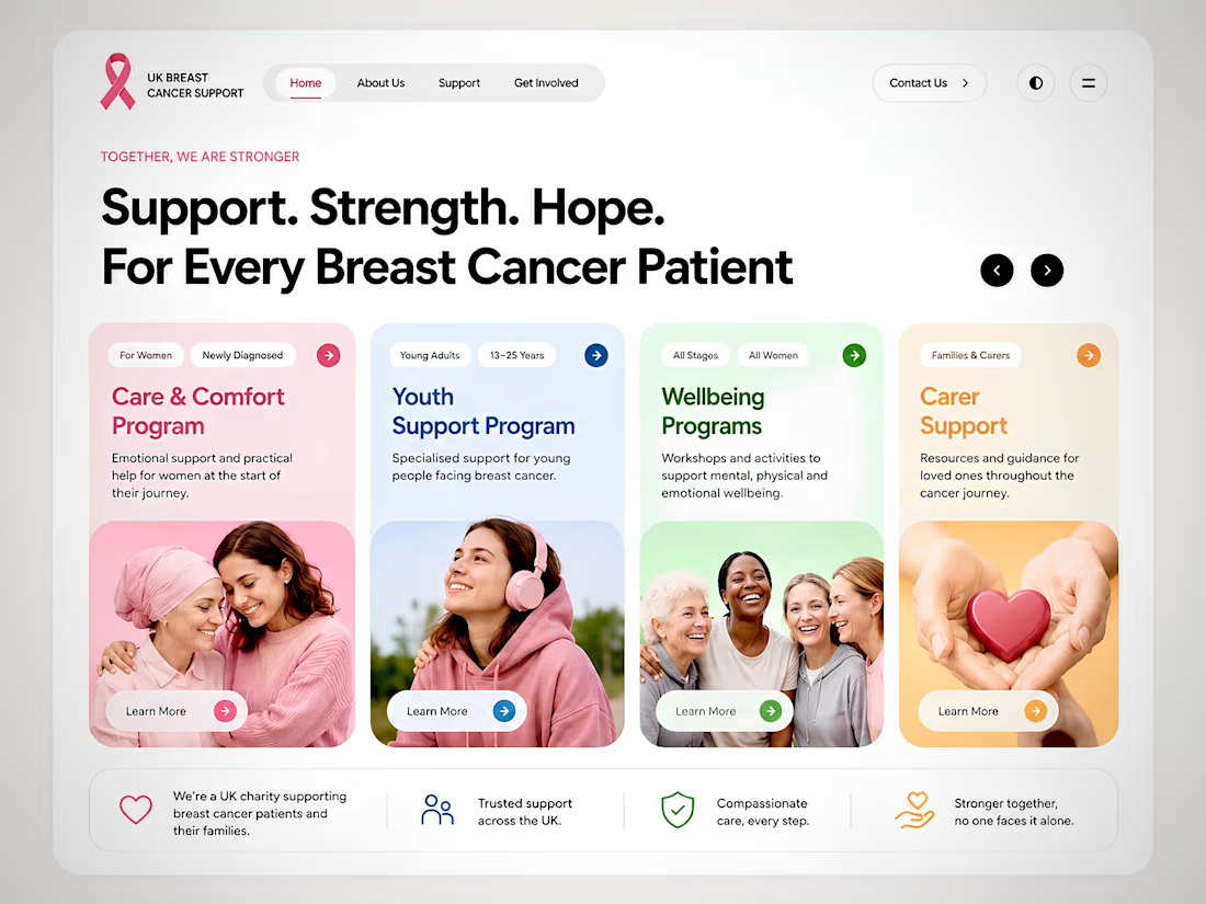
Designing Hope Through Clarity, Not Complexity
Healthcare and charity websites often try to communicate everything at once, which can overwhelm people who are already under emotional stress. For this concept, I kept the interface intentionally minimal so visitors can immediately understand where to go and what support is available.
The multicolour card system gives every support pathway its own visual identity, making it easier to scan and remember. Instead of relying on decoration, colour is used as a navigation tool that helps users distinguish services such as emotional support, wellbeing, youth programmes, and carer resources at a glance.
The hover interactions are subtle by design. They provide clear feedback, reinforce interactivity, and improve accessibility without distracting from the content. Every animation has a purpose: increasing confidence, reducing hesitation, and guiding users toward the next step.
In healthcare UX, trust is built through clarity, consistency, and empathy. Good design doesn't just look beautiful. It helps people find the support they need when they need it most.


The network for creativity
Join 1.25M professional creatives like you
Connect with clients, get discovered, and run your business 100% commission-free
Creatives on Contra have earned over $150M and we are just getting started






Trending

Claude
Claude has entered the design space. How are you using it?

Contra University
Learn from expert creatives how to earn more using next-gen AI tools.
Brand Design
The best brand designers are on Contra. Scroll to see what's trending in brand design. What are you building?
creativeaiflow
Creative AI workflows are evolving. What tools do you use, and what are their strengths and weaknesses?
freelancerlife
Freelancer life is wins, pivots, and everything in between. What’s yours right now?
Related posts



Impressive design. The branding feels strong and consistent.

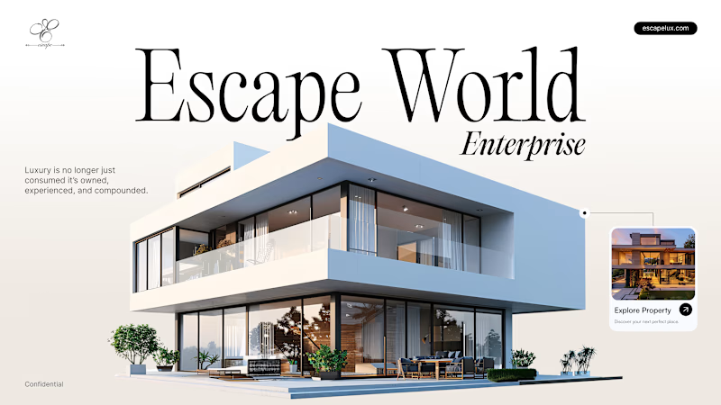
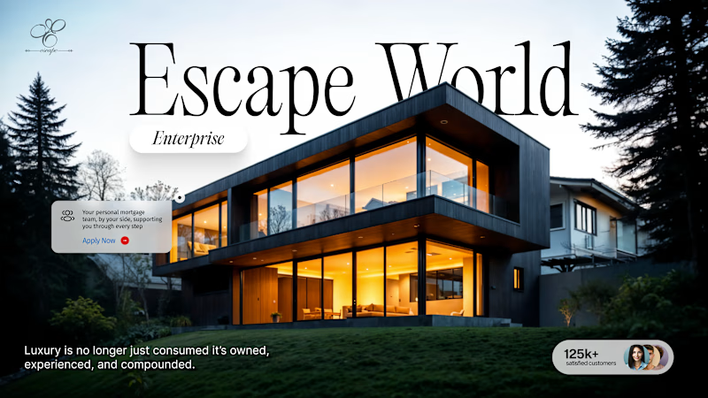
"Luxury is no longer just consumed, it's owned, experienced, and compounded."
Two different ways to sell the dream.
Which hero makes you click "Explore"? 👇
16 voted
23%
53 voted
77%
69 votes
Closed

Cinematic twilight for me. 🌆 That golden-hour mood makes luxury feel like something you step into.


Awesome!