The network for creativity
Join 1.25M professional creatives like you
Connect with clients, get discovered, and run your business 100% commission-free
Creatives on Contra have earned over $150M and we are just getting started
Back to feedPost

Hii!!
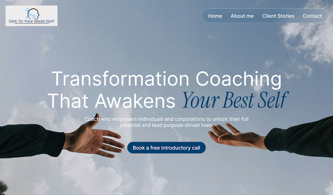
I wanted to share my practice of redesigning the main section of the website for transformation coach. 👩🏻💻
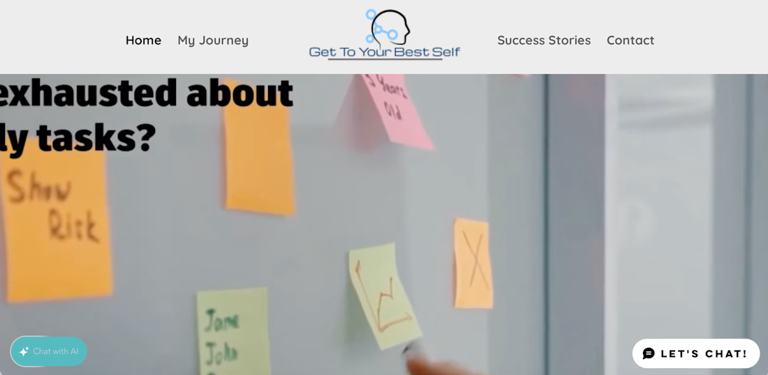
The main problems were:
- no clear hierarchy
- unclear meaning at first glance
- poor readability on different screen sizes (the video is cropped, so I couldn’t read it at all)
Redesign Focus:
- clear structure and message
- added call to action
- calm, modern visual style
All text and colours are taken from the original site. I couldn't remove the background from the logo, so I took a screenshot.
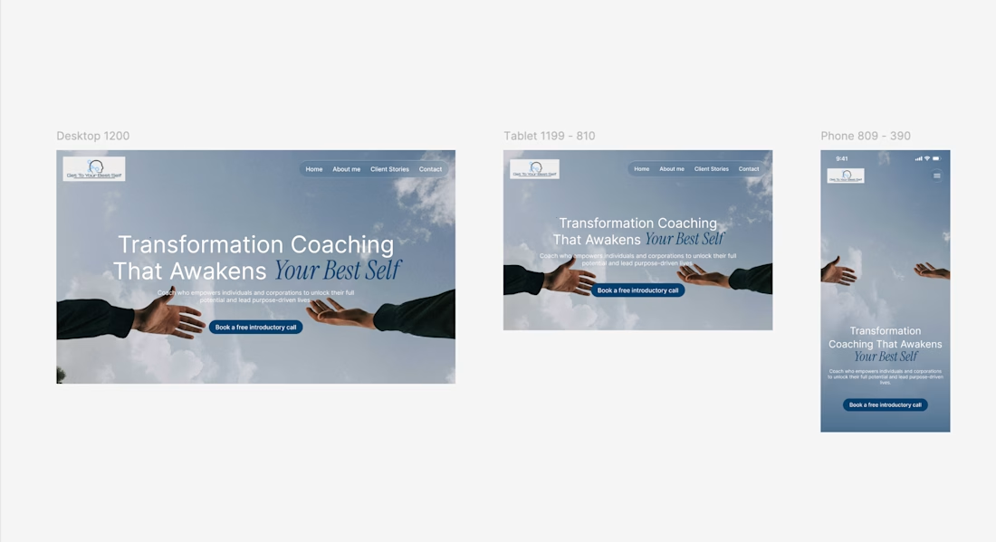
I also made it responsive for desktop, tablet and mobile devices.
What do you think?
I will be glad to receive feedback on the hierarchy of layouts and typographic solutions.🌸

The network for creativity
Join 1.25M professional creatives like you
Connect with clients, get discovered, and run your business 100% commission-free
Creatives on Contra have earned over $150M and we are just getting started





Related posts




🔥 🔥


pure eye candy 😍

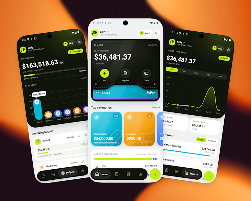
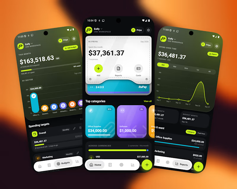
A great app should not just function, It should feel visually distinct
When the market is full of similar-looking products, design becomes part of the product’s well identity
For this finance project, we focused on a sleek UI, intuitive UX, and a visual language that doesn’t feel generic
Both dark and light modes were designed to feel equally intentional.
Which one do you prefer?
10 voted
56%
8 voted
44%
18 votes
Closed

I’d go with Light Mode. 👌 It feels fresh, clean, and the UI elements stand out beautifully against the background. Both are strong, though! 🔥