The network for creativity
Join 1.25M professional creatives like you
Connect with clients, get discovered, and run your business 100% commission-free
Creatives on Contra have earned over $150M and we are just getting started
Back to feedPost
UX Redesign for a Task Management and Reporting App
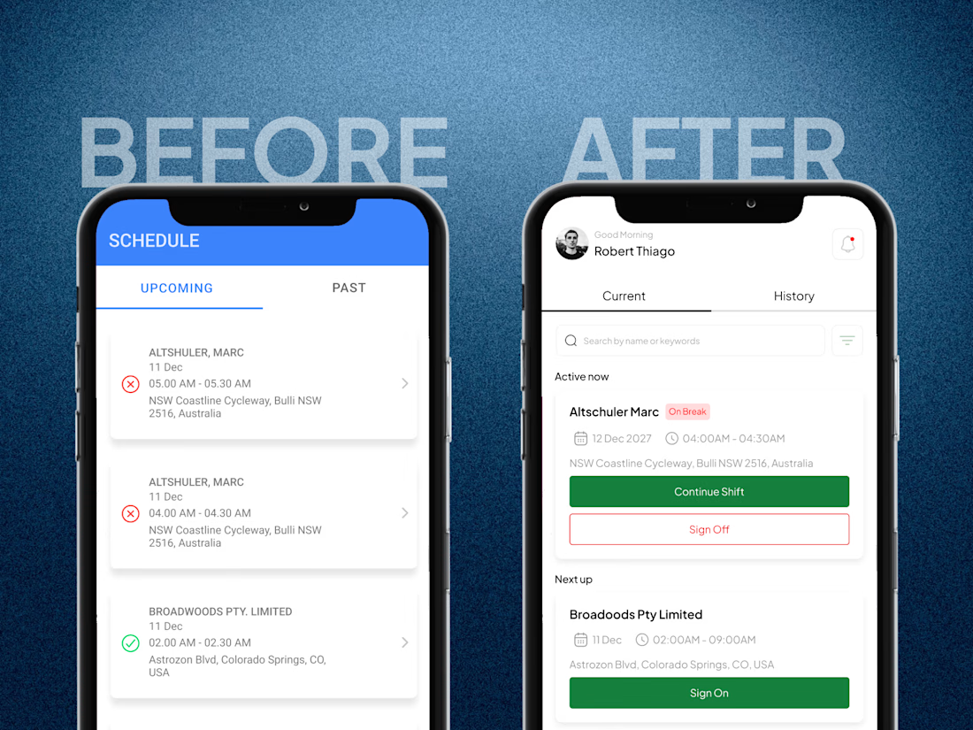
Simplified 15+ screens into just 8, creating a smoother, more intuitive user experience and reducing unnecessary steps in task management and reporting.


Cutting 15 screens down to 8 is the real work. It is easy to keep adding, much harder to decide what goes. The Accept and Decline pair in the booking view is a great example, everything in one place. Was there a screen you fought to keep that the team talked you out of?

Thank you! The sign-on signature was the one I fought for. I thought it added trust, but the team pointed out the worker already confirms everything at sign-off, so it only slowed people down at the start. Letting it go made the flow much cleaner.

Cutting 15 screens to 8 is hard to do. What did you drop first?
The previous flow had too many confirmation pop-ups, so I decided to remove them first and explain my reasoning to the client.
The network for creativity
Join 1.25M professional creatives like you
Connect with clients, get discovered, and run your business 100% commission-free
Creatives on Contra have earned over $150M and we are just getting started





Related posts

New case study for the brand and digital work we did for Seeper Studios.
Go Check it out


Evolving a brand with almost 30 years of history is the hard version of brand work. You have to keep what people already trust while making it feel current. Nice job balancing both.

Check out my latest case: a 40-second launch film for Arch, a platform that lets you borrow against crypto without selling it. I handled it end - to - end, from concept and script to 3D, animation, and edit. Chrome objects, the real app, and one calm beat per idea.
Would love to hear what you think.


This is cool! Great job 🙌

Photographer Portfolio Website
"Capturing light, emotion, and the moments you never want to forget." That line set the tone, and the layout follows it.
The hero is one motion-blurred portrait washed in red. The photographer's name runs across the bottom in a condensed white face, so large the screen cuts it off. The photo keeps its soft focus, and the name still reads first.
Thin grid lines split the page into narrow columns, and the small copy sits justified inside them. The loose photo gets a strict structure to lean on.
A single round red button with an arrow sits right on the letters and marks where to go next.
Designed by the Hue & Machine team.
#WebDesign #Photography #PortfolioWebsite #EditorialDesign #Typography #UIDesign #ProductDesign #CreativeDirection #ResponsiveDesign #FigmaDesign


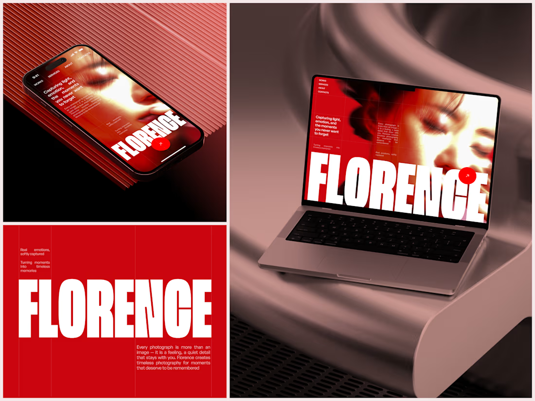

The heavy condensed white FLORENCE over the red portrait is bold, and keeping the same red across phone, laptop and type tile makes the case study read as one system. Did the red come from the photographer's own work, or was it your call?


