The network for creativity
Join 1.25M professional creatives like you
Connect with clients, get discovered, and run your business 100% commission-free
Creatives on Contra have earned over $150M and we are just getting started
Back to feedPost

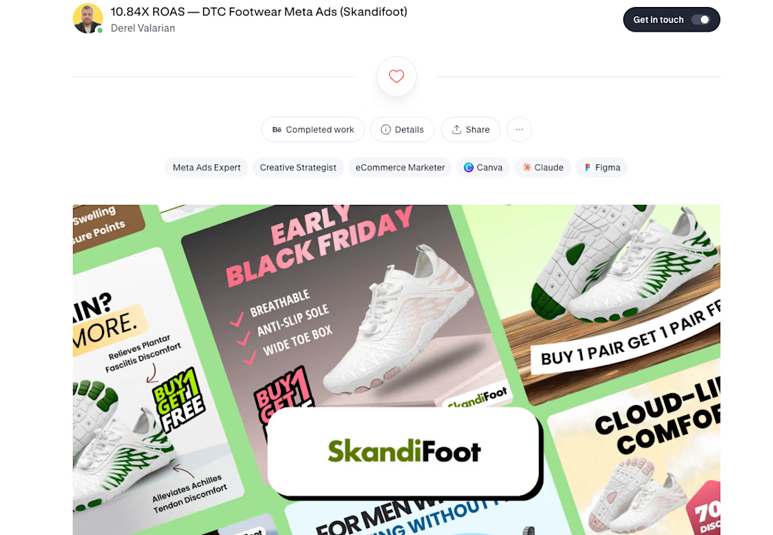
A DTC footwear brand was running discount ads and getting inconsistent results.
I changed one thing — the angle.
Instead of leading with the product, we led with the identity of the buyer.
Not "lightweight hiking shoes for men."
But "For Men Who Love Walking Without Pain."
That single creative hit 10.84X ROAS. Campaign averaged 5X across 6 creatives.
Most brands think they have a targeting problem.
They don't. They have a creative angle problem.
Fix the angle — fix the ROAS.
The network for creativity
Join 1.25M professional creatives like you
Connect with clients, get discovered, and run your business 100% commission-free
Creatives on Contra have earned over $150M and we are just getting started




Related posts

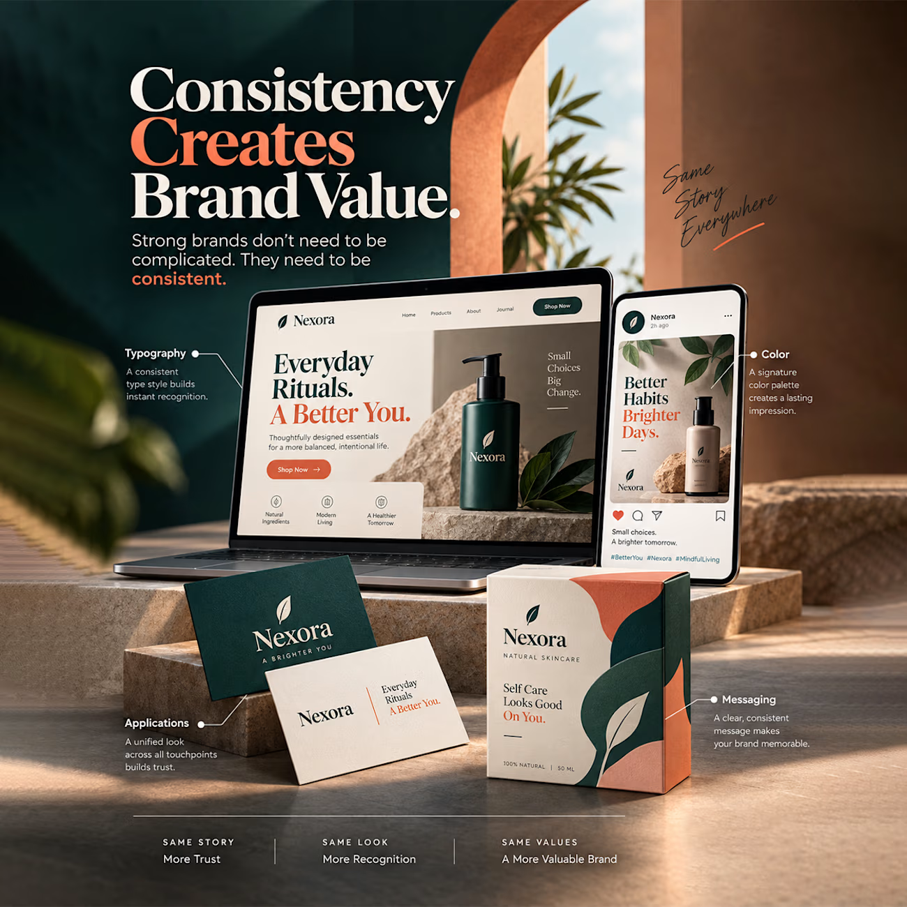
Strong brands do not need to be complicated. They just need to be consistent.
When someone visits your website, scrolls through your social feed, and unboxes your product, every touchpoint should feel like it belongs to the exact same universe. That seamless consistency is what turns a one time buyer into a loyal customer.
Here is how visual alignment creates real brand value:
• Typography: Using a consistent type style across all channels builds instant recognition.
• Color: A signature palette leaves a lasting impression wherever customers meet you.
• Applications: Keeping a unified aesthetic from screens to print collateral builds deep trust.
• Messaging: Clear, repeated messaging keeps your core value memorable.
Same look brings more recognition. Same story builds more trust.

Outstanding bro. Keep it up.

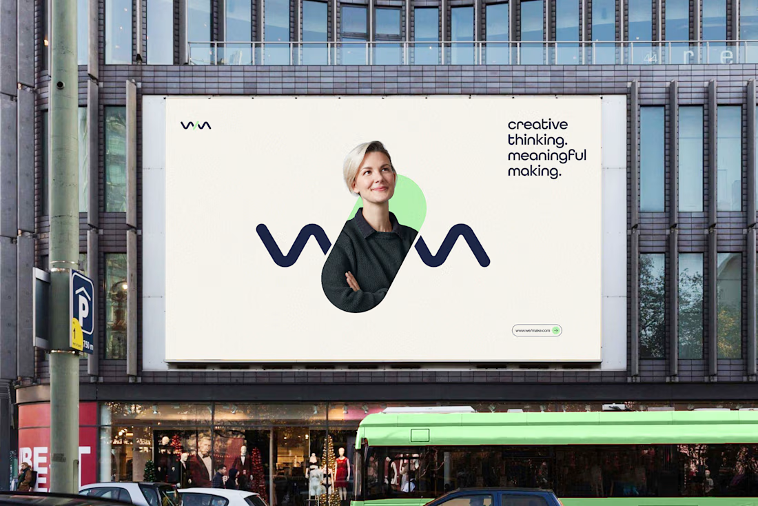
We/Make - Brand Identity Designed for Business Growth
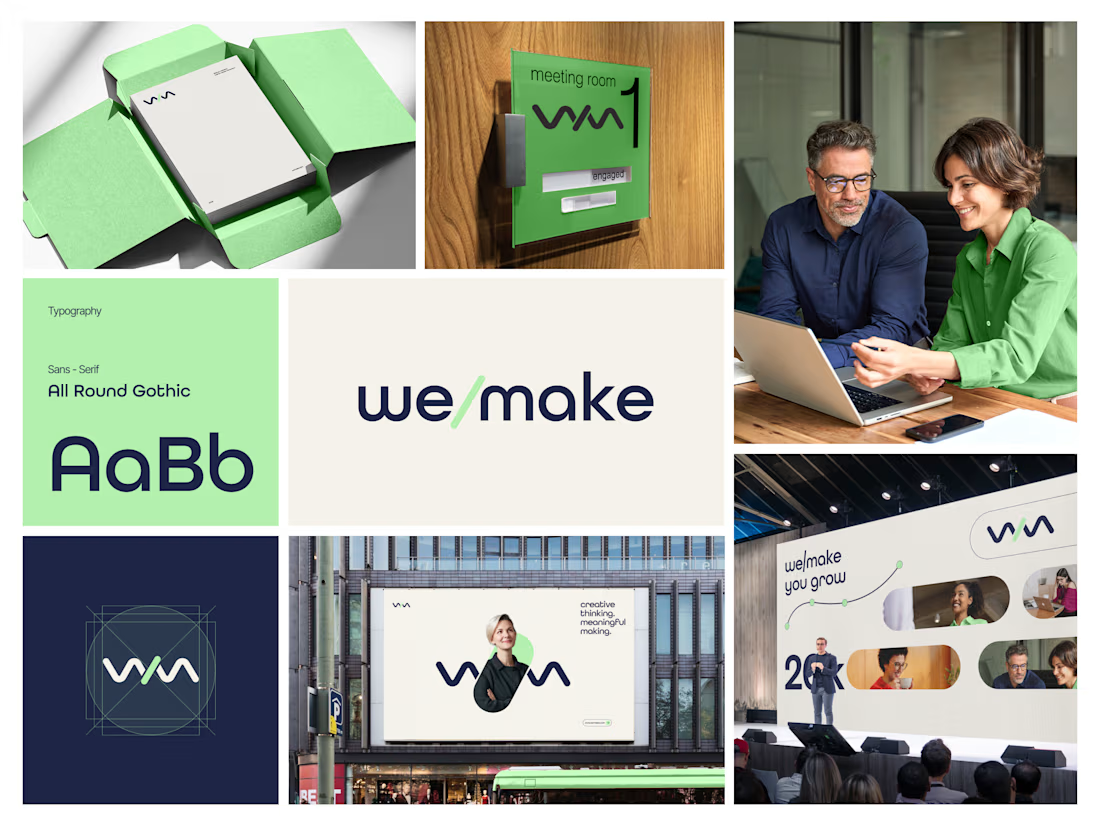
A strategic brand identity for We/Make, built to create a stronger market presence, communicate credibility, and give the business a clear, recognizable visual position.
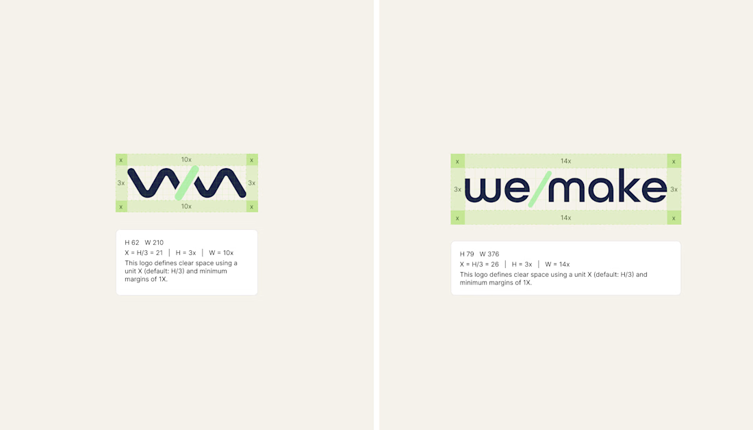
Rather than creating a logo in isolation, we developed a scalable identity system that helps the brand communicate consistently across digital touchpoints and build stronger recognition as the business grows.
The focus:
→ Clearer brand positioning
→ Stronger visual recognition
→ More credible & professional presence
→ Consistent communication across touchpoints
→ A flexible identity system built for long-term growth
Deliverables: Logo Identity · Visual System · Typography · Color Direction · Brand Guidelines · Logo Construction & Clear Space
Brand Strategy | Brand Identity | Logo Design | Visual Identity | Brand Guidelines | Business Branding
#BrandIdentity #BrandStrategy #LogoDesign #VisualIdentity #Branding #BrandGuidelines #BusinessBranding #BrandDesign #ContraDesigner #CreativeStrategy



This is brilliant

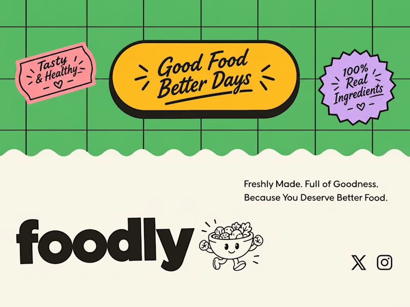
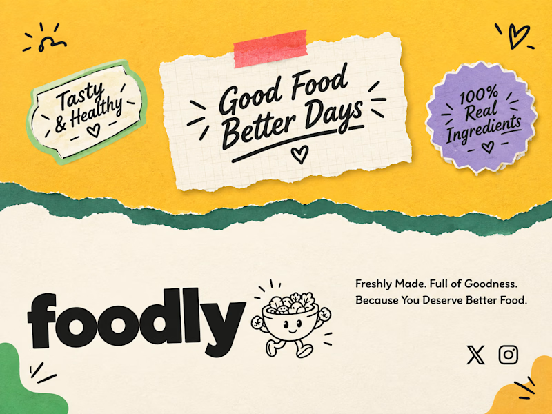
Two footer treatments for the same badges.
Texture alone changes how trustworthy vs. how fun a brand feels.
Which one would make you stop scrolling? 👇

19 voted
54%
16 voted
46%
35 votes
Closed

torn-paper version is really good .