The network for creativity
Join 1.25M professional creatives like you
Connect with clients, get discovered, and run your business 100% commission-free
Creatives on Contra have earned over $150M and we are just getting started
Back to feedPost
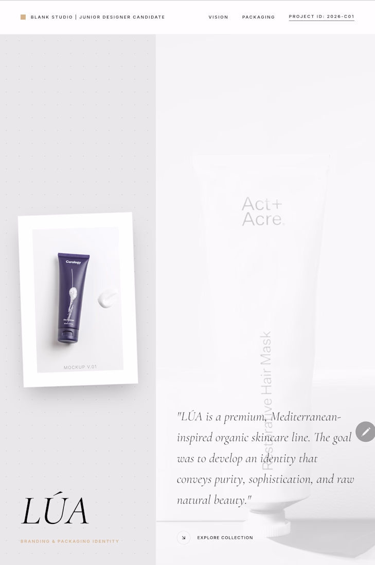
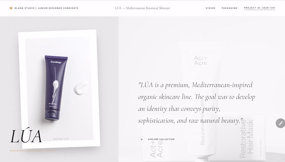
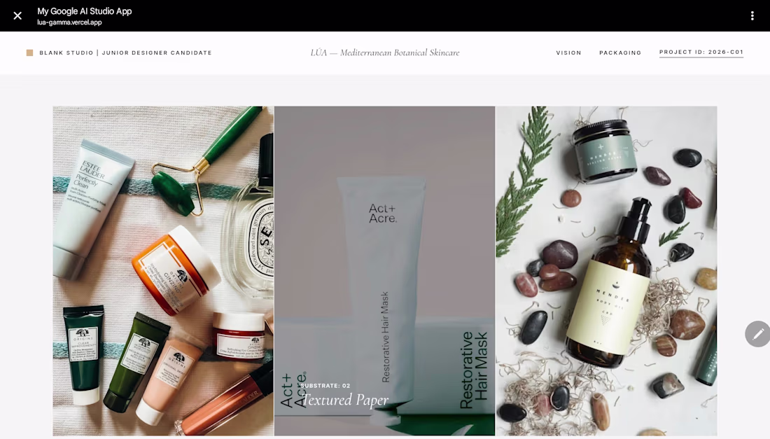
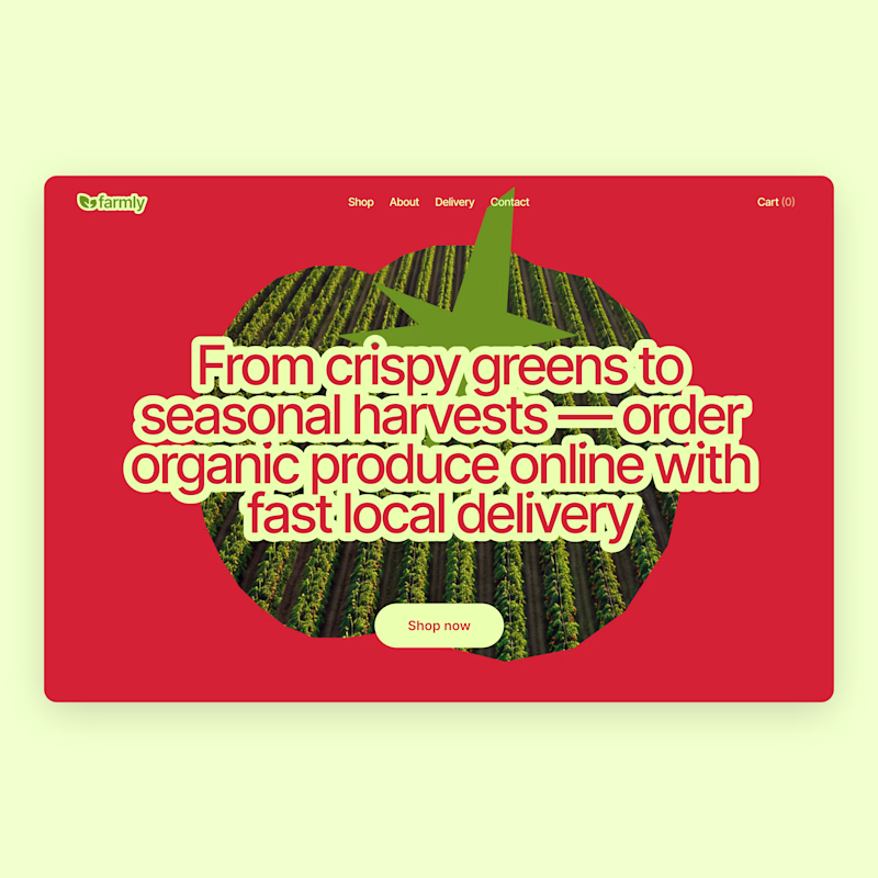
LÚA — Mediterranean Botanical Skincare Identity & Web Concept
LÚA is a conceptual premium skincare brand inspired by the raw, sun-bleached landscapes of the Mediterranean. This project was developed as a case study for my candidacy at Blank Studio, focusing on the intersection of organic purity and high-end sophistication.
The Vision: "Raw Refinement"
The core objective was to strip away the excess and focus on the biological connection between nature and skin. The identity leans heavily on tactility and atmosphere—evoking the feeling of sun-drenched linen and cold stone.
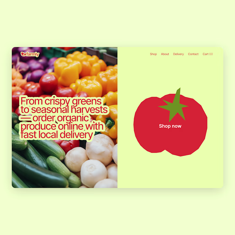
Design Execution
Logo System: A minimalist botanical monogram merging the letter "L" with an organic olive branch, paired with a clean, high-contrast sans-serif typeface.
Typography: A balanced pairing of Cormorant (for editorial elegance) and Inter UI (for functional clarity).
Packaging Concept: Focused on sustainable luxury, utilizing amber glass, textured paper substrates, and blind embossing to create a sensory experience.
Digital Presence: A custom-coded React & Tailwind CSS landing page featuring fluid animations (Framer Motion) and a grid-based editorial layout.
love the concept Filip!! super clean aesthetic on the visuals
The network for creativity
Join 1.25M professional creatives like you
Connect with clients, get discovered, and run your business 100% commission-free
Creatives on Contra have earned over $150M and we are just getting started
Related posts
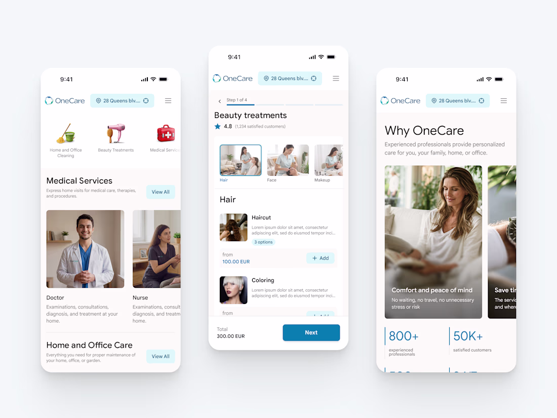
New project in the works - OneCare.
One app for premium care delivered to your address. Cleaning, beauty, healthcare at home, handyman, plumbing, pest control, pet care, laundry, and a lot more.
More to come soon 🤌
Nice work
New resource: Auria AI Rebuild Prompt ✦
I turned the complete Auria homepage into one detailed prompt for Codex and Claude Code.
Auria is a luminous Framer template created for modern service businesses, wellness brands, and productized offers.
Usually $19. Free for anyone who supports Auria on its Framer Marketplace page.
Get the prompt:
https://startfrom.co/templates/auria
Created with Framer, Midjourney, Claude Code, and Codex.
Rebuilding a whole landing page with just one prompt is such a cool experiment, Alex! Did Claude Code manage to handle the Framer-specific layout structure well on the first try?
I already shared the first concept a few days ago, but I couldn’t stop exploring 😅
So here’s an alternative direction.
Which one would you pick?
Vote below 👇
75 voted
63%
45 voted
37%
120 votes
Closed
Trending
Claude
Claude has entered the design space. How are you using Claude Design?
Contra University
Learn from expert creatives how to earn more using next-gen AI tools.
creativeaiflow
Creative AI workflows are evolving. What tools do you use, and what are their strengths and weaknesses?
freelancerlife
Freelancer life is wins, pivots, and everything in between. What’s yours right now?