The network for creativity
Join 1.25M professional creatives like you
Connect with clients, get discovered, and run your business 100% commission-free
Creatives on Contra have earned over $150M and we are just getting started
Back to feedPost

Your product has 2 seconds to catch someone’s eye. Would you make it move? 👀⚡
I’ve been thinking about how much a cover can change the way people experience a project. For Earthful, I wanted to explore something beyond a good-looking pouch mockup — something that feels real, premium, and impossible to scroll past.
A clean static mockup can look beautiful, but motion adds another layer. It brings out the details, creates a little emotion, and makes the product feel more alive.
Because sometimes, it’s not just about how good a design looks. It’s about whether it makes someone stop scrolling.
So, what would catch your eye in a discovery feed — a stunning static mockup or a cinematic motion piece?
I’m curious to know which one you’d click first. Let’s talk design! 🚀
The network for creativity
Join 1.25M professional creatives like you
Connect with clients, get discovered, and run your business 100% commission-free
Creatives on Contra have earned over $150M and we are just getting started





Related posts

Branding work for WithNation
Love the motion, visual style and aesthetics on this one
The concept is to mix the power of creative prompting and allowing everyone to orchestrate their business from start to finish.
Build • Run • Market
The logo represents a shopping bag with the prompting input inside


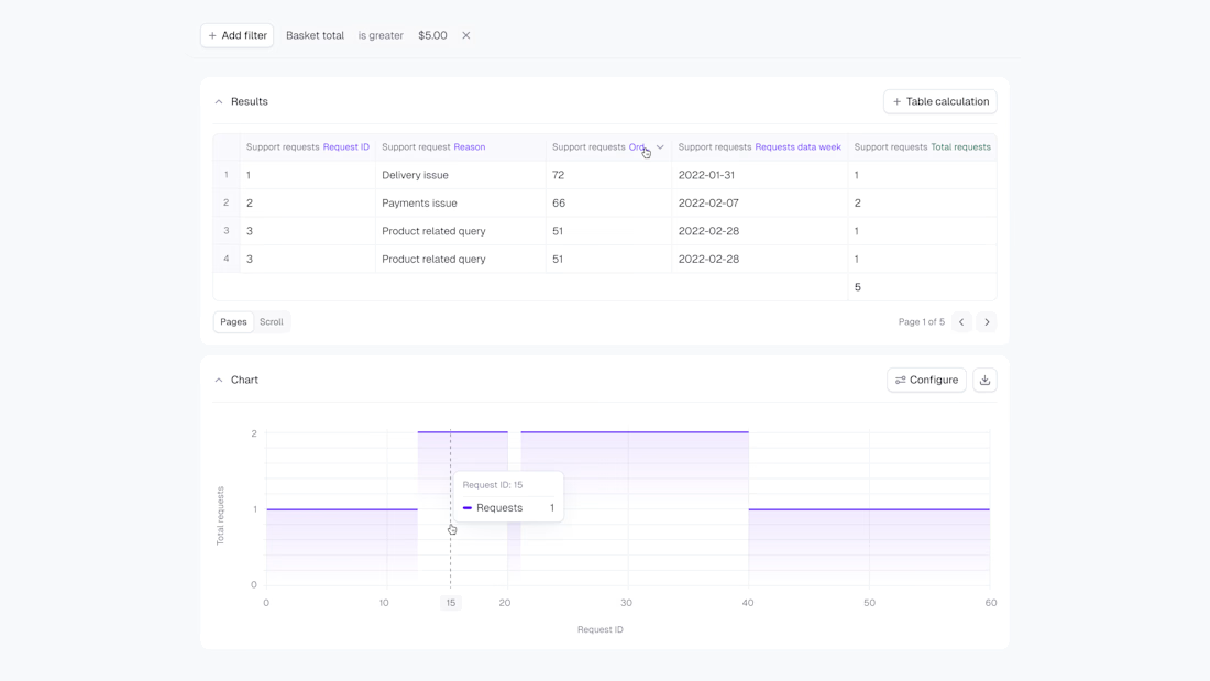
Product refresh for Lightdash, part of the work behind their $11M Series A. Full case study: https://contra.com/p/oQZBPZZR-taking-lightdashcom-to-an-dollar11-million-series-a-funding

Full of visual hierarchy. love the cleanliness